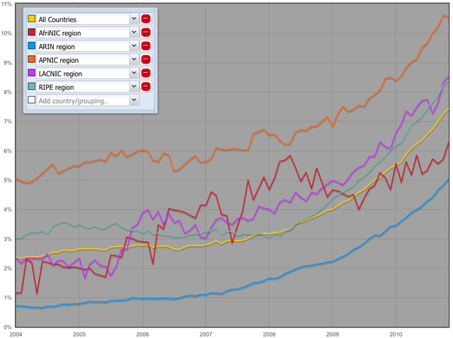
This infographic shows the percentage of networks (autonomous systems) that are IPv6 enabled from 2004 up until now. The interactive graph allows for comparison between IPv6 deployment in countries, and groups of countries.
Introduction
Inspired by our co-operation with the OECD on IPv6 deployment, we want to provide more IPv6 deployment statistics to network operators, and a wider audience of stakeholders including national governments. As a result we created this infographic that shows the percentage of networks (ASes) that announce one or more IPv6 prefixes in the global routing table:
For more information on the methodology used, please see footnote [1]. Also note that this prototype uses relatively new HTML technology (HTML canvas), so on older browsers your mileage may vary; the latest versions of FF, Safari, Chrome, IE, Opera are all supported.
Results
This metric provides insight in how many networks have actually deployed IPv6 in a country or group of countries, but it doesn't provide information on the size of the networks, nor on the state of their IPv6 deployment; a network could announce it for a small testlab, or a full production network.
As an example the image below is a comparison between the 5 RIR regions. It shows significant growth over the last couple of months, with APNIC ahead of the rest of the regions.

Figure 1: Networks with IPv6 for the 5 Regional Internet Registries
We added a permalink, so you can share the graph with countries you selected with others. You can use this to show your neighbors how well your country is doing, or ask your local government representative why your country is behind other neighboring countries, for example. If you find an interesting combination of countries, please post it in the comments section below, and if you have an explanation on why certain countries are doing better/worse please provide it too!
We plan to update this graph monthly, so you'll have an up-to-date view of how IPv6 deployment progresses.
I hope this infographic provides a wide audience with a key IPv6 deployment indicator, that allows people to compare countries, and hopefully this spurs some regions that seem to be behind a bit to act ... now.
[1] For every date we sampled, we took a BGP table dump from the Routing Information Service (RIS) and counted the percentage of ASes that announced an IPv6 prefix, relative to the total number of ASes in this routing table. We mapped the ASes to country using the RIR stats files . To assess the accuracy of that mapping we compared it to geolocating all announced IPv4 space for an AS. Geolocation was done with the MaxMind geolocation database. We found that in 89% of ASes all IPv4 address space geolocated to the same country as RIR stats. An extra 5% of ASes geolocated to multiple countries, but the largest fraction of address space geolocated to the same country as RIR stats. Some countries do not show up in this graph, either because there are no ASes in the RIR stats for that country, or the ASes listed for the country are not announcing any address space.


Comments 6
The comments section is closed for articles published more than a year ago. If you'd like to inform us of any issues, please contact us.
Anonymous •
Very cool visualization.<br /><br />If nothing else, it says which ASN are *capable* of receiving IPv6 traffic.<br /><br />Thinking about it, it seems like an ASN with a large number of networks would be more likely to advertise an IPv6 route. There are differences in the number of ASN in each region, so that seems like it could have a strong effect on these numbers. A country where every organization feels it needs its own ASN is likely to have a lower percentage of ASN using IPv6 than a country where organizations are happy to get this from their provider.
Anonymous •
Re: *capable*: very true, but I think being capable is a useful indicator of an operator having at least thought of IPv6 and then actively taking steps to get it deployed.<br />Re: biases: yes, I suspect there may be biases like that, for instance Eastern vs. Western Europe. I was thinking of additional analysis that would weigh ASes based on the amount of IPv4 address space they have deployed. That might shed a little more light on biases.
Anonymous •
It would also be interesting to plot the relative growth per region. <br /><br />By that I mean that for now, we should consider IPv4 growth as a baseline for network growth and measure the delta between that and IPv6. It's possible that this particular method is not appropriate for that kind of measurement and something else is needed, though.<br /><br />We see really strong growth in the Asia Pacific region but is that growth just down to massive network deployment there? How does the rate at which IPv6 is being deployed in the parts of the world that are already well-served with IPv4 differ from those experiencing the most rapid growth?
Anonymous •
Thanks Leo for your suggestion, I'll look into it and see if I can distill something interesting that takes into account IPv4 growth.<br />I was also thinking of plotting the percentage of IPv4 address space that is announced by IPv6-enabled ASes (or more precisely ASes that announce at least one IPv6 prefix), but haven't gotten around collecting these numbers yet. Maybe this year :)
Jaris •
Hello, I would like to know if there's a way to know how many IPv6 prefixes /32 or others are being advertised around the world.
Mirjam Kühne •
Hi Jaris. Sorry for the delay. We looked at our Routing Information Service (RIS) and found that currently 4,712 /32s are seen by at least 10 RIS peers. In total they see 11,422 IPv6 prefixes. You can also look at the RIS output yourself: http://www.ris.ripe.net/dumps/riswhoisdump.IPv6.gz