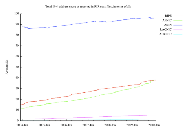
On 30 January 2010 the RIR system reached a small milestone: on this day APNIC has surpassed the RIPE NCC in terms of total allocated/assigned IPv4 address space, as seen in the RIR stats files. On this occasion we decided to look a bit into how IPv4 allocation/assignment rates changed over the last couple of years.
Introduction
All five RIRs publish a so called "stats" or "delegations" file every day. These files list all the resources that are allocated or assigned to entities (NIRs, LIRs, ISPs, PI space holders, etc.) in the particular RIR's region, including IPv4 addresses, IPv6 addresses and Autonomous System Numbers. The RIRs have been publishing these files in a consistent format since late 2003, which allows relatively easy analysis of trends. You can find these files on the RIRs' FTP sites, but you can also query them online using the INRDB if you wish.
The big picture
Here's what these files show in terms of total IPv4 address consumption as a function of time, with a per RIR breakdown. Note the crossover of the RIPE and APNIC lines on the right hand side:
(For a longer history of a similar graph, see Geoff Huston's exhaustive "IPv4 Address Report" , specifically figure 28. There are slight deviations because of different interpretations of allocation time, but the big picture is very similar.)
As we can see, there was about 5 /8s worth of "difference" between APNIC and the RIPE NCC in the early days of 2004, which has diminished over time, suggesting that APNIC's IPv4 "allocation speed" has been higher in this period.
Details
Before diving into deriving the allocation speeds, we have to deal with some historical artefacts. A significant amount of IPv4 addresses have been allocated prior to the existence of the RIRs, or in a different region than where they are really used. Since then, the RIRs executed a couple of shuffling operations collectively known as Early Registration Transfers (ERX) , in order to properly register these resources in the region where they are really used. For administrative reasons, some of these operations were executed at different points in time, some as late as 2009. (Most of this address space is marked as "Administered by <RIR>" in IANA's IPv4 Address Space Registry , so collective identification is not hard to do.)
These operations do not reflect real allocation activity at the time they appear in the stats files (again, these allocation were made in the nineties). They obscure the analysis, by artificially increasing the allocation rates, or decreasing them, sometimes with more than a /8 per month (!). So it makes sense to filter out the affected address space for this specific analysis.
Absolutely!
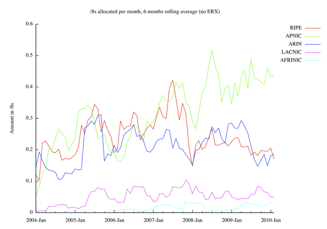
If we now extract the amount of address space for each RIR (excluding ERX, as explained above) for each month, then calculate the difference in address space consumption between successive months, and finally apply a 6 month rolling average calculation to this series, we end up with the following graph:
A less scientific, but more "pleasing to the eye" version can be shown by adding Bezier smoothing to the same graph:
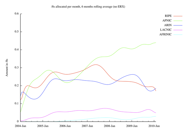
Both graphs show that APNIC, ARIN and the RIPE NCC had approximately the same "allocation speed" in 2004-2007. APNIC has clearly and consistently been allocating IPv4 addresses faster than any other RIR, roughly since mid 2007.
It's all relative
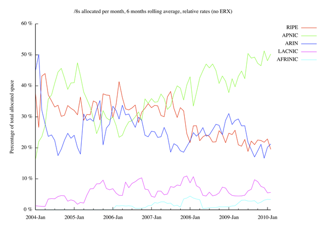
We can also compare the allocation speeds of the RIRs to each other (i.e. for each RIR and each month, compare its monthly allocation to the total RIR allocations in that month), thereby producing a "relative allocation speed" graph:
The smoothed version:
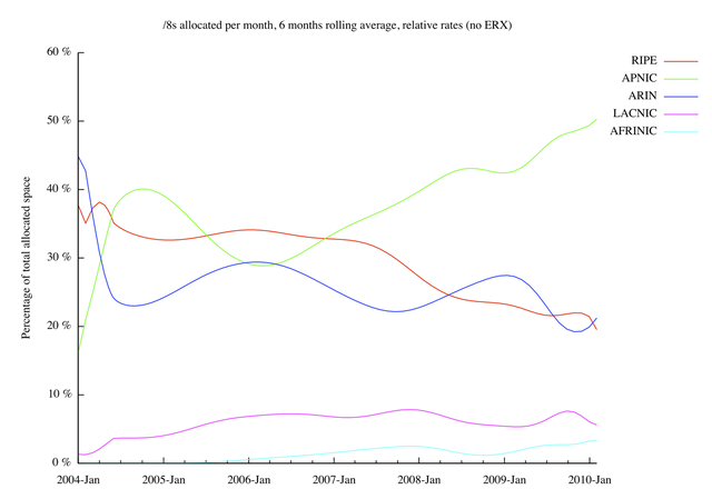
APNIC's recent dominance is even more clear on these graphs. Note that this is probably caused by a multiple of factors; somewhat different policies and economic factors also play a role.
It is also interesting to note LACNIC's slight periodicity on the jagged version of the graph: in their spring season, a relative boost can be observed -- or is this a relative production loss in the other regions? :-)
Closing remarks
Not surprisingly, the above graphs are remarkably similar to Geoff Huston's graphs. There are slight differences though, which are most likely caused by the differences in methodology (like excluding/including ERX and related address space, or the handling of resource extensions, etc.).
Some of the features in the above graphs may be partly or entirely caused by policy decisions in the different regions. It's possible that some of these (future) policies will significantly change the picture.
IPv4 addresses are running out. In the last 6 months, on average, all the RIRs combined allocated 0.87 /8s per month. It's going to be "exciting" to update the above graphs regularly, and watch if they change as the run-out date approaches. Will they change? How? Why?
Rest assured, if we see interesting changes, we'll produce updates to this analysis!


Comments 1
The comments section is closed for articles published more than a year ago. If you'd like to inform us of any issues, please contact us.
Anonymous •
Very interesting, this kind of info ie. the big picture can frame<br />whats happening in a context. Maybe allowing us to see how the v4 run out scramble is already beginning. Keep up the good work