
This post describes the result of an internship of a month of integrating an experimental data analysis method into RIPE Atlas.
You may remember from earlier this month that we have been working on an API to summarise RTT time series. This work is part of the PhD I'm doing at IMT Atlantique and has been presented in a RIPE Labs post and in a conference paper. My internship at the RIPE NCC is coming to an end and I'd like to share some interesting results.
RIPE Atlas trends API
Our primary goal was to build an API that would provide the basic building blocks for further analysis: a summary of the results of an arbitrary RIPE Atlas ping measurement. This summary consists of a grouping together of similar results from the same origin-destination pair. This grouping we will call a state. So the summary is an enumeration of states, their properties and an enumeration of the time slices each state was valid for. These time slices we call segments.
We designed and implemented an HTTP API similar to the measurements results API: request a measurement, a probe, start time and a stop time, and get a summary. All the heavy lifting (data cleaning, model learning, results formatting) is done behind the scenes.
We're currently working out the latest details before making the API public, and we'll give more details in a new article in the coming weeks. In the meantime, here’s a preview of what the results look like:

Use cases
Three main applications can be built on top of this API by aggregating summaries at different levels. The first is providing a status report for anchor hosts where we provide an aggregated view of the events towards the anchor.
The second is to monitor large infrastructures, such as IXPs, by looking at the frequency of the events for origin-destination pairs that reliably go through an infrastructure.
The third is to look at the whole anchoring mesh measurements and create a weather map showing the frequency of changes geographically.
Data Analysis
RTT summaries can be used to study how the delay on a single origin-destination evolves over time. We can summarise further by combining multiple origin-destination pairs. Of course, this only shows events that happen between these origin-destination pairs. An interesting and open topic to explore is how to best select the origin-destination pairs to capture relevant events. In order to validate this approach we chose known events that happened on the Internet (such as the AMS-IX outage in 2015) and looked at the frequency of the events over time for a given set of origin-destination pairs that reliably go through these infrastructures. We see a clear increase in the state changes frequency around the time of the events.
We then considered the anchoring mesh measurements. For the first week of February, we count 422 anchors which amount to ~160k origin-destination pairs. Once the model has been learned it is easy to extract the change points, and we get something like:

Table 1: Changepoints and their associated features
In this dataset, we count 14 million changepoints (from 400 million RTT observations), which amounts to 80 changepoints per origin-destination pairs over the week. Of course, some pairs are undergoing more changes than others and this can be a good indicator of the “stability” of a path.
The final changepoint dataset, including metadata such as ASNs and timezones, is 2GB, compared to the original 9.3GB of time series.
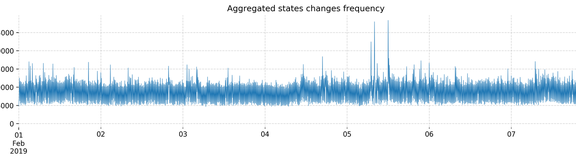
To see how changes occur over time we can plot the change point frequency over time:

Figure 1: Aggregated state changes over time
We see some spikes but they are not very clear. However, if we apply a data transformation to filter the background noise, we get the graphic in Figure 2 below. We did this by weighting changes by the delay difference they caused and take the moving average.

Figure 2: Aggregated state changes over time (weighted)
At first glance, two events stand out (highlighted in red). During these two events, the average frequency of state changes, weighted by relative delay difference, was particularly high. We intend to look into these events in more detail in a future post.
Where to go from here
Looking at state changes rather than raw delay measurement gives us a new perspective on RIPE Atlas data, in particular when looking at many measurements at the same time. By carefully choosing existing measurements going through specific infrastructures (such as IXPs) it is possible to monitor those for unexpected events. However, while we automated change point extraction, one open problem is the automatic processing of these changes time series.
At the level of a single time series, changes could be classified according to some of their properties (short vs. long changes, a difference in a delay before and after), and in turn the time series could be classified according to their change patterns (seasonalities, diurnal patterns, infrequent or very frequent changes).
At the aggregated time series level, change detection methods in data streams could be used to detect an unexpected increase in the state change frequency.
Finally, many visualisations and exploration tools could be built on top of the summaries to ease manual exploitation of the data.
We would be interested in your thoughts and comments about this! Let us know by leaving a comment below or writing us at labs@ripe.net
Comments 0
Comments are disabled on articles published more than a year ago. If you'd like to inform us of any issues, please reach out to us via the contact form here.