
As the RIPE Atlas network continues to grow, it's useful for ambassadors and potential probes hosts to easily see where we already have probes deployed and where we'd like more probes installed. We created a few useful maps to help with this.
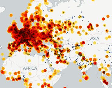
As the RIPE Atlas project is now focused on distributing probes to areas where we currently don't have many probes already installed, I thought it would be interesting to see how RIPE Atlas probe distribution compares to human population distribution. To try to gain some insight into this, I used CartoDB to create the visualisation below. It shows urban population areas in blue ( data from Natural Earth ) with the RIPE Atlas probe distribution density as a yellow to red overlay. So areas that show urban population markers without any colour overlay are those without any RIPE Atlas probes (yet!). If you know people in these areas, or live there yourself, you can make a difference by applying to host a probe !
You can zoom in/out on the interactive map below. You can also set it to full screen by clicking on the button below the zoom buttons. You can also find this map at CartoDB here .

Another way to visualise the same data is using so called hexagon maps (credits to Martin Levy for pointing this out), as in the example below. The hexagons are colored yellow to red based on the number of RIPE Atlas probes that are in that specific hexagonal area. If you zoom in, the hexagons will cover a smaller geographic area, which allows you to see what the distribution of RIPE Atlas probes is with more granularity. This map is also available at CartoDB here .

Please let us know if you want to see more visualisations like this, and/or create them yourself by cloning these prototypes on CartoDB.
We're also hosting a RIPE Atlas hackathon in March 2015 to create even more visualisations based on RIPE Atlas data. Join us, and help spread the word!
Comments 0
The comments section is closed for articles published more than a year ago. If you'd like to inform us of any issues, please contact us.