
We've enabled RIPE NCC members to do IPv6-traceroutes from all RIPE Atlas probes to IPv6 destinations. Until now they could get the raw analysis results (text/JSON representations of traceroute results) for analysis. In this article we present a first experimental analysis and visualisation of the traceroute results.
For a network operator it is far easier to find out what the Internet looks like from his or her network, then it is to find out how his or her network looks from the Internet. Tools to see from outside-in include route collectors (like the Routing Information Service ) where control-plane data can be found, and looking glasses where control- and data-plane data can be obtained, but only from a single source at a time.
In a recent article LIRs: Test Your IPv6 Reachability Using RIPE Atlas , we described a new service for RIPE NCC members: Every RIPE NCC member, even if they do not host a RIPE Atlas probe, can now use RIPE Atlas to test the reachability of their network over IPv6. Specifically, you run traceroute6 from over 600 RIPE Atlas probes towards a destination in your network. This enables operators to have an outside-in view at the data-plane. In that article we also announced that we are working on better visualisation and some more customised analysis. This prototype analysis and visualisation is now available and in the article below we describe how to interpret the results.
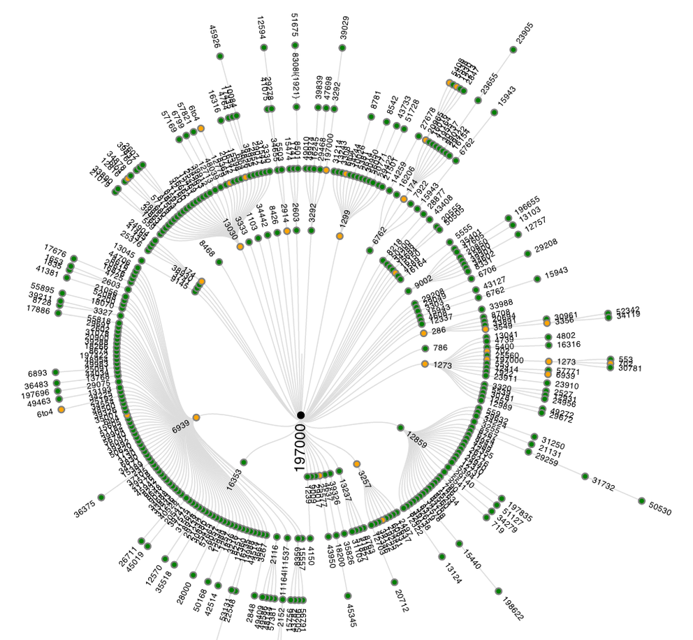
If somebody performs one of these 600+-source traceroutes, he or she can download the raw data from the RIPE Atlas website after the measurement finishes. As the raw data may be a bit overwhelming, and time-consuming to process, I tried to come up with a way to make the data more accessible, by automatically analysing it. An example of the analysis results is shown in Figure 1. The methodology that was followed for analysing the traceroute data as input for this visualisation is described in footnote [1].

Figure 1: AS-level graph of successful traceroutes to ns.ripe.net
Figure 1 shows the inferred AS-paths of all succesfull traceroutes. Traceroutes 'go' from the outside towards the center of the graph, where they reach their destination. ASes are represented as colored circles that are connected if they were seen next to each other in an AS-path. ASes with hosts that respond as the final destination are represented with black circles in the center of the graph. This is usually a single AS, but it is also possible to have multiple ASes as destination (think big Content Delivery Networks, or destinations that have multiple IP addresses). The other ASes are colored like this:
- Green indicates that all traceroutes that traversed this AS reached the intended destination
- Yellow indicates that some, but not all traceroutes, that traversed this AS reached the intended destination
- Red indicates that no traceroute that traversed this AS reached the intended destination
As Figure 1 only shows results when traceroutes were successful, only 'yellow' and 'green' ASes are visible. If there are unsuccessful traceroutes - and there typically are some - these are shown in a separate graph. An example of such a graph can be seen in Figure 2. In the center a '???' mark provides a visual clue to suggest that these traceroutes didn't end up at the intended destination, and no black or green nodes are visible, only yellow and red.

Figure 2: AS-level graph of unsuccessful traceroutes to ns.ripe.net
At this scale, I often see a small fraction of traceroutes that do not reach the intended destination, and while these could indicate real problems in reachability, they could also be caused by ICMP-rate limiting.
Because we display the traceroutes as a tree, any time an AS is seen with multiple distinct downstream AS-paths, it is visible multiple times. If, for example, the following two AS paths are seen:
64496 64497 64511
64496 94500 64511
then AS64496 will appear in the visualisation twice. If, for some reason, routers in AS94500 don't respond to traceroutes, a link between AS64496 and AS64511 would be seen in the visualisation, so a link in the graph doesn't necessarily imply that 2 networks are directly peering.

Figure 3: Hovering over a specific node produces a popup with additional information
You can interact with the data: You can hover over a specific node to get more information about it, as can be seen in Figure 3. The links observed directly upstream and downstream of the hovered-over AS are highlighted. If an AS appears multiple times in the visualisation, all instances are highlighted when one of the nodes is hovered over, as is seen for 6to4 (which is treated as a special case) in Figure 4. The popup that appears on hover-over currently shows the AS number (together with a link to RIPEstat ), the netname and a link to retrieve the 'raw' traceroutes that traversed this specific AS at this specific place in the topology. The 'raw' traceroute results that are displayed are enhanced with AS and hostname lookup information, which makes interpretation of traceroute results easier (see this NANOG presentation for background on interpreting traceroute results).

Figure 4: Hovering over a node that appears multiple times, will make other instances of that AS in the graph more visible, by putting a thicker black circle around them.
An example of showing the 'raw' traceroute6 results is visible in Figure 5. Showing the raw results is important, since it allows for verification of the information that was inferred from the original data, which may not always be correct. By having the ability to view the 'raw' traceroute results, this visualisation becomes a means of browsing through the massive amount of data to get to the most interesting traceroute results.

Figure 5: Raw traceroute results for a specific node allow for verification of the visualisation and can help in debugging specific network issues.
An example of the visualisation for traceroutes to ns.ripe.net is available here .
If you have done one of these traceroutes from RIPE Atlas before, the results are also available if you go to your user-defined measurements (UDM) page at https://atlas.ripe.net/atlas/udm.html . If you go to the details for an individual measurement that you did, and scroll all the way to the bottom, you'll find a 'results' section. Clicking on that section will allow you to download the raw data, but also will show the analysis and visualisation of these results. The same webpage also has a permalink to the analysis results, which has the following advantages:
- More screen-space
- All traceroute results will be visible when scrolling
- Allows for sharing of the visualisation results as you don't need to be logged in to view this graph, all the information needed is embedded in the permalink
As the graphs are scalable vector graphs (SVG), they can be zoomed in using built-in functionality in the browser. A downside of SVG is that older browsers may not support it.
This is a first prototype, and I already have a wishlist of what I would like to improve or add:
- Include RTT in the visualisation
- Distinguish between direct and indirect AS-links (as inferred from traceroute data)
- Better IP address to AS resolution
- Display more information in the pop-up, like probe-ID, and other probe meta-data, IP addresses in this AS seen 'closest' to the destination
- Detection of traceroute artifacts due to things like equal cost multipath routing, path changes during a traceroute etc.
If you like or don't like this visualisation of results, or if you have suggestions for features, please comment below.
If you work for an LIR and want to see this in action: go to the IPv6 reachability test page when logged in with credentials associated with the LIR, fill in an IPv6 address of something that can be traceroute6-ed to. It will typically take 1 to 2 hours for the measurement to be finished, and the analysis to be done. Happy measuring!
Footnotes
[1] Methodology: As a first step, traceroutes are put into 3 categories: unusable , destination not reached and destination reached . Unusable in this case is defined as no IP addresses past hop 2. This discards most traces with dysfunctional CPE (typically hop 1) and also dysfunctional tunnels ending up at CPE (typically hop 2). Also some corner cases, like traces where every hop was the same IP address, are classified as unusable. Distinguishing if a destination is reached or not is more tricky: A response from an IP address that is not the destination IP address can also mean that the intended destination was reached (for instance a multi-homed host), so currently I use the following definition:
-
Last hop has no IP address: fail
-
Last hop IP address is destination IP address: success
-
Last hop responds with ICMP other then TTL exceeded: fail
-
Hop count = maximum hop count: fail
-
All other: success
For all usable traceroutes I tried to determine what ASes where traversed in a traceroute. For a description of the IP address to AS lookup see footnote [2]. With this information we divide ASes in 3 classes, that are listed in the measurement result page:
-
Succeeding: all traceroutes through this AS reached the intended destination
-
Failing: all traceroutes through this AS didn't reach the intended destination
-
Mixed: some, but not all, traceroutes through this AS reached the intended destination
There are some small inherent problems with traceroute data and the way we use it here:
-
AS inference is not 100% correct, and for parts of traceroutes where we don't get any IP address information, we can't tell what ASes were traversed.
-
You are only seeing the forward path (i.e. inbound from RIPE Atlas probe, to the measured destination). Problems on the reverse-path from any intermediate hop towards the original source will affect the traceroute result.
[2] IP address to AS lookup: First take care of special cases (RFC1918, 6to4, teredo), and then look at what AS announces this address space (as seen in RIS). As IXP address space leaks, accidentally or purposefully, into the BGP tables as seen by RIS, I tried to correct for this. This is needed because otherwise whoever announces the IXP prefix will be seen as a hop between 2 other networks. By using PCH IXP data , and not attempting to lookup AS for known IXP address ranges, a lot of these false AS inferences are avoided.
Comments 0
The comments section is closed for articles published more than a year ago. If you'd like to inform us of any issues, please contact us.