This time we explored Twitter feed visualisation with CartoDB, a map visualisation tool.
We've been evaluating easy ways to combine data and maps, as detailed in the recent article Distribution of RIPE Atlas Probes , where we looked at the location and distribution of RIPE Atlas probes compared to the population in those areas.
Here we look at a completely different dataset: Twitter feeds. And because we're always looking for new ways to promote IPv6 deployment, we were curious to see what we could learn from the Twitter universe about IPv6 popularity.
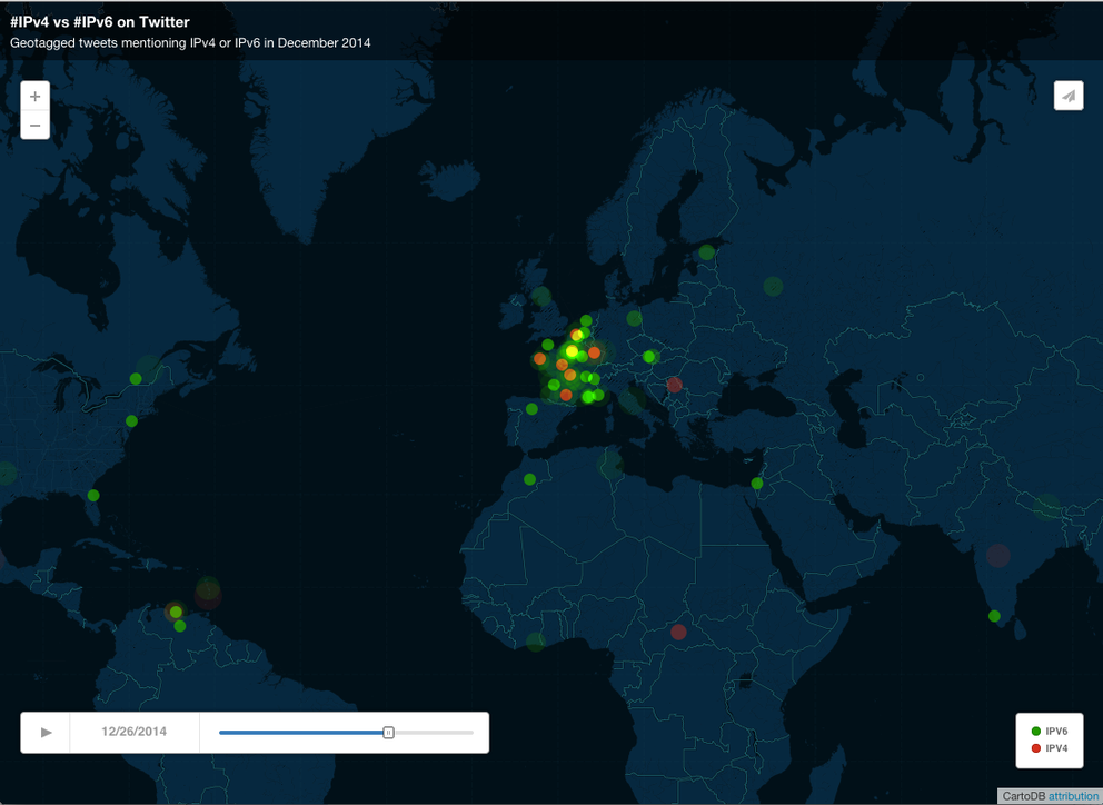
The tool we're using, CartoDB , allow you to find geo-tagged tweets with specific keywords. In this case, we searched for the keywords IPv4 and IPv6 in the last 30 days, and put them on a map. You can see the results in Figure 1 below, or view the map at CartoDB . IPv4 tweets are coloured red, IPv6 tweets are green.
Figure 1: Tweets mentioning IPv4 (red) and IPv6 (green) over the last 30 days
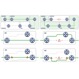
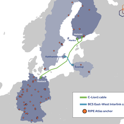
IPv6 was clearly the more popular keyword of the two for the period we looked at. We also noticed some interesting tweet clusters during that time (you can enlarge the images by clicking on them).
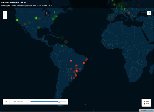
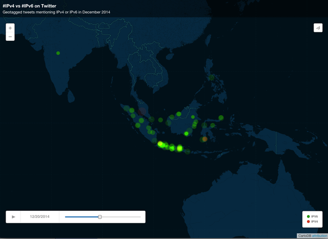
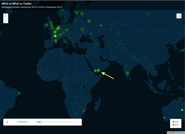
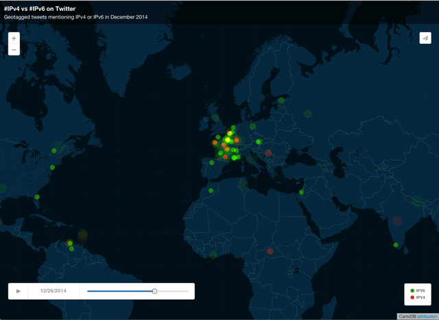
We didn't look into what caused these tweet clusters. If you have more details or know of any other interesting stories around them, we'd love to hear them.
If you spot more interesting things on this map, don't hesitate to post screenshots of these as well.

Comments 0
The comments section is closed for articles published more than a year ago. If you'd like to inform us of any issues, please contact us.