
This article shows some prototypes of visualising network outages with RIPE Atlas using CartoDB.
We're looking for better ways to visualise network outages with RIPE Atlas. At RIPE 63 in Vienna Daniel Karrenberg's presentation about RIPE Atla s featured screenshots of simulating an outage with a network of 20,000 RIPE Atlas probes:

RIPE Atlas has over 7,700 probes now so we can see how much that simulation reflects what we can see with RIPE Atlas.
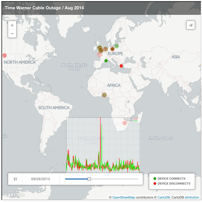
One of the biggest events in 2014 was the Time Warner Cable outage (see earlier RIPE Labs article ), and as we have pretty good coverage of RIPE Atlas in the USA, I picked this event to test things out.
For the methodology used, please see the footnote below. In short, the methodology uses ICMP pings to various destinations and infers a RIPE Atlas probe connect or disconnect event from these. In Figure 2 you can see the result of visualising this data with CartoDB :
Map 1
Figure 2: Visualising the Time Warner Cable outage in 2014 with CartoDB
As you can see in Figure 2, probe connect and disconnect events happen all the time, and because Europe is dense with RIPE Atlas probes, the background noise of connects and disconnects is most prominent there.
But did you spot the event? I didn't the first time I saw this animation, and quite likely you didn't either. Is this a case of "too much animation"? If there is too much movement in an animation, it gets difficult to focus your attention. The human eye and brain may not be optimised for picking up signals like an Internet outage if it is visualised this way it seems. A phenomenon called "change blindness" causes us to ignore otherwise obvious changes when we are distracted by other movement.
While looking into the background of this a bit I found this fascinating bit of research " Change blindness as a result of mudsplashes " that appeared in Nature in 1989. From this text:
" When a few small, high contrast shapes are briefly spattered over a picture, like mudsplashes on a car windshield, very large changes can simultaneously be made in the scene without these being noticed. This occurs even when the mudsplashes do not in any way cover or obscure the changes. "
Example animated images are still online if you want to see for yourself. The challenge is: every few seconds a "mudsplash" will appear. Can you see what else is changing in the picture?
Here's an image with mudsplashes , and if you want to know the solution there is a version without mudsplashes .
One way to make it easier to spot the outage is to stop the animation at the point where outage events happen. An experimental version of how that would work can be seen in Figure 3. Here I tried to capture the events using the odyssey.js package , which allows for zooming, stopping at certain points in the animation and adding a text to it to explain it.
Unfortunately we encountered a bug when looking at this javascript animation in Firefox (it stops once the animation zooms into the USA). Firefox users can watch this movie that shows the animation or watch it on YouTube .
Map 2
Figure 3: Visualising the Time Warner cable outage 2014 with CartoDB and odyssey.js. This way the animation includes additional information to point out the event
A second way to solve this is to add additional information about the event to the timeline, so your brain and eyes are prepared for when events happen. In Figure 4 the same animation plays as in Figure 3. But to prime the human perception about events that are about to happen, a graphical representation of the number of connects and disconnects, aligned with the timeline slider is included. You can separately see this graph in Figure 5, now with proper labelling of axes.
Map 3
Figure 4:

Figure 5: RIPE Atlas probe connect and disconnect events. This is the same data as used for the visualisations before.
At this point we'd be curious to hear if either of these visualisations work for people, and what can be done to improve them.
If there are other events that people would like to see visualised this way, please let us know what day they happened. Please note this will only work if there are enough RIPE Atlas probes in the affected network at that point in time.
As you can see in these visualisations, the notion of 20k probes was a good ballpark for when this type of outage would be visible with RIPE Atlas. Note that I picked a noticeable event in an area where we have good RIPE Atlas coverage. The story is different for areas where we unfortunately don't have good coverage yet.
To help distribute RIPE Atlas probes in those regions, please consider becoming a RIPE Atlas ambassador .
Footnote on methodology
First I took IPv4 ping data for all RIPE Atlas probes to three of the built-in measurement destinations. Because I knew some heavily anycasted destinations were still reachable during this outage, I did select these three destinations based on them having a low anycast instance count while at the same time getting some kind of global coverage. This resulted in picking m-root, h-root DNS servers and a RIPE Atlas control-infrastructure server in the Hetzner network in Germany. The data I took was for the three day period from 26 August to 28 August to see if there was a difference between the day before, the day of the outage and the day after.
I merged the ping measurement results for these three destinations and for each individual probe recorded whenever the probe didn't get any result for 15 minutes. If that was the case I inferred a 'probe disconnect'-event at the time of the last successful ping response, and added 120 seconds (half the measurement interval of the individual measurements) in an attempt to better pinpoint the exact time of disconnect. If a probe started successfully pinging again after a disconnect event, I inferred a 'probe connect'-event at that point in time, and subtracted 120 seconds off of that. Defining a 'probe disconnect' and 'probe connect' event this way is somewhat arbitrary, and may not reflect actual network connect and disconnect events sometimes, it seems to work quite well, despite it's simplicity.
Because RIPE Atlas probe geolocation information is available (via the probe API ) we now have latitude, longitude and time of a connect- or disconnect-event, so we can now put all this information on a map and animate this for the three days worth of data we created.
Comments 3
The comments section is closed for articles published more than a year ago. If you'd like to inform us of any issues, please contact us.
Michiel Appelman •
Emile, since you already mention the background device connect/disconnects as being noise, why would you not filter the noise out by setting a threshold? Perhaps even a dynamic threshold, something like a user-controlled slider. Love these kind of animations by the way. Keep it up!
Emile Aben •
Hi Michiel, Thank you for your comment. You mean only show connects/disconnects if the number of events at a given point in time exceeds a certain threshold? Or if the number of events for a given area for a given point in time exceeds a certain threshold? We could also create baselines based on average/median event rates over time and/or for specific areas, and define thresholds based on these baselines. Interesting concepts to explore I think.
Emile Aben •
Here is a more recent example from AS7922/Comcast on 2015-02-10 . This issue was reported here: http://seclists.org/nanog/2015/Feb/271 http://www.dslreports.com/forum/r29852647-Connectivity-Comcast-down-Quincy-MA RIPE Atlas/CartoDB view: http://ripe.cartodb.com/u/meileaben/viz/0955ee32-b2b5-11e4-b106-0e018d66dc29/embed_map