
We visualised the measurements collected by our RIPE Atlas anchor. This allows us to analyse the quality of our connectivity and topology changes and to help debugging network issues. This monitoring page is publicly available.
Introduction
When the RIPE NCC started the RIPE Atlas anchor project, I decided to host an anchor, mainly to help the project. Once done, I realised that a lot of RIPE Atlas probes were sending measurements to my anchor and - even better - the results were freely accessible (this is a
built-in feature for RIPE Atlas anchors
). I downloaded the JSON file provided by the RIPE NCC and started to look for useful data. I found data such as source IP, ping time and traceroute paths to my anchor coming from all over the world.
Having this kind of data is very valuable as it provides a picture of the connectivity of my network or autonomous system (AS) in almost real time. There are various use cases: If a customer is complaining that their connection from a certain place in the network is slow, we can check if that is really the case. Or if one of my upstream providers changes the bandwidth profile, we can check if some traceroutes have changed and how.
Methodology
When I saw how useful this kind of information could be for my operations, I started visualising it so that it would provide a clear view of the current quality of service, help debugging network issues and optimise my routing policy. For that I downloaded the JSON file every hour, parsed it and saved it in a database. I kept 5 data sets:
- Source IP
- Source AS
- Source country (using GeoIP databases)
- Ping time
- Traceroute path
Analysing the traceroute paths gave me another useful insight into the AS paths of incoming packets from many ASes. This information is very important as it is the only way to check if BGP prepending and BGP communities are configured since many ASes still don't provide a looking glass . I wanted the visualisation to be simple and clear. I also wanted to make it possible to select data by country and by AS. Please see below some examples (you can click on the images to enlarge them).
Visualisations
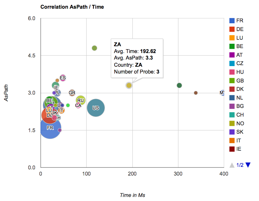
The first image (Figure 1) shows the correlation between the AS path and the round trip time (RTT) for each country. We grouped all probes located in one country and measured the average number of hops and the RTT (in ms) towards my anchor. If you hover over one of the dots, you will see some additional information.

You can, for instance, see that the number of hops and the RTT from probes in France are low, because they are in the same country as the anchor.
The two maps in Figure 2 basically show the same information, but this time presented on a map: the number of hops on the left and the RTT on the right. This allows us to easily detect latency from certain countries towards our network.

As mentioned above, you can specify a country and time period on top of the page. We use the Maxmind GeoLite database to map an AS to a country. See below the visualisation for ASes in France:

Again, you can see the number of hops and RTT from various ASes in France towards our network. We also present this as a graph that shows the RTT over a period of time, which will allow us to detect potential problems (see Figure 4).

Once a country is selected, you can look at the data for a specific AS in that country. See below an example for AS 3215. When you hover over the graph, you will get additional information.

You can further drill into the data by clicking on the IP address on the table at the bottom of the page. You will then get all the traceroutes from that probe to the RIPE Atlas anchor (see Figure 6).

Conclusion
With the simple data provided by the RIPE Atlas infrastructure, we now have a real monitoring system that gives useful information about our connectivity over time. I use this tool on a regular basis to analyse the quality of our connectivity and topology changes and to help debugging network issues.
The
tool is publicly available
. Please feel free to play with it and send me your feedback, ideas or bug reports or post a comment below. At the moment the code is not published, but if we see that people are interested we can clean it up and post it on github.
Comments 5
The comments section is closed for articles published more than a year ago. If you'd like to inform us of any issues, please contact us.
Daniel Karrenberg •
Congratulations on this nice work! And thank you for sharing it with the community. I am very happy to see another example of someone developing visualisations that work for them from RIPE Atlas data. Let us see more of these. And let us see more code being shared! Have you thought about scheduling your own measurments to fill any gaps in coverage of the default measurements? Or to schedule specific measurements to analyse problems or user complaints. It should be easy to have the viz pick those up based on userid or string in the description. Again, nice work! Daniel
Salim Gasmi •
Thanks Daniel for your message, we are proud you like this project. Yes, we are currently working on the next version which will include custom scheduled measurements as well as new visualisations. For example we are working (currently beta) on this kind of view: http://bgpmap.sdv.fr/index.php?dst=212.46.64.34&p=47408,174,8839 to see return AS path we got from the probe. Regards, Salim
Benjamin A •
Hello, I have trouble understanding the first graph. Are we talking about AS Path from the probes to your anchor ; or about the number of hops (i.e. routers) from probes to your anchor ? If we are in fact talking about AS Path, how does a probe get this information ? Cheers, Benjamin PS : I would be interested in the code too (even ugly code) ! :)
Salim Gasmi •
Hello Benjamin, We are talking about AS path length. The AS path length is calculated from the traceroute we get from the probe using a IP to AS database. Example here: http://ripeanchor.sdv.fr/detail.php?date=17/03/2015&src=212.46.64.34#05:32 where you can see a traceroute with 12 hops and a calculated AS path length of 5. We are currently working on code cleaning as too much things are currently hardcoded. When it will be available I'll let you know. Regards, Salim
Uriel Carrasquilla •
Hi Salin. I sent you an e-mail asking if you are sharing the code (GitHub/GitLab). I have some questions that might be easier to answer by looking at the code. More important, the option to be able to change the endpoint (your anchor), the probes (e.g. by ASN and by country), and cutoff RTT.