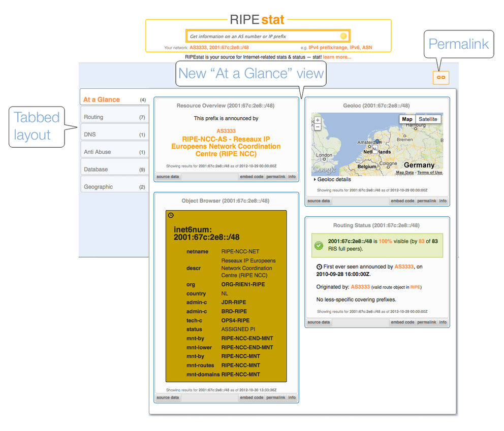
RIPEstat has a new layout as part of a series of user interface improvements we'll be making over the coming months. Users will now benefit from query results that are organised and presented more efficiently. Here we describe the new features and give an overview of the next round of upcoming improvements.
New Tabbed Layout
The previous RIPEstat layout presented all resource query results as one continuous page of widgets that were not sorted or organised in any particular way. With the new layout, users will see this potentially overwhelming amount of data presented in a more selective and organised manner, which makes it easier to find the specific data that interests them.
Query results are now displayed in a default "At a Glance" landing tab view, which includes smaller widgets displayed side-by-side and gives users a quick, concise summary of the resource including the following widgets: Resource Overview, Geolocation, Object Browser and Routing Status.
In addition, all RIPEstat widgets can be found under useful pre-defined categories, accessible in a tabbed format on the left side of the page. These categories represent some of the most sought-after types of data and include: Routing, DNS, Anti Abuse, Database and Geographic. Users can now see how many data widgets are available in each of these categories for any given query and can see all data relating to these pre-defined categories displayed together on one page by clicking each tab.
A permalink is also now available for each view.

Upcoming: "My Views"
The next round of improvements is currently being developed and will focus on widget controls and user-defined views.
Starting in November, users will also have access to a "Create New View" tab to define their own customised views based on categories they define themselves. Later, they will be able to manage their customised views by adding and removing widgets from them, re-arranging their customised view tabs, and renaming the tabs. These customised views will be remembered when users log in.
Future Plans: "My Clipboards"
Users will continue to benefit from future improvements to the next generation user interface. Some future plans include a more sophisticated interface that will include such additions as "My Clipboard" functionality. By dragging widgets onto the clipboard, users will be able to compare side by side query results for different IP prefixes at a fixed point in time, for example.
We will continue to announce new features as they become available and we encourage users to check back frequently for further improvements and stay on top of new functionality and other updates with our regular RIPEstat demos .


Comments 0
The comments section is closed for articles published more than a year ago. If you'd like to inform us of any issues, please contact us.