
In this article Marcel Flores and Stephen McQuistin describe how they used RIPE Atlas to understand the network behaviours their end-users are experiencing.
One of the biggest challenges of operating a global scale Content Delivery Network comes from understanding the network behaviours our end-users are experiencing. In order to help get a grasp on this, we’ve made use of RIPE Atlas, a measurement platform from the RIPE NCC. Here, we’ll talk a bit about the RIPE Atlas platform and how we use it to assess the behaviour of the networks between our server and end-users. While it’s not the only way we use RIPE Atlas here at Verizon Digital Media Services (VDMS), it represents an area where the platform has had significant impact.
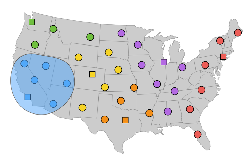
Catchments
First, we’ll discuss some of the background about how clients are directed to our Points of Presence (PoPs) and how we measure them. Specifically, we use anycast: many different physical locations (our PoPs) announce the same IP block. Individual routers in the Internet then make decisions about which destination to forward packets to using the Border Gateway Protocol (BGP). The idea is that these routers will each take the shortest path, which will result in end-user packets being deliverd to the nearest PoP.
We refer to the set of clients which go to any PoP as the catchment of that PoP. We can try and understand where each PoP is drawing clients from by analysing the end users that fall within its catchment. The size of these catchments can have direct impact on the performance of the CDN: a catchment that is too large may be straining the capacity of a particular PoP and may also be causing end users to travel too far to fetch content. Too narrow a catchment can result in underutilised resources.

Figure 1: An illustration of catchments in the US: squares are PoPs and circles are users. The colours indicate which PoP each user mapped to, i.e. the catchment of each PoP.
While logs from the CDN offer a passive view of where our customers are going in the network, they don’t allow us to explore what-if scenarios for our announcements. This means it’s hard for us to test and assess potentially new configurations with a data-informed methodology using just CDN logs.
RIPE Atlas
In order to bridge this visibility gap, we use the RIPE Atlas platform. For the unfamiliar, RIPE Atlas is a platform which makes use of probes which are deployed directly by end-users to edge networks. The probes consist of small measurement boxes which a host places in their home or business. These probes connect to a central controller which then allows users of the system to run experiments from the probes, including: pings, traceroutes, and DNS queries. RIPE Atlas further operates on a credit system: measurements consume credits, while credits are earned by hosting a probe or anchor, and for contributing to measurement results.
VDMS is a host of special large data-center focused probes known as RIPE Atlas anchors. VDMS is host to 12 anchors, which allow us to perform a number of large scale experiments. These anchors further provide the RIPE Atlas project with greater visibility of the Internet.
RIPE Atlas provides significant global coverage with its probes. While not in every network, they still allow use to get a general sense of how external users may be experiencing our platform.

Figure 2: A snapshot of the per-country probe coverage provided by RIPE Atlas. An up-to-date map with breakout details is available from the RIPE NCC.
Comparing Catchments
So, how do we actually employ RIPE Atlas to measure our catchments? And how will we actually determine if one configuration results in a better catchment than another?
Measurements
In order to actually measure the catchment of a configuration, we have each probe perform a traceroute to our anycast address. For each traceroute, we correlate the penultimate hop with our internal BGP session information. This allows us to see which router that probe’s traceroute traversed, and therefore which physical PoP the packet was delivered to. We further can use the round trip time (RTT) from the final hop to determine the latency between the probe and the PoP to which it connected.
Groups
So how will we actually use this information? The probes are distributed across many providers and networks, which may see widely variable performance, making direct comparisons complex. Therefore, instead of considering the performance of each individual probe, we divide the probes into groups. The idea is that each group should represent similar behaviour in reaching our network.
In order to construct the most meaningful groups we considered a handful of possibilities and compared a number of metrics. Specifically we examine: the size of the resulting groups (if the groups become too small, the data may become extremely noisy), the variation of RTT seen within each group (high variation indicates our groups are likely experiencing widely different behaviour in the network, and the Jaccard index of the paths (a high Jaccard index here indicates the probes traverse similar paths).
For our groupings we consider Grouping by:
- Autonomous System Number (ASN)
- AS and Geolocation (State in the US, Country elsewhere, Geolocation)
- The /24 prefix of the RIPE Atlas probe (Probe Prefix)
- The /24 prefix of the first hop away from the probe (First Hop BGP Prefix)
- The AS of the last hop before reaching the CDN (Last Hop ASN)
- The /24 of the last hop before reaching the CDN (Last Hop BGP Prefix)
Our preliminary results are below:

Figure 3: The group sizes observed for each technique. In general, most groups are small.
Here, we see a CDF of the group sizes. Here we see that in general, the groups are quite small, with the best case having nearly 70% of groups only a single probe, even when grouping by AS alone. This is inline with the expectation that while RIPE Atlas has wide AS coverage, it may consist of only a single probe in many cases. Not surprisingly, the Probe Prefix case shrinks the groups further.

Figure 4: A CDF of the difference between the 95th and 5th percentiles. Probe Prefix provided the closest spread of values.
This plot shows the difference between the 95th and 5th percentile of the RTT for each grouping. Here, curves closer to the upper-left hand corner represent the smallest variation. Not surprisingly, the Probe Prefix provides the most granular information.

Figure 5: Jaccard index within each grouping when considering large US networks. The Geolocation groupings provided the most similar paths.
Here we present the Jaccard similarity when considering a collection of large US networks. The larger networks have largely nationwide coverage but only a single (or small number of) AS. Here we see that Geolocation far outperforms the others, providing us with the most similar behaving probes, in terms of selected path.
While our evaluation of these groups are ongoing, in particular in regions outside the US, our preliminary results suggest that Geolocation data provides the best trade off between our three metrics, and we therefore use it as our grouping technique for the remainder of the analysis (It’s important to note the RIPE Atlas geolocation information is human entered, and therefore subject to different inaccuracies than other geolocation data sources.).
Experiments
The next step is to use the above traceroute data and groupings to determine the performance of a configuration. In order to do so, we will consider a simple experiment methodology. In particular, we will use 2 configurations: a control (CTRL) and an experiment (EXP). The basic idea is that the CTRL configuration will represent a known status quo and EXP a proposed new configuration. So for some configuration pair CTRL and EXP, we conduct the above measurement and grouping procedure. Then for each grouping gi, and the rtt measurements taken from each traceroute, we measure their change in RTT:

We further normalise these values into a score s using a logistic curve:

Finally, we weight each of these scores to try and capture the importance of the group it describes. In particular, there may be probes in networks that are not of particular importance to the CDN ( e.g. probes at a university are not very important compared to probes in a Cable ISP), we multiply the score by the fraction of traffic we see from the corresponding AS in a 24 hour period. While not included in the score, the above computation provides us further insight into the the gaps in Atlas’s view: we can see which networks matter to the CDN but aren’t covered by RIPE Atlas probes.
All of these weighted scores can then be summed over all of the groups to provide a total score for the EXP configuration as compared to the CTRL, with a score of 1 indication uniform improvement, and -1 indicating a uniform decrease in performance.
However, we can further examine the score of individual groups to get a more nuanced view of the impacts of the EXP configuration. Here we can examine which groups saw the greatest increases and decreases. Doing so can allow for more nuanced adjustments to the configuration to try and optimise performance.
Below we provide an example from an EXP configuration which included peering to a number of additional networks versus the CTRL. Here we show the groups that had biggest improvements, as well as the biggest decreases:
| Groups | # of Probes | RTT CTRL | RTT EXP | Score |
|---|---|---|---|---|
| A | 83 | 50.37 | 13.27 | 0.039 |
| B | 13 | 55.62 | 16.92 | 0.026 |
| C | 12 | 20.77 | 20.77 | -0.002 |
| D | 4 | 13.32 | 15.01 | -0.003 |
Here we see that group A showed significant improvement, as EXP provided new routes which allowed the clients from A to reach our servers more directly. Group D, however, shows moderate increase in RTT. Further investigation found that this was actually the result of a down BGP session which was preventing the packets from taking an even more direct route in the EXP configuration. Despite this, no other groups saw significant decreases, suggesting the EXP configuration is worth deploying to our produciton setup.
We can further visualise the changes between our two configurations by plotting them on a map. Here, each point on the map representes an individual probe. Each is coloured by the PoP to which its packets were sent. The map on the left is the CTRL configuration, and the map on the right is the EXP configuration:

Figure 8: Visualisation of the changes between our two configurations by plotting them on a map
The EXP configuration provides much richer connectivity, with the probes more frequently connecting to a more diverse set of nearby PoPs.
Conclusion
Our current explorations are working to improve our validation of our grouping procedures, ensuring that the techniques outlined here are effective outside of North America. We further hope to expand the entire system to using IPv6, a critical and growing part of the Internet. We also hope to validate the ability of the scoring methodology to detect potentially marginal differences between CTRL and EXP (for example, the difference of announcing to a single new provider, adding BGP communities, etc.). Finally, we plan to compare the visibility of networks important to the CDN with RIPE Atlas versus our production log data and other newly proposed techniques such as Verfploeter.
Through the use of RIPE Atlas, this methodology has the ability to greatly simplify and automate how we configure our network. It has enabled greater visibility into the behaviour of end-user networks, while creating the ability for making rapid data-driven decisions about our network configuration.
This article has originally been published on the the Verizon Digital Media blog.
Comments 0
The comments section is closed for articles published more than a year ago. If you'd like to inform us of any issues, please contact us.