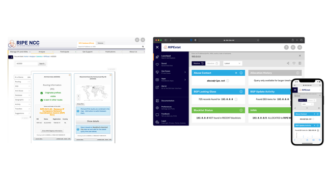
For several years, RIPEstat has been supporting two user interfaces - the original 2013 version and a redesigned version introduced in 2020. While each has its strengths, maintaining two separate interfaces has introduced inefficiencies for both our users and our development team. After thorough analysis and user feedback, we’ve decided to consolidate our efforts into a single interface. Building on the foundation of the original 2013 UI and enhancing it with modern design principles, this new version will bring together the best of both interfaces into one cohesive experience.
The 2020 UI revamp
Back in 2010, RIPEstat was built to provide a unified view of what was happening on the Internet. Through a User Interface (UI), widgets that could be used for visualisations, and a Data API, RIPEstat remains a core tool to diagnose technical issues and illustrate key Internet trends.
In 2020, we introduced a new prototype UI for RIPEstat. Built with modern frameworks and designed to be more responsive, mobile-friendly, and customisable, it aimed to address emerging user needs. We implemented features like universal search, a self-contained ‘app’ experience, and more options for sharing and interacting with data.
Initial reactions from the community were mixed. Some users praised the new look and feel of the app while others preferred the simplicity of the older interface. As we simultaneously launched a unified design across multiple RIPE NCC web applications, part of a great coordinated effort between a number of internal teams, we developed several iterations of the RIPEstat 2020 UI, however, this kept widening the gap between the old and the new.
This left us in a kind of limbo, now with two UIs, which confused users and required the additional effort of having to maintain two separate interfaces, each with its own codebase, bugs, and design philosophy.

Listening to our users
To better understand what needs to change, we went back to the drawing board and asked users what they valued in RIPEstat. We ran extensive user research, interviewed both external users and internal stakeholders, and analysed the findings of the RIPE NCC Survey 2023, to identify common themes and pain points.
In summary, RIPEstat users valued the stability, simplicity, and speed of the original 2013 UI. They didn’t want a flashy interface or complex customisation options. They wanted a data-rich visualisations platform that was easy to navigate, convenient, and reliable when it came to accessing critical data. And, crucially, the 2013 UI already did — albeit in a more outdated package.
After much deliberation and consultation with our development team and stakeholders, we made the decision to roll back to the 2013 UI and focus on improving it. This might seem counterintuitive in a world where ‘newer’ is often synonymous with ‘better’. But in this case, a full rewrite is much riskier, and an honest assessment of the platform’s strengths and weaknesses, as well as the data and user feedback we reviewed, all pointed to this being the right path forward.
What’s next for RIPEstat?
We have created a new internal team with product developers, UX designers and business analysts to go back to the fundamentals and scope out the future of RIPEstat. Aside from a technical standpoint, our plan is to create a long-term vision for the service and see how it will grow alongside our existing measurement and tools, including RIPE Atlas and RIS.
Initially, we will focus on reverting to the 2013 UI and adding the unique features that were available only in the 2020 UI. Afterwards, we will continue building on what we have, and on what we learned, and build something better that aligns with what our users need. Finally, we will sunset the 2020 UI as we continue developing the newer user interface.
We will share with you any updates as we progress and want to hear from you on what you would like us to improve on. Please share your ideas and suggestions on the RIPE NCC Forum.
We are also looking for participants who would like to conduct user research or beta testing so please reach out to Antonella De Bellis if you are interested in participating.


Comments 0
The comments section is closed for articles published more than a year ago. If you'd like to inform us of any issues, please contact us.