
We're pleased to announce a fresh new look for the RIPE NCC that better reflects who we are and what we do. Learn more about why we made the change and what the design process involved from the RIPE NCC's graphic designer, Miguel Bastos. We hope you'll like what you see!
Introduction
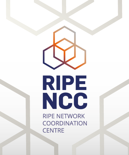
Today, we unveil a fresh new look, at the heart of which is the new RIPE NCC logo . The logo represents our key values: transparency , inclusiveness and engagement . It also depicts the key pillars of our work: the registry, services and coordination , at the intersection of which is the community .
![]()
Why are we changing our look?
There are some practical reasons for wanting to change things up. The old logo was also difficult to use: it contained a gradient and multiple layers, it was inflexible, and it didn't translate well into a single-colour version required for certain printing and engraving processes. From a design perspective, developing a new logo in vector format also means we can be much more efficient every time we need to adapt it for a new platform or use, instead of having to manually reconfigure it each time.
Much more importantly, however, the RIPE NCC has changed a lot since its humble beginnings in 1992, when it comprised a handful of people working to expand the Internet in Europe. Since that time, our membership, service portfolio and staff have increased tremendously. We've gone from being just a registry to offering a range of services and tools, from the RIPE Database to training courses to RIPE Atlas, and we decided it was time for our visual identity to reflect those changes.
Evolution of the RIPE NCC's logo over time
The RIPE NCC's logo hasn't actually changed much in its 20+ years. Throughout this time, it included some form of the yellow ball of IP addresses, which made sense when the RIPE NCC was first established and our main function was as a registry. Below you can see the evolution of the RIPE NCC logo over time.
![]()
The RIPE NCC's logo hadn't evolved much over time - until now
Although the registry remains at the heart of what we do, we've evolved into much more than this, and as we developed different services and offerings, we ended up with a lot of different logos and visual styles. This ultimately diluted and fragmented the RIPE NCC's visual style, and created confusion because one organisation had so many different styles and logos. Below are some examples of the different logos for specific services and tools we've come up with over the years.

In order to visually align all of these services, products and tools, we decided to start completely fresh with a totally new design that reflects all that we are and everything we do, while maintaining one cohesive look throughout. The new logo comprises four hexagons that reflect our core functions as a registry, the services we offer and the coordination role we play, with the community at the intersection. It also reflects our key values of transparency, engagement and inclusiveness.
The Design Process
Coming up with an entirely new visual identity for an organisation as diverse as the RIPE NCC wasn't a simple task. After an objective review and detailed analysis of all RIPE NCC materials used in our visual communications, we started the design process by identifying concepts that could represent our core work and values.
The goal was to create a logo for the RIPE NCC composed of different design elements - shapes, colours, typography - that work together to reflect those concepts. Bringing these elements together with the same concept meant we could create a strong visual language that is flexible enough to allow for a multitude of different design solutions while ensuring one, unified look for all of our digital and printed materials.
As an essential part of this design process, all the research done was based on the core business values of the RIPE NCC. In addition to focusing on Internet services and products, we explored different shapes, patterns and visualisations of networks, information maps and Internet traffic. We researched organic networks and the flow of information. For example, we looked at the shape and dynamics of spider webs and honeycombs as key representations of networks.


These examples contributed to the inspiration for us in developing and experimenting with different geometric shapes and defining a narrative path forward, and ultimately led us to the hexagon as the core shape upon which to build the logo. The hexagon is a powerful shape that offers flexibility, creativity and efficiency in terms of how it can intersect with other hexagonal shapes to create different patterns, connections and networks. This gives us a lot of creative freedom and room for growth in coming up with new visual systems to communicate better.

After all of this research and the exhaustive design process, we decided on the icon of four intersecting hexagons as the the best way to represent everything that the RIPE NCC encompasses today, both in terms of the work we do and the values at the heart of that work.
Our New Look
The four hexagons reflect our function as a registry , the services we offer and our coordination role, with the community at the intersection. Also reflected are our core values of transparency , engagement and inclusiveness .

In addition to the main RIPE NCC logo, all of our various services, tools and departments also have new logos that are a subtle variation of the main logo. The graphic element remains the same throughout, with just the sub-header text changing. We consciously decided to do this in order to maintain visual consistency and unity. Even though we have different functions and offer many different services, we're one organisation that is unified in everything we do - and we wanted to make that clear with our visual style across all platforms and media.

We hope that you like our new look. We're pretty excited about it and think it will continue to provide us with a strong visual identity that continues to reflect who we are what we do well into the future.
The new logo, along with a new RIPE NCC Member logo, is available for download in different formats.
Comments 12
The comments section is closed for articles published more than a year ago. If you'd like to inform us of any issues, please contact us.
José Manuel Giner •
I don't see a new RIPE member logo, will be available?
Amanda Gowland •
It's available for download here: https://www.ripe.net/participate/member-support/info/billing/ripe-ncc-billing-information Thanks, Amanda
Antonio Prado •
Cool, it reminds me of Triquetra, an ancient celtic image. thank you -- antonio
Michael Findlay •
Looking much more modern! :-)
MikeH •
Keeping the aspect ratio the same would have been nice.
Dmitry Kohmanyuk •
I see not three, but four hexagons - of which three interest only at a central dot; and halves of three larger ones, which intersect in three points but then there is no central dot. Either way, three isn't what it is.
Amanda Gowland •
You're right, it should have said four. We've fixed the typo.
Dmitry Kohmanyuk •
I see not three, but four complete hexagons - of which three intersect only at a central dot; alternatively, there are halves of three larger ones, which intersect in three points but then there is no central dot. Either way, three isn't what it is. Perhaps it is intentional. And complaints about gradient in old logo seem strange as there is one in this one as well.
Amanda Gowland •
Thanks for your feedback. The gradient with the new logo is designed differently and because the logo is flat, it means it can be made one-colour easily.
aaron •
In the new logo you miss one very relevant aspect: that the 'net (and RIPE NCC is a huge part of it) is *global*. Hence a globe. I believe the new logo turns the Internet into a honeycomb. Which it is not. It is a global thing. Did you consider this?
Amanda Gowland •
Thanks for your feedback Aaron.
Jani •
Congratulations for the new look. The new logo looks really good.