
Please enjoy this guest post by Agustín Formoso, Software Developer at LACNIC: Regional connectivity is not an easy metric to measure. To do it properly you need measurements generated by multiple vantage points, located in as many places as possible (both geographically and logically). Besides, connectivity is not something strictly defined, as it has no standard definition (as opposed to many metrics we use in today’s Internet).
RIPE Atlas is a great option in regions with a considerable number of probes. But what do we do when that is not the case or if RIPE Atlas is not enough?
For measuring connectivity in the Latin America and the Caribbean (LAC) region, we first had to define what connectivity really means to us and then find a way to perform distributed large-scale measurements. To accomplish this, we used a worldwide platform, composed of thousands of virtual probes (which are easily deployable), called Speedchecker . Based on the measurements collected, we analysed a network graph and grouped the data into country clusters.
This post describes the method we followed to get our results and provides a perspective of what connectivity is for us and in which state it is in the LAC region.
The study
The data
By performing around 200 daily ICMP pings over 12 months, we built a latency dataset that covered 21 countries in the LAC region. Out of this dataset, we built a network graph that represented the latency relations between the countries. The geolocation information regarding each measurement is taken from the Mozilla Geolocation API and the Maxmind Lite database.
Each measurement has its own minimum, maximum, average, and median RTT values. Measurements are built by about 10 samples each, distanced sequentially about one second apart between them (in a traditional ping fashion).
Building the network graph
By grouping all the results by country, we built a graph showing countries as nodes and measurements as edges.

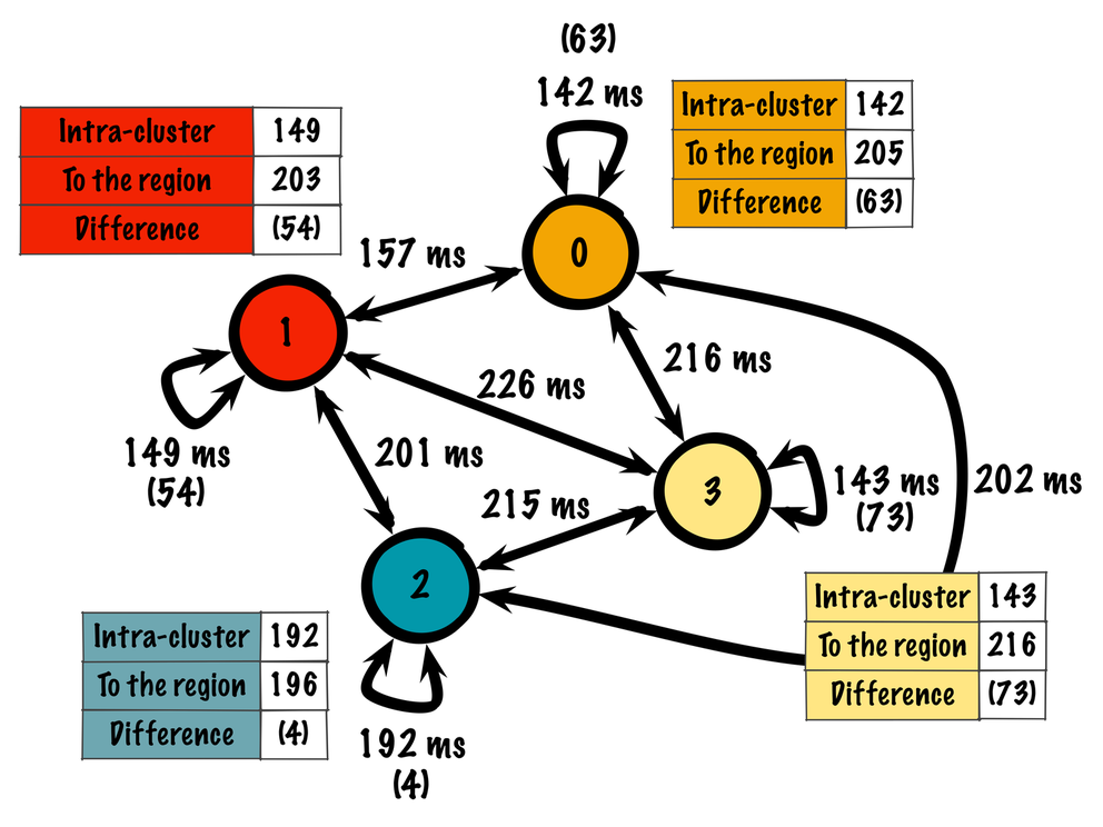
Figure 1: Network graph representing the latency relations between 21 LAC countries
The figure above describes the following:
- Cluster 0: Belize, Colombia, Costa Rica, Cuba, Ecuador, Honduras, República Dominicana, Suriname, Trinidad and Tobago
- Cluster 1: Mexico, El Salvador, Guatemala, Panama, Venezuela
- Cluster 2: Bolivia, Chile, Peru
- Cluster 3: Argentina, Brazil, Paraguay, Uruguay
The links connecting different nodes depict the average minimum measurement taken for that subset of measurements. That means that from the k samples taken between two nodes, we filter the minimum value for each sample and we take the grand average over that population. As a result, the graph is based on the best latency measurements that could be achieved during the time the experiment was conducted.
By looking at the same clusters on a map, we can easily see a strong geographical component.

Figure 2: The four clusters shown on a map
Conclusions
Connectivity
The first new insight about connectivity was getting a new definition or at least a more formal approach to the term. Based on our cluster analysis, we could define connectivity based on three metrics:
- The number of clusters found by the communities clustering algorithm
- The intra-cluster latency
- The inter-cluster latency
We could start building metrics based on these numbers, but having those three metrics already gives a clear view of how close countries and clusters are between them. In the case of the LAC region, we found four clusters. Building new metrics is definitely useful in the cases of having a greater number of clusters (and therefore an even greater number of edges).
In the case of the LAC region, we can see that:
- Cluster 2 (Chile, Peru, and Bolivia) has weak intra-cluster connectivity, almost the same as its average inter-cluster connectivity. That means that latency between these countries is not clearly better than to other countries; in this case operators from those countries could start thinking about getting better intra-cluster connectivity, or choose to join another cluster. At a glance, we can say that cluster 2 has the weakest connectivity of all.
- Additionally, by looking at cluster 3, we can see that it has good intra-cluster latency values, but high inter-cluster ones. This means that the countries belonging to this cluster (Argentina, Brazil, Paraguay, and Uruguay) have good connectivity between them, but still need to get the cluster closer to the region (cluster 3 is at ~215 ms from the rest of the clusters).
- Finally, clusters 0 and 1 don’t have a clear boundary between them, as their inter-cluster and the edge 0 <–> 1 have very similar values. Looking at the map we see that geographically they are very close and with the geographic boundaries not as well defined as the rest of the cases. That means clusters in Central America and the Caribbean have good ICMP connectivity!
By looking at the graph’s edge values you could draw similar conclusions.
Dis-connectivity
We thought about a way to detect bad connectivity links, as our connectivity graph in Figure 1 only clusters based on good connectivity relationships. In this graph, the edges (relations) represent RTT values. We created a a new graph with the edges showing 1/RTT values. That way, by feeding the same clustering algorithm with the new graph we found relationships between countries that are poorly connected. Some interesting cases were found, including a couple of neighbouring countries that show poor connectivity between them:
- Argentina and Chile
- Colombia and Venezuela
- Brazil and Peru
Still, despite being neighbours, the pairs of countries mentioned above don’t share the coast between them. The connectivity between these pairs of countries is most likely following well-known “coast” cables that connect countries belonging to the same coast. That means part of its traffic is being routed to somewhere far away and that direct connections are not present or are not being used.
Some final questions
This study leaves us with some open questions regarding connectivity:
- Is there one index that could summarise country-level connectivity health, based on our measurements?
- Do you see any physical connections that are not being fully used?
- Are there any links that are escaping our measurements platform?
- Are software probes worth using (I think they are, especially in regions that are under-represented on platforms such as RIPE Atlas or M-Lab )?
Please comment!
The original post appeared on LACNIC Labs and on the APNIC blog .


Comments 2
The comments section is closed for articles published more than a year ago. If you'd like to inform us of any issues, please contact us.
Randy Bush •
cool study, but ... why maxmind and google geo-loc as opposed to op-declared probe geo-loc? clustering based on latency, as opposed to say traceroute, would seem to overly weigh geographic proximity. i.e. if A and B have one 10ms link, yet A and C have 25 20ms links, which is clustered?
Agustín Formoso •
Randy, hello. Thanks for your comments. As this is not an ops-based platform like RIPE Atlas, but rather a client-based one (remember it's a software based platform), the best means we found to get geoloc is by those kind of services. The clustering algorithm is based on community search, the kind of algorithm that you would use when operating over a social network graph for finding sub-groups of people. It works on relative values, so the cluster boundaries depend on the dataset you're working on. I think latency is a good means of detecting if you're far away from a geographically close place (neighbouring countries? in-country measurements?). But your comment is useful, and it is indeed our next step, network operators might want to see what comes out of applying traceroute clustering.