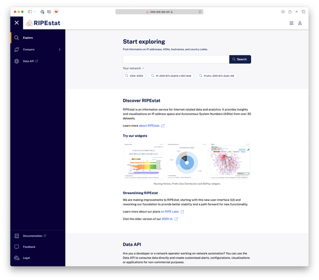
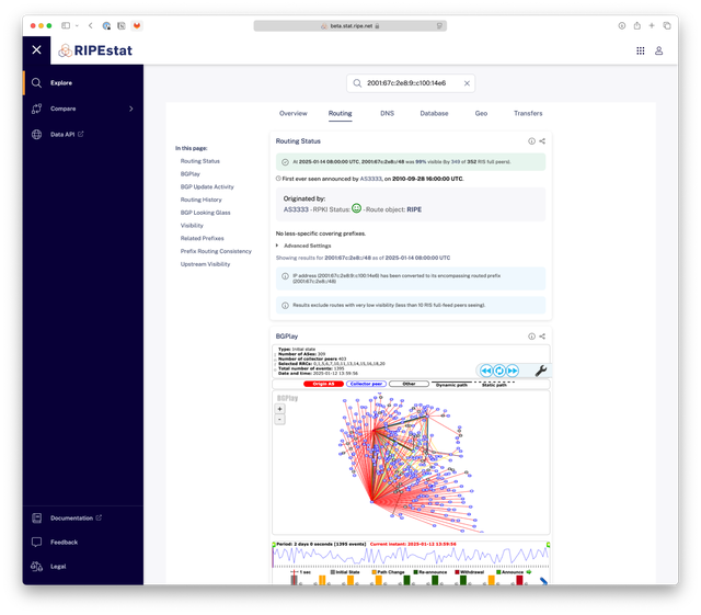
The RIPE NCC launched a new version of the RIPEstat UI, that has replaced the previous version. In this article, the team highlights some of the changes made and shares a first look at the new design.
In October 2024, with visitors to RIPEstat having had access to two distinct user interfaces since 2020, we decided it was time to streamline things and start the process of moving back to a single, consolidated RIPEstat UI.
The goal was to come up with something that would stay true to the foundations of the original interface from 2013 - for which many users voiced a preference in testing and feedback - but also to introduce some much needed changes that would, among other things, bring it in line with the modern theme now familiar across other RIPE NCC applications.
After working toward this goal for some months, we're pleased to present a first look at the new RIPEstat:
https://stat.ripe.net
This became the default interface for RIPEstat on 26 February 2025 [update 26/02/2025: we have launched the new UI as planned!]. Until then, to get a head start on collecting feedback for the new UI We invite you to take a look at the beta version above and share any feedback you might have so we can keep learning and incorporating your input into the design.
So what’s new with the new RIPEstat UI?
At first glance, the new UI brings back the classic style of RIPEstat with design elements consistent to those you'll find across other RIPE NCC applications. The most noticeable changes are in the visual theme and navigation menu.

Upon closer inspection, the index page has been revamped and updated with fresh content to get users started with useful RIPEstat features. Multiple small applications already present in UI 2013 were moved to the menu and made more visible. For example resource comparison, where you can see one widget for multiple resources, or IPv4 Prefix Size Distribution, which shows how the /8 prefixes are sliced up into allocations and assignments. Other parts were removed - for example, the 'notable network events' - as such events can be covered in more depth on RIPE Labs.
Deeper in the application, the navigation structure for widget pages has been updated. The tabs are now fixed at the top, remaining visible as you scroll. This provides a simpler view of each category and easier navigation across the different features within RIPEstat.

What happens next?
After the launch of the new UI, the 2020 version (aka. the RIPEstat app) will initially remain available, but will no longer be supported and will be sunsetted six months after the release of the new UI and we have scheduled its removal for 2 February 2026 [update 01/2026: added removal date].
Moving forward, if you find there are things you cannot do in the new UI, or things that are harder to do, please let us know. We'll be tracking adoption carefully and listening for feedback, so please share your ideas via the RIPE NCC Forum and let us know your suggestions for future improvements.
We are also looking for participants for user research or beta testing of RIPEstat and other RIPE NCC services. If you're interested please take a look at our information about user research and how to sign up.


Comments 6
The comments section is closed for articles published more than a year ago. If you'd like to inform us of any issues, please contact us.
Stéphane Bortzmeyer •
It currently times out (TCP connection is established, so it is not a layer-3 issue, but then no answer to the GET request).
Ties de Kock •
@Stéphane: Thanks for you report! We underestimated the load the system would have. This should be resolved by now. We will track this on https://status.ripe.net/incidents/2jyvq1h34bgv
Tuan Nguyen •
UI 2013 is forever in our hearts! My one true stat.ripe
charles •
Always a good idea to fix something that is not broken
Charles •
Hello - What happened to being able to look up an organization's IP using the RIPE Org-ID???? This new system does not allow for that. I have to plug in the IP address. Before, the old stat.ripe.net would allow you to look up the IPs using an Org-ID and then filter using attributes to see all IPs under a particular Org-ID. How can we access that information?! Is it gone? Also, the Ripe Launchpad provides a lot of useful info in one place such as Abuse Contact, Allocation History, BGP Update Activity, IANA, Maxmind Geo Map, Prefix Status, RIPE Reverse DNS Delegation, RIPE Atlas Probes, RIPE Atlas Targets, RIR Registration, RIR Stats Country, RIS Visibility, RIS Looking Glass, Routing History, RPKI Origin Violation, Transfers, RIS Related Prefixs, RPKI History, and WHOIS. What happened to all that information and can we still access it???
Ties de Kock •
We described in this, and our earlier updates, that we can not maintain two user interfaces. We understand that we can not make everyone happy. However, we had to take a path forward and decided to move forward from the UI that worked better for users in our research. About searching by ORG-ID: That is an interesting feature. RIPEstat did/does not support searching by ORG-ID. This type of search query is supported and works very well in the RIPE database at https://apps.db.ripe.net/ however.