
VisualK is a new tool that allows to visualise the evolution of the service provided by the K-root name server. It can be used to monitor the status of K-root in near real-time.
Introduction
K-root is one of the 13 Internet root name servers. It is operated by the RIPE NCC since 1997. The service is provided by a set of distributed nodes (called root name server instances) using anycast which means a single IPv4 or IPv6 address is announced simultaneously by a set of nodes deployed in different geographical locations. K-root operates 18 anycast nodes. You can see a map of all anycast nodes on the RIPE NCC’s website.
Root name servers are core services of the Internet: as such they receive a huge amount of queries per second and are supposed to answer reliably with acceptable delay. K-root makes no exception, with an average between 10k and 15k queries per second. In the image below, you can see the typical distribution of queries per second on all instances of K-root.

VisualK was conceived as a tool to efficiently monitor the performance of K-root, showing the traffic load supported by each instance and the traffic migration between pairs of instances over time. It aims at distinguishing usual patterns from unusual patterns, helping operators to timely address specific issues and have a clearer idea of the behavior of the system as a whole.
Overview
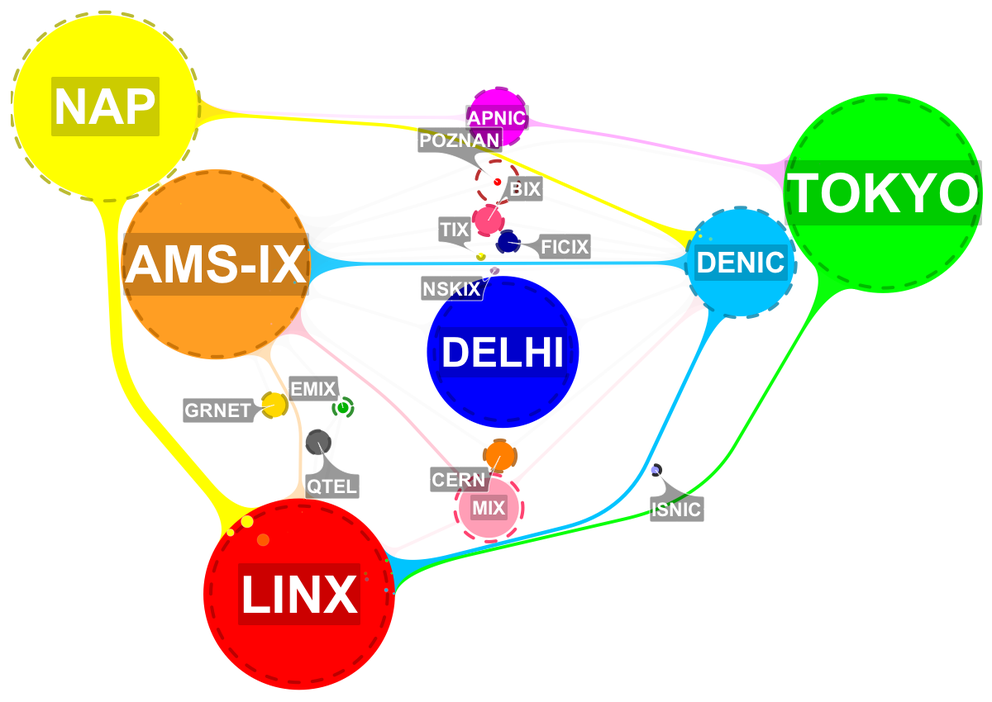
The system in action looks as follows. Each instance of K-root is represented by two concentric circles:
- The first one, filled with colour, has a size proportional to the number of queries per second received on that instance;
- The other one, surrounded by a dotted line, shows the average load over the previous 30 minutes as a reference value.
In the screenshot below you can see that in most cases, these circles overlap. But in some cases the dotted line is much larger, for example at the root name server instance in Poznan, Poland. This means that something has changed recently: the number of queries has dropped significantly.

Figure 2: VisualK standard interface
In the image you can also see that pairs of instances are connected by links (or "tentacles") if they are considered topologically adjacent. The corresponding graph (circles as nodes, links as edges) is what we call migration graph . Links are generally grey and semi-transparent, but become active when a traffic migration is detected between the corresponding instances: color and size show origin and volume of traffic flow, together with bubbles pouring into the instance receiving the traffic. In our example you can see that a lot of traffic has moved from the instance at NAP (in Miami, Florida) to the one located at LINX (in London, UK).
In addition, VisualK highlights unusual behavior with visual effects. Flashing arrows show traffic migrations between instances that are not adjacent, while instances blink if their traffic load decreases significantly. In Figure 3 below, you can see that a lot of traffic moves from the instance in Poznan to the one located at LINX even though they are not close to each other.The goal is to help spotting unexpected changes while they are happening and to allow root name server operators to investigate what causes these changes.

Figure 3: VisualK interface showing unexpected events
Technology
VisualK is built on top of the new Hadoop cluster introduced at the RIPE NCC for storage and large computations. Query logs from all instances are timely stored on the cluster, while VisualK periodically retrieves aggregate data and computes an updated layout. The client application, entirely based on JavaScript, receives the layout and takes care of the animation on screen.
The data layer inevitably plays a crucial role, given the high volume of queries received by K-root. Query logs are sent from the instances as gzipped PCAP files and stored on the cluster, then directly processed with MapReduce jobs thanks to the Hadoop PCAP library open sourced by the RIPE NCC last year . The default time period between two layout updates is five minutes: to give an idea, that roughly translates to four millions individual queries that are processed on the cluster for each iteration. In terms of data volume, five minutes of compressed PCAP files from all instances of K-root generally sum up to about 300MB, which become 600MB or even 1GB when uncompressed. The response time depends on the load of the cluster, but usually lies in the range of seconds.
As a final remark, please note that the visualised data is not actually real time, because query logs need to reach the cluster before being processed. Hence a safe delay interval is applied to wait for all instances to send their data. The current delay is set to one hour, with an upper bound imposed by distant nodes (like those in Tokyo or Delhi). During the following months this bottleneck will be improved, allowing for an even more up-to-date visualisation.
Credits
VisualK was realised in collaboration with the Compunet Lab at Roma Tre University. It is based on research work published in the proceedings of the 19th International Symposium on Graph Drawing with the title How to Visualize the K-root Name Server .
VisualK is currently a beta prototype. It has been tested on major Web browsers. For questions, suggestions and bug reports you can leave a comment here or use the contact info available on the VisualK page.


Comments 2
The comments section is closed for articles published more than a year ago. If you'd like to inform us of any issues, please contact us.
Jay Daley •
Excellent work. This is very much at the cutting edge of big data for registries. Can you explain more about the processing on the Hadoop cluster: Are you using Pig or Hive or something else? Have you got map/reduce jobs that extract DNS data from PCAP files that you could share? and more ...
Claudio Squarcella •
Hi Jay, thank you for the feedback! We use simple MapReduce jobs to process data. The server is written in Java. Once the time interval of interest is defined we select the PCAP files within that interval with a class extending PathFilter. Then we group the input data by source host (map) and for each host we compute the total number of queries and the instance answering its last query (reduce). We tried with Hive for a while, but that implies adding more structure (e.g. partitions) to the underlying data to obtain comparable performance (otherwise it simply scans the whole dataset). Also, you can notice how the above MapReduce algorithm is a bit tricky to write in plain SQL. Hoping that helps, Claudio