Humans are pretty good at finding patterns in network measurements, but it can be difficult to automate this so one can process many time series at the same time. Now we have an expert in the house who can help us with this.
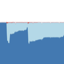
We generate a lot of interesting latency data with RIPE Atlas that people use for network monitoring. Humans are pretty good at finding patterns in this latency data (try it for yourself in Figure 1), but what I've been struggling with is how to automate this, which would allow for many time series at the same time, finding patterns, similarities etc.

Figure 1: An example of a RIPE Atlas latency time series
At the TMA conference in 2017, I gave a tutorial on how network researchers can use RIPE Atlas. After this tutorial, I met Sandrine Vaton, a professor in statistics, to whom I complained about how devilishly difficult it is to apply statistics to data produced by RIPE Atlas, and how great it would be if we could look more into this.
Fast forward to RIPE 76 where Sandrine's student Maxime Mouchet was a RIPE Fellow, specifically so he could get feedback on methods he developed applying statistics on RIPE Atlas latency data. And at RIPE 77, Maxime was part of the RIPE Academic Cooperation Initiative (RACI) programme and gave a talk on the methodology they had developed so far.
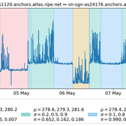
In short, the method uses statistical techniques that will automatically find a number of network states from an input time series of RTT data, for instance RIPE Atlas ping measurements. Why this is really cool is probably best explained when you compare Figure 1 to Figure 2. One is the raw input signal, the other one has the different network states shown in different colours. As you can see, the colouring pretty much matches what a human brain would consider the different states that the RTT time series is in.

Figure 2: A RIPE Atlas latency time series, with colours representing different states
In February, Maxime will work with us to create an API that will convert an RTT time series. He will turn what is generated by RIPE Atlas ping measurements into a "summary view". That way, we can see the different states the network between two end points was in, as well as interesting information about these states (statistical parameters) and when they happened exactly.
If you are interested in this (maybe you want to be an early API tester?) and/or want to contribute ideas, please let us know in the comment section below, or send us an email at labs@ripe.net.
Maxime will explain the nitty gritty of the methods he's been using to do this in an upcoming article.
Watch this space!


Comments 1
The comments section is closed for articles published more than a year ago. If you'd like to inform us of any issues, please contact us.
Gert Doering •
cool stuff! (And I fully share the sentiment "all the data is there, but how to make sense out of it?" :-) )