
This article presents a set of open-source tools - “reusable visualisations” - that extend the AS hegemony visualisations provided by the Internet Health Report. Users can directly use the online tools or embed the IHR data on their own posts, webpages, or Observable HQ notebooks.
AS hegemony and the Internet Health Report
What is AS hegemony?
Networks connected to the Internet rely on other networks - a.k.a, Autonomous Systems, or ASes - to transmit data. Consequently, the connectivity of a network depends on the connectivity of other networks. AS Hegemony is a metric to evaluate these interdependencies based on BGP data collected from public large-scale measurement platforms (RIPE RIS and Route Views).
For example, the dependencies of AS2497 (IIJ Internet Initiative Japan Inc., JP) and the networks dependent on AS2497 for 3 February 2023 can be seen in the following figure.

Internet Health Report (IHR)
The AS hegemony results (as well as more analyses, tools and visualisations) are made publicly available by the Internet Health Report (IHR), a project led by Internet Initiative Japan (IIJ) Research Laboratory. IHR aims to monitor the conditions of networks that compose the Internet and provide network operators, policymakers, and other stakeholders with a better understanding of the Internet's infrastructure and its evolution.
“Plug and Plot with Internet data”
The “Plug and Plot with Internet data” project was a part of Google Summer of Code (GSoC) 2022, whose goal was to develop reusable visualisations for Internet open datasets.
The “reusable visualisations” developed by the project are open-source tools (or, blocks of code) implemented on the Observable HQ platform, as a series of public notebooks. You can see the full collection of reusable visualisations here.
Specifically, the notebooks contain reusable code blocks for visualisations related to the AS-hegemony data. The code blocks retrieve data from the AS-hegemony API and generate visualisations that extend the visualisation of the IHR website.
The goal of this project is to give users an easy way to interact with and embed IHR data on their own tools.
The users can:
- Directly use the notebooks to visualise the queried data with their own customised parameters, and/or;
- Copy the code and use it in their own page/notebook (and you could also then embed the visualisations as iframes)
Below, you can find all the visualisations, which are also provided - for your convenience - in separate notebooks.
List of reusable visualisations for AS-hegemony
An overview of all notebooks is available here. In this section, we describe each of the reusable visualisations in turn.
Important notice: Some visualisations execute a lot of API calls. Changing the input parameters (e.g., AS or time range) may need some time to update the visualisations.
AS Dependencies (Timeseries) Link to component
This visualisation shows all the ASes that the given network depends on - i.e., upstream networks - and the AS hegemony value for each dependency, during the given time range. It is the same visualisation that can be found in the IHR website - e.g., see Figure 1 - and is used as a basic building block of other visualisations.
AS Dependencies Grouped By Country (Timeseries) Link to component
This is a visualisation similar to the AS dependencies, but instead of presenting the dependencies per AS, it presents the dependencies per country. The dependency values for each country are calculated as the sum of the AS hegemony values of the AS dependencies for the ASes in this country. An example is shown in Figure 2.

Number of Dependent Networks (Timeseries) Link to component
It shows the number of networks/ASes that depend on a given network (i.e. downstream networks), during a given time range. This visualisation can be used, for example, for detecting significant routing changes that affect many networks. An example is shown in Figure 3, specifically it depicts the drop in dependent networks TELECOM ITALIA had due to a recent outage between 2023-02-05 and 2023-02-07.

Dependent Networks Grouped By Country (Timeseries) Link to component
This is a visualisation similar to the number of dependent networks, but instead of presenting the total number of networks (i.e., one line), it presents the number of networks per country (i.e., one or more lines). An example is shown in Figure 4.

Dependent Networks Grouped By Type (Timeseries) Link to component
This is similar visualisation to the number of networks/ASes that depend on the given network, but instead of presenting the total number of networks (i.e., one line), it presents the number of networks per type (i.e., one or more lines). A type can be any attribute selected by the user (needs to provide the relevant data). We provide as examples two attributes: continent and network type (retrieved by CAIDA’s AS rank and PeeringDB datasets). An example is shown in Figure 5.

AS Dependencies Difference (Table) Link to component
This notebook implements a table that shows the difference in the AS hegemony values of networks that depend on the given network, between the given start and end dates. An example is shown in Figure 6. It can be used for easily finding significant changes between two time points.


AS Dependencies Difference (Bar) Link to component
This presents in a visualisation (bar plot) the same data as in the table described above. An example is shown in Figure 7.

AS Dependencies for Large Time Windows [with sampling] (Timeseries) Link to component
This visualisation shows all the networks/ASes that the given network depends on (i.e., its “dependencies”) and the AS hegemony value for each dependency, i.e., the same quantity provided in the IHR website. However, because the IHR website cannot accept time ranges larger than 7 days (max. limit of the AS-hegemony API), this visualization implements an iterative call to the API and a sampling method. Specifically, the given time range is split to equal intervals (according to the given number of “chunks”), and the AS hegemony values are requested at the end data of each interval. For example, if the user gives a time period of 100 days and 5 chunks, then the samples will be at day 1, day 20, day 40, …, day 100. An example is shown in Figure 8, for a time period of two months.

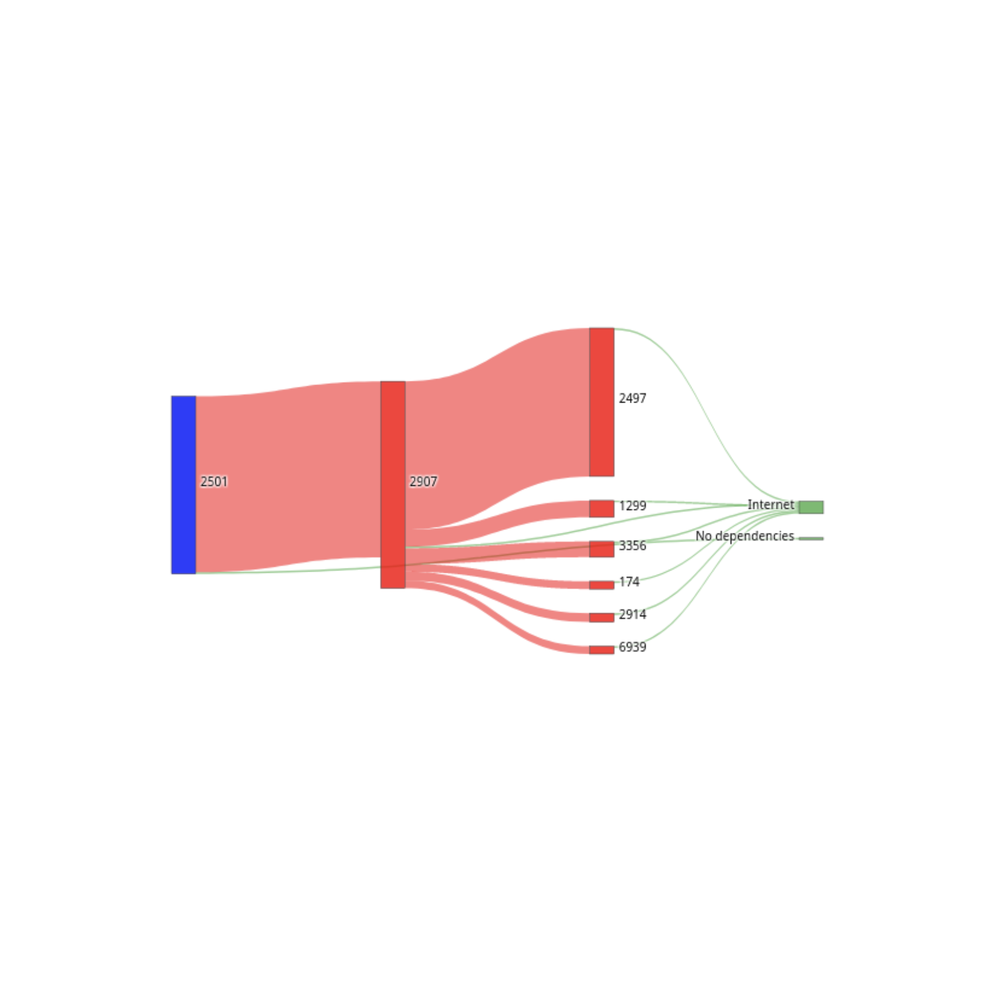
Two Hop AS Dependencies (Sankey Plot) Link to component
This visualisation shows in a sankey plot the direct and indirect dependencies of the given network.
An AS may depend directly (i.e., direct neighbours - one hop in AS paths) or indirectly (i.e., more than one AS hops) from other ASes. However, the AS hegemony API returns the list of dependencies, without indicating which of them are direct or indirect. In this component, we infer which of these dependencies are direct dependencies, by retrieving the list of neighbours from the RIPEstat API.
An example is shown in Figure 9.
In the sankey plot:
- the given AS appears at the left of the plot (layer 0)
- the 1st layer at the right of the AS shows the direct dependencies of the AS (i.e., the dependencies that are also direct neighbours)
- the 2nd layer shows the indirect dependencies of the AS, as well as through which ASes of the 1st layer these dependencies exist
- the values on the edges denote the AS hegemony score: (i) values of edges between layers 0 and 1, indicate the AS hegemony score for the given AS, (ii) values of edges between layers 1 and 2 are all set equal to a default value.

Country Hegemony Graph (Graph Plot) Link to component
This visualisation shows a graph with all the networks that are dependencies of the given country for the given date (find more information at the IHR website).
An example is shown in Figure 10.
- the nodes of the graph are networks, and are coloured based on the country they reside (since a country has dependencies from networks of other countries)
- the size of the nodes indicate the value of their hegemony for the given country; a country depends more of larger nodes
- edges correspond to dependencies between the corresponding nodes, as they are retrieved from the AS hegemony API

For clearer visualisations, an option is provided to hide nodes with AS hegemony values less than the selected threshold.
How to use the reusable visualisations
Detailed instructions on using the reusable visualisations are provided in the overview notebook.
The “easy way” - use the Observable HQ notebooks: Users can visit any notebook, and use them directly in their Web browser. They can select their desired parameters (e.g., time range, network of interest), and a visualisation of the results will appear.
The “observable way” - create new Observable HQ notebooks: Users can import the code into new observable notebooks, and create new notebooks, e.g., by combining more than one visualisations, parametrising the parameters (time ranges, networks or countries of interest, etc.) or even the data and writing their own text. Specifically, the Observable HQ platform uses popular visualisation libraries. The building blocks are open-source, and published as templates in the Observable HQ platform. Any user would be able to fork/copy a template and plug their own data, and/or modify it according to their needs.
The “iframe way” - embed visualisations in web pages as iframes: users can export the visualisations of the existing or new observable notebooks as iframes. This can be done by selecting the ”export” -> “embed” option that is available for each notebook. This will generate an iframe that can be pasted in any website.
The “developer way” - reuse code: Since the code is in D3.js and Plotly.js (javascript), the building blocks can be re-usable by any javascript component, not only in Observable HQ. Hence, users can copy the code and use them in their own web applications. This can be done by selecting the ”export” -> “download code” option that is available for each notebook and then the observable runtime must be used on the developers website to run the code.
Credits
The code has been developed as a part of a Google Summer of Code 2022 project [link1, link2], for the IHR (Internet Health Report) project.
The main developer is Tasos Meletlidis, research assistant at the Data and Web Science Lab (Datalab) of the Aristotle University of Thessaloniki (AUTh).
His work was under the supervision of:
- Romain Fontugne, IIJ Research Lab
- Emile Aben, RIPE NCC
- Pavlos Sermpezis, Datalab, AUTh
Comments 0
The comments section is closed for articles published more than a year ago. If you'd like to inform us of any issues, please contact us.