
We’ve been looking at how members navigate between RIPE NCC services and where friction appears. This article shares the research and reasoning behind a new unified navigation model launching in March 2026.
Navigation shapes how users experience clarity and control across services, and from time to time it needs revisiting to make sure that it still supports consistency and discoverability. A few years ago, we adopted a navigation system to create greater consistency across RIPE NCC services, and that work laid important groundwork. However, as we continued to observe how members interact with our services, it became clear that the experience could be smoother. Over the past year, we’ve explored these improvements through research and iteration.
In this article, we outline the issues we identified, the insights that informed our approach, and the principles behind the unified navigation model that will be rolled out starting 16 March 2026.
The existing navigation
Before we get into what’s changed, let’s begin by looking at the existing navigation and some of the features that prompted further exploration.

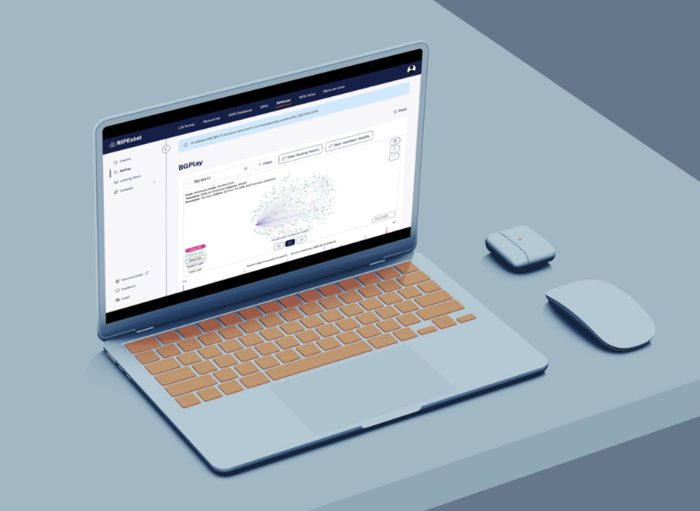
One main issue has to do with the way users actually discover services. Right now, navigation distributes services between the left-hand sidebar and the app switcher. This can feel fragmented, and in practice (see more on user testing below), we saw that several users accessed RIPEstat and RIPE Atlas via search engines rather than navigating internally, temporarily leaving the RIPE NCC environment to find what they needed. This indicates limited cross-service discoverability and an opportunity to create a more cohesive experience.
Another recurring issue concerned the "Resources" tab on the sidebar. Although listed under the LIR Portal, selecting it switched the visual context to the RIPE Database. The structure reflected internal system boundaries more than users' mental models, and often left users unsure where resource management "belonged".
Finally, as submenu items have been added over time, the sidebar has grown longer and denser, increasing scanning effort and cognitive load. The current approach simply isn't scalable. And accessibility considerations, including contrast levels and brand inconsistencies, reinforced the need for a structural revision rather than incremental refinements.
From exploration to a unified navigation model

The first instinct was not to replace the model, but to improve it. Early iterations focused on refining the existing sidebar, reorganising sections, clarifying hierarchy, and simplifying nested structures. This was the least disruptive path, aiming to preserve user familiarity while addressing visible friction points.
However, despite visual and structural adjustments, underlying issues persisted. Discoverability remained limited, contextual shifts continued to create ambiguity, and scalability concerns were unresolved.
At that point, the question shifted from "How can we improve the sidebar?" to "Is this the right structural model at all?". Stepping back from an established navigation pattern is not a trivial decision. It affects multiple services and interaction flows. Several structural alternatives were explored and evaluated before committing to a unified top-level model that better reflected how users move across services. Only after validating these directions did the unified navigation emerge as the most coherent and scalable solution.

The redesigned structure introduces a high-level navigation bar that serves as a consistent entry point to both our core and secondary services. Regardless of which service you're using, you'll see the same navigation elements in the same places. There's less reliance on expandable menus and clearer separation between organisational management and resource management
For users, this means more predictable navigation across services, less time spent scanning through long vertical lists, and more clarity on what services are available, encouraging exploration without overwhelming the interface.
Coordination across teams
Delivering a unified navigation experience across eight different teams requires careful coordination. Some services are built with React, others with Vue.js and other frameworks. While the technical implementation varies, the user experience needs to remain consistent across all of them.
Achieving this required shared standards, ongoing communication, and collaboration between development teams and UX. The goal was not only to redesign navigation visually, but to ensure a coherent experience across our services despite differences in underlying technologies.
User testing at RIPE 90
To validate the structure, we conducted 10-15 minute usability sessions during RIPE 90. Participants performed tasks in both the current and prototype versions, navigated between the LIR Portal and the RIPE Database, accessed RIPEstat and RIPE Atlas, and indicated their preferred version.
Results:
- 86% preferred the new navigation
- 9% preferred the current version
- 5% were undecided
Core tasks were completed successfully in both versions; however, differences emerged in cross-service navigation.
The "resources" decision
Originally positioned under the Database, "Resources" reinforced ambiguity around ownership and context. Both users and internal colleagues suggested presenting it as a distinct service.
Although access remains limited to members, separating it clarifies its purpose - managing Internet number resources (IPv4, IPv6, ASN) - and aligns the structure with user expectations of accessing their IP resources directly.
Rollout and what’s next
The updated navigation will be deployed starting 16 March 2026. Over the past year, we've explored multiple iterations and refined the structure through user research and internal collaboration. As with any change to a familiar interface, we recognise that even improvements can feel disorienting at first.
But our goal is simple: to reduce the mental overhead of moving between services so users can focus on their tasks rather than on how to navigate between applications.
We will be monitoring how the new navigation performs and listening closely to feedback. If you encounter friction points or notice aspects that work particularly well, we encourage you to share your thoughts in the comments below.
If you would like to participate in future user research or beta testing, you can find out more about how to get involved: click for more information on user research at the RIPE NCC.
Comments 0