After we published the new user interface for DNSMON to our subscribers and presented it during the RIPE 61 meeting in Rome, we now make this interface available to the public. In this article you can find information about the main changes.
Earlier this year, we opened our new concept DNSMON interface for a closed subscriber preview - we wrote about the work we'd done on the back-end and user interface in a previous RIPE Labs article DNSMON - New User Interface .
To encourage feedback and better ongoing participation with DNSMON users, we surveyed our subscribers, and gave a public demonstration of the interface at the RIPE 60 meeting in Prague. We'd like to extend our thanks to everyone who attended and provided feedback.
The overriding trend in the feedback we received was that the DNSMON service remains useful and interesting, but that access to the data could be improved. Specifically, our users asked for
- Better performance
- Easier navigation through the plots
- More real-time data
Luckily, we were already working on some parts of this, but your feedback enabled us to put more focus on the areas which were most important to you.
Our new distributed processing architecture has reduced processing times so that subscribers can see most new data within 5 minutes, compared with 15-60 minutes on the old system. Data remains artificially delayed by 120 minutes for non-subscribers.
We implemented smart caching and pre-caching mechanisms to make plot generation and presentation noticeably faster.
We also improved the legibility and usability of the plots themselves in several ways:
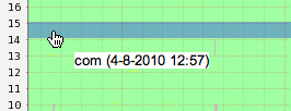
- Hovering your mouse over rows within plots now reveals the object being represented in that row (in this case, the domain .com). Previously, this had to be cross-reference against the (sometimes very large) key beneath each plot:

DNSMON - Highlighting time
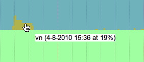
- We further applied this functionality to date in rows, where actual values are displayed at the mouseover point (in this case 19% dropped queries). Previously these values had to be assessed by eye:

DNSMON - Highlighting rows
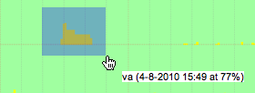
- We also made it easier to highlight and access specific data points of interest by enabling click-and-drag zooming across all plots. In this case, an interesting data point is observed in plot with 30 rows, but you want to see it more closely:

DNSMON - Drag and zoom
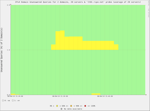
- after a simple click and drag, the precise data is available to you at full size:

DNSMON - Zoomed image
We have received some promising feedback from the subscriber beta, which we also opened to DNS-OARC members, and we're incredibly grateful to all of the individuals who assisted in testing (and breaking) our beta.
Today we are excited to announce that the beta service is being made available to members of the public. You can visit the new DNSMON user interface now.
We will continue to run the existing production DNSMON service alongside the new beta DNSMON user interface while we continue to collect feedback and make additional improvements and bugfixes. We hope that members of the community find this work useful and interesting, and we invite feedback, either by leaving a comment under the article or by sending email to the development team via dnsmon@ripe.net .


Comments 2
The comments section is closed for articles published more than a year ago. If you'd like to inform us of any issues, please contact us.
Anonymous •
First of all, the speed improvement is significant!<br />However, analogous to the old dnsmon all plots are currently the "probe" view. Will we see the return of domain and server plots in the new version ?
Anonymous •
Thanks for the feedback Ruben!<br /><br />The server/domain plots are still available, just type a custom query into the plot box and it will auto-complete with available options (for example 'nl' or 'k.root-servers.net'), and hit plot! You can be more imaginative in the query box, have a play :)