
The Seismograph is an interactive RIPE Atlas tool that allows users to analyse and visualise ping measurements. Here we explain the tool's different features and how you can make the most of them.
Introduction
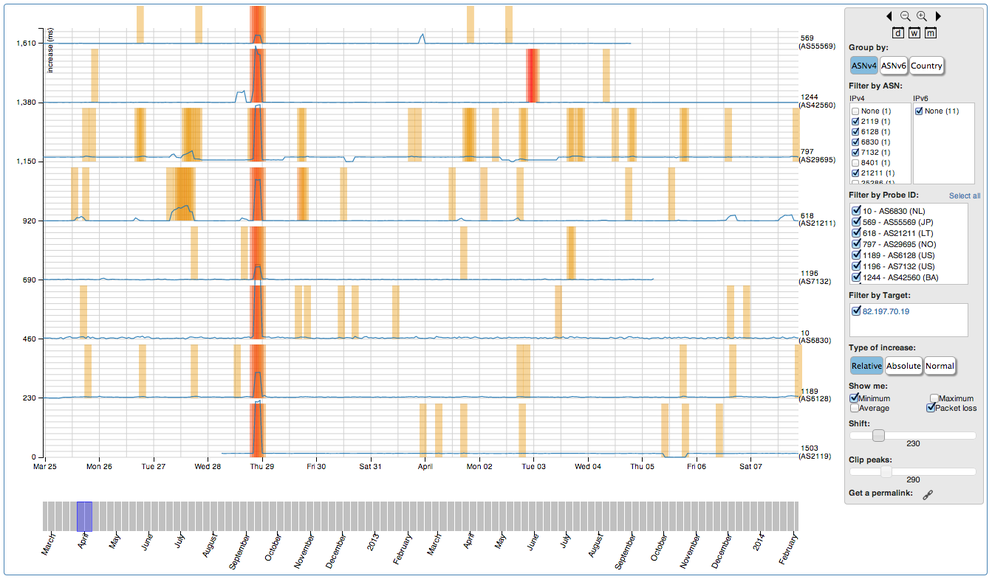
The basic idea of the Seismograph is to show different RTT and packet loss trends measured by multiple RIPE Atlas probes in one contained visualisation. This visualisation allows the user to get a fast, cumulative overview of the probes' ping measurements, and highlights patterns between different results collected by different probes.
The Seismograph is the new way to visualise ping user-defined measurements within RIPE Atlas, and is meant to replace the old ping visualisations (under the RRDs tab), which we will decommission at the end of February 2014.

It's worth pointing out that most of the RIPE Atlas probes are hosted on residential Internet connections, so the Seismograph can be a valuable tool for analysing network issues from the end user's point of view.
The Stacked Graphs
The Seismograph presents all the RTT measurement results in stacked graphs, with one graph (row) per probe. Packet loss is highlighted by the gradient coloured areas.
Time is represented along the x-axis.
The y-axis represents the increase in RTT values in three different ways, depending on the “type of increase” option selected. The relative (percentage) and absolute (milliseconds) options are relative to the per-probe minimum RTT seen in the selected time frame. Conversely, the normal option plots the trends of the real RTT values.
By hovering over a line, it is possible to see precise timing information about a particular trend: a small pop-up will show additional information, while the y-axis will focus on the selected trend.
Understanding the RTT Values
Alhough the stacked view is designed to scale so that each graph's data line will be displayed, it can sometimes be useful to manually adjust the scale of the y-axis with the “shift” and “clip” controllers on the right-hand side. It is really important to familiarise yourself with these two controllers in order to fully understand the data.
A cut-off threshold is imposed on the RTT increases before they are displayed, so that they fit within their respective graphs. This threshold can be adjusted with the clip controller. Increasing the cut-off value allows the representation of high RTTs, but can introduce overlap between the graphs. This overlap can be solved by increasing the shift value; however, the space between the lines will increase at the expense of precision.
Other Features
The “show me” controller allows you to choose the type of information displayed in the graphs, including the minimum, average and maximum RTT values for the three ping attempts, as well as the packet loss.
By default, only a subset of the probes involved in the measurements is represented. It is possibile to change this subset, and therefore the amount of data displayed, by using the “filter by ASN”, “filter by probe” and “filter by target” controllers. The grouping (and the order) of the probes can be changed with the “group by” controller.
Changing the Time Frame
One of the most useful features recently introduced in the Seismograph is the interactive ability to adjust the time frame displayed. You can select a portion of a graph to zoom in and see increasing detail. The time bar underneath the graphs, combined with the small buttons at the upper part of the control panel on the right, can be used to easily navigate throughout the time frame of the whole measurement.
Feedback
As we continue to develop RIPE Atlas, we rely on ideas, suggestions and feedback from the Internet community to help guide us and ensure we provide the most useful tools to you. Let us know what you think:
- For specific questions about RIPE Atlas, please use the RIPE Atlas mailing list for active RIPE Atlas hosts and interested users, which is also followed and answered by RIPE Atlas developers: ripe-atlas [at] ripe [dot] net
- For more general discussions about measurements and future plans, please use the Measurements Analysis and Tools Working Group Mailing List: mat-wg [at] ripe [dot] net
-
For direct feedback, or any requests, please contact the Measurements Community Building team, at mcb [at] ripe [dot] net
- Join the discussion on Twitter @RIPE_Atlas
Comments 2
The comments section is closed for articles published more than a year ago. If you'd like to inform us of any issues, please contact us.
Pavel Šimerda •
The seismograph doesn't seem to be very usable to me. The popup on mouse over to the graph line sometimes shows up, sometimes not. The numbers at the left sometimes move to the graph I'm pointing to using mouse, sometimes not. By default I only see a flat line in the graph and huge gaps between the graphs.
Massimo Candela •
Dear Pavel, Unfortunately we were not able to reproduce the problems you describe in the major browsers. The lines are thin and maybe difficult to select, but when selected everything works as expected. If you want us to explore this further, please send a mail to atlas@ripe.net. Regarding your last point, this is a possible (correct) behaviour caused by RTT trends with outlier. You can use the “shift” and “clip” controllers to adjust the chart like described above in the section “Understanding the RTT values”. Thanks for the feedback. Please let us know if you have any questions.