The RIPE NCC has been hard at work on the website redesign project we announced to the community last year, and we thought you might be interested in hearing about some of the behind-the-scenes work that's been taking place in order to make it happen.
This project comes in response to feedback received via the RIPE NCC Survey 2013, focus groups with RIPE NCC members, and an online usability survey that was open to all website visitors. The specific action items identified in the survey were to improve the site's navigation, structure and usability, as well as the search functionality.
One consistent item of feedback was that users had difficulty finding information on the website. With over 10,000 items currently published, it became clear that we needed a better way to organise all that information to make it more accessible, while retaining all the important documents for archival purposes.
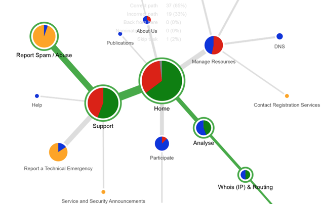
We worked with an information architect to help us organise and structure the content because we wanted a fresh, neutral evaluation of the site along with suggested improvements. The research went in a number of directions simultaneously: web analytics, user interviews, internal workshops and online surveys. The resulting report and wireframes, including feedback from the community, allowed us to build a new site map and navigation overview that brings to the front those areas of the site that are of most interest to our visitors.
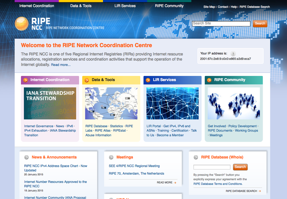
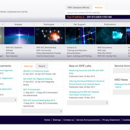
Once that stage was completed, it became clear that, apart from the content and navigation, a new visual design was also needed in order to provide a modern look to the site and take into account current best practices in the field, such as HTML5 support. This led to the creation of a whole new set of templates for the site that focus on clarity, readability and usability. As we did that, we also gained a number of secondary, but very useful, improvements, such as the ability for user customisation, better accessibility, responsiveness on mobile devices, and improved efficiency and speed.
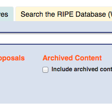
As the front end received an overhaul, we did not forget the back-end. We concentrated our efforts on search functionality in order to make the results better match user expectations. We achieved that by considerably improving the metadata for much of our existing content. This search engine optimisation was not done for the benefit of external search engines, but to improve the rankings of relevant information in our own internal search software based on Solr . Many of these changes can already be seen when using the current version of the website, and additional improvements will be made when the redesigned site launches.
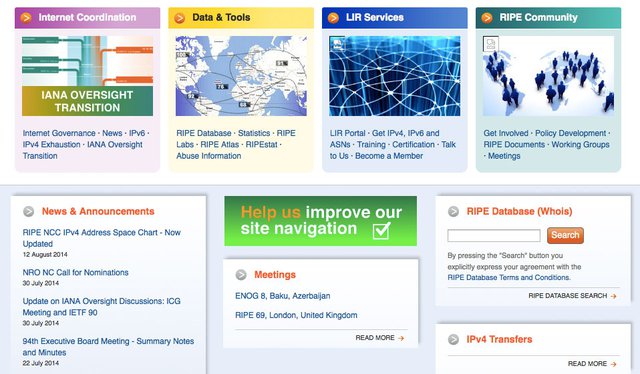
We are now in the final stages of the website redesign project, busy migrating content to its correct place in the new structure and putting the final touches on the design and template. We will be counting on you to provide further feedback as we get closer to launching a test version of the new site in March.
In a series of upcoming RIPE Labs articles, we'll describe the major components of the project and go into more detail about what we've outlined here, including the re-organisation of the navigational structure, improvements to the search functionality and the visual redesign of the site.
We hope you'll find these sneak peeks interesting and will let us know what you think of the changes. Stay tuned!


Comments 0
The comments section is closed for articles published more than a year ago. If you'd like to inform us of any issues, please contact us.