
This article is the third in a series that explains the main changes we're making to the RIPE NCC website as part of the website redesign project. Now that we're just a few days away from the launch on 13 April, we wanted to give you a sneak peek of the new visual design, and explain some of the back-end changes we made in order to support it.
You can get an
overview of the website redesign project
in the introductory article, read about the
improved search function
in the first article, or learn more about the
information architecture
in the second article of the series.
When we started the website redesign project, we focused on restructuring content and improving the search function – we didn’t intend to change the site's template significantly. However, as we started to work on these aspects of the site, it became clear that the changes we wanted to make to the navigation would be greatly enhanced by changes to the site's template and visual design.
As a result, the technical development of the site progressed hand-in-hand with the visual design. Here you can learn more about the changes we made to the site's template from a technical perspective as well as the new visual look and the reasons behind the decisions we made.
Technical Details
Our new website design features:
- Greater readability
- Better user experience within our applications
- Improved viewing on a mobile device or tablet
- Faster rendering speed
In order to provide our users with a quicker, cleaner interface, the redesigned site makes use of the most up-to-date web standards: HTML5 and CSS3.
An HTML5 site enables us to implement more user-friendly forms and better mobile device integration. In addition, we made use of its markup changes to improve the site's accessibility.
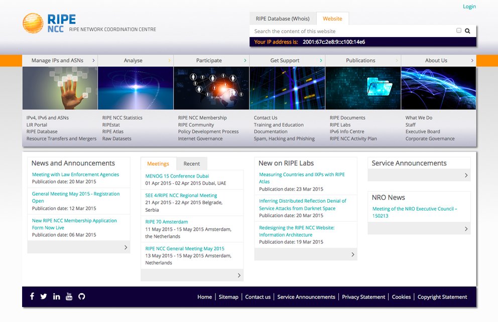
HTML5 lets us improve the navigation. One of the new standout features is a “mega menu” that will be available from the homepage and across the site, which gives users an overview of the content in each of the six top-level sections and provides a shortcut to key content.
Our analysis revealed that most of our visitors access the site using large screens, and the redesigned site is optimised for this kind of display; however, it is still fully adaptable to mobile devices.
While the previous site was 960 pixels across, the new design scales nicely to a width of 1250 pixels to accommodate our majority users. The increased width allows us to increase font size and spacing to maximise readability. We use the additional space more effectively within our applications such as data visualisations and online forms.
Of course, it was also important to make the design fully responsive for mobile devices, and so it can scale down to a width of 200 pixels to accommodate those users. Even on smaller devices, the website's layout should be clear and the content easy to navigate, as you can see below.

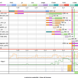
We've also improved the site's speed and efficiency. On the current website, the base template loaded 37 elements - on some pages, this soared to more than 70. Like most websites, the loading elements included local CSS and JavaScript files. Our new, cleaner design let us redesign the site with a smaller rendering footprint.
The prevalent use of images as design elements was another thing that weighed down the current site. Now that more browsers support HTML5 and CSS3 , we no longer need to use images to improve the site's visual design. In fact, the logo is the only real image used within the template. We will now be able to use a template with just 13 resources, and in addition to CSS3's more advanced imaging capabilities, this means content will render much faster.
Common libraries such as Bootstrap , jQuery and Font Awesome are hosted locally and are used to provide improved application features, responsive functionality and to keep the site's design clean.

Although it’s nice to have the latest and greatest technologies, it’s important that our site still works and renders content for slightly older browsers. To help achieve this, we implemented Modernizr and Respond.js to make sure that older browsers are still supported according to our browser support policy. And although custom JavaScript has been written to improve the navigation and is used by some applications, www.ripe.net will still be fully functional for those users who choose to disable JavaScript.
We're confident that these technical improvements we've made behind the scenes will give our users a better experience on the front end.
Visual Design
We aimed to develop a visual design that:
- Lets users navigate the site in an intuitive way
- Makes the site's content the key focus
- Guides users to the information they're looking for quickly and easily
- Provides a fresh, modern look

Much more than simply window dressing, a website's design plays a key role in the way visitors interact with it, from helping direct them to the information they’re looking for using visual cues, to highlighting news, to shining the spotlight on key information in each section.
With this in mind, we wanted to design a site that is intuitive, where content is key and users can easily find what they're looking for and get the information they need. The new design uses white space, gradients, typography, heading and subheading styles, photographs and other graphics, and colours to define distinct sections and spaces that helps separate and organise content to make it easier to find and understand.
One big change we made was to move the main navigation on each page to the left-hand side of the page, in keeping with current best practices. This also frees up the rest of the page and allows us to focus more on the content itself so that users can find what they're looking for in a more structured way, with the most important content highlighted for easy reference. We used typical eye movement patterns users have while browsing a website to create a dynamic flow of information.

We focused on streamlining the design in order to reduce the number of visual elements, like buttons, banners and backgrounds, so that the site's pages load quickly without being weighed down. We cleaned up the visual clutter and simplified the colour palette while keeping the look and feel of the site fresh and dynamic.
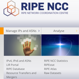
In terms of colour, each of the site's six main sections have an associated background colour, which you can see at the top of the above image. These are the colours users will consistently see on each page within those six main sections. Although this may not appear obvious to the casual website user, it creates a subtle visual cue that helps users navigate the site's large amount of content in a consistent, structured way.
The colour scheme was developed to create a harmonious look across the site while creating contrast between each of the six sections. We tried to maintain some of the colour associations that users already had from the current site so they could easily orient themselves. For example, the green of the "Participate" section mirrors the green of the RIPE community logo. Colour blindness and accessibility also influenced our colour choices.

To ensure the most effective readability, we used a generous leading for the text so that users aren't overwhelmed with visual clutter. After different experiments and analysis of the different types of information available on the site, we came up with six different headings to help define different levels in the content's hierarchy in terms of relevance. This helps bring some more variation and dynamism to a website that comprises a large amount of text, graphs and diagrams that should be clear and easy to understand.
One of the main areas we focused on was the typography. We wanted a font with a neutral look and several bold and italicised variations so we could create a distinct hierarchy to the information presented. The font family selected for the redesign was Open Sans, a sans-serif typeface designed by Steve Matteson and commissioned by Google. According to Google, it was developed with an "upright stress, open forms and a neutral, yet friendly appearance" and is "optimised for legibility across print, web, and mobile interfaces".
As you can see from some of the schematics we’ve included here, there are a lot of details that go into a complete design, from measuring margins and defining leading, to choosing graphics and images so the site has a dynamic look, to creating a colour palette that helps users navigate. But despite the effort that goes into it, a good design shouldn’t be overtly flashy or obvious; it should simply enhance the content and help the user find the information they’re looking for quickly and easily.
Feedback
We are very happy with the new, fresh design and the technical improvements we've made, and we hope you are as well. The redesigned website launches on 13 April — please tell us what you think by leaving a comment once you've had a chance to explore the new design.


Comments 2
The comments section is closed for articles published more than a year ago. If you'd like to inform us of any issues, please contact us.
Josh Jameson •
The old design looks much better.
Ricardo Cabral •
Responsive layout and prettier interface! Nice :)