This article is the next in a series that explains the main changes we're making to the RIPE NCC website as part of the website redesign project. Here, we describe the research we conducted in order to improve the information architecture of the website and the steps we took to implement the changes in our new design.
You can get an overview of the website redesign project in the introductory article , or read about the improved search function in the first article in the series.
Initial Research
One recurring topic that came up in the RIPE NCC Survey in 2013 and from the feedback we received from focus groups and RIPE NCC members was that users had difficulty finding information on the website. With over 10,000 items published and a complex navigation structure, it became clear that we needed a better way to organise all that information to make it more accessible while retaining all the important documents for archival purposes.
We decided to work with an information architect to help us organise and structure the content as we wanted a fresh, neutral evaluation of the site along with suggested improvements.
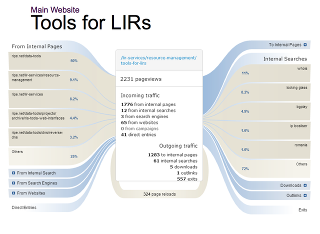
The first step of the process was to gather as much information as possible about the usage patterns of the website. We installed web analytics software called Piwik to gather a large amount of statistics and comprehensive (while fully anonymous) details about the way users were interacting with www.ripe.net (see an example in Figure 1).
To complement the visitor data, we also conducted in-person and remote interviews with members of the community, as well as day-long workshops with internal and external users to define the personas (main types of visitors with their needs and individual characteristics) and determine the most sought-after content on the website.
We also created an online survey that invited website users to answer specific questions about the way they were finding information and we collected answers directly from visitors over a period of weeks.
Some of the most interesting conclusions of the research were:
- The top searches on the website were for Whois information and IP address details
- The most visited pages were the ones referencing the RIPE Database, IPv4/IPv6 information, RIPEstat and DNS services
- Visitors were searching for RIPE documents but not always finding them, so we needed to improve their reachability
- People could not find all the tools we offered, since they were spread all over the website
- Old content still received significant amounts of traffic
Defining the New Structure
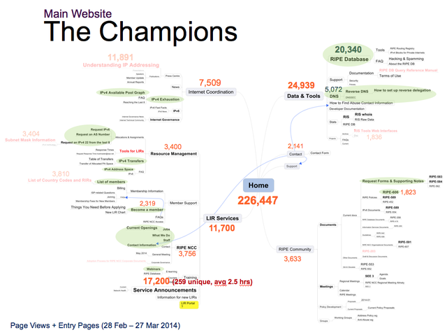
Once we had all the data, the information architect analysed the usage patterns combined with community requirements and defined a first version of a new content structure and website navigation/site map (see Figure 2).
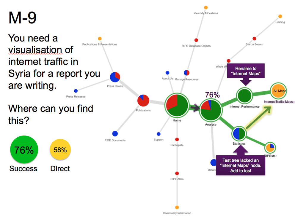
The navigation structure was presented to stakeholders and we again invited website visitors to provide feedback as part of a " tree testing " exercise which ran on the website for a number of weeks. We collected the feedback, analysed the results and proposed a revised navigation structure that was again tree-tested with website visitors (see Figure 3).
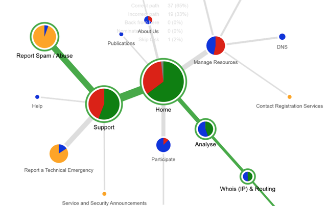
After several iterations of improvements and refining the proposed site map, we reached a solution which we believe highlights the areas of the site that are of most interest to our visitors while preserving access to all the existing content.
Results and Next Steps
Here are some of the guidelines we had in mind for the new website architecture:
-
Label the RIPE Database search as "Whois" and place it more prominently on the homepage
- Present the most popular tools, documents and forms more directly
- Use call-to-action titles for categories whenever possible to make them more dynamic
- Use the second level navigation pages as a funnel to guide visitors to their desired content
- Bring the content that was buried deeper in the site closer to the top level and minimise the number of clicks required to reach it
- Reduce number of links on pages, keeping important cross-links when needed
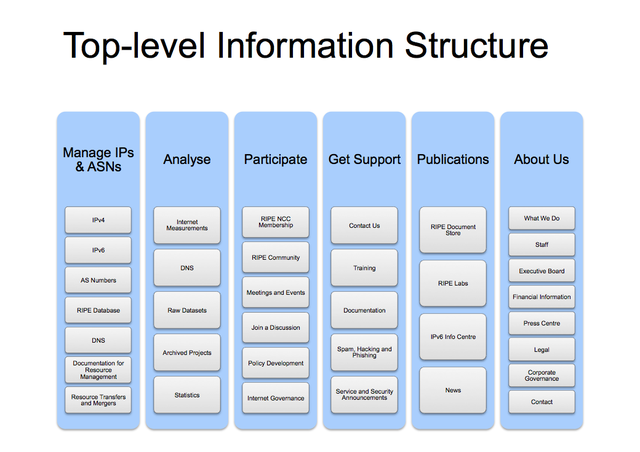
This resulted in a new navigation structure as can be seen in Figure 4 below:
Once the plan was laid out, we embarked upon the task of migrating content, restructuring the navigation and creating the required landing pages that would make finding the desired content on the website much easier. There is one more usability study planned before launch, and with all final tweaks in place all will be revealed with the website redesign in a few weeks. It is important to note though that it will be just the beginning — once the new site navigation is in place, we will periodically analyse usage patterns and analytics to improve the website.
The navigation restructure is one part of our project to redesign the website. The deliverables from our information architecture research also included a set of wire-frames for various types of content; we used these as the base of a completely new, fresh and clean design which makes the content itself take centre stage and become much easier to read. That will the subject of an upcoming RIPE Labs article, so stay tuned!
Feedback
What do you think about the improvements we're planning for the website's navigation? Please leave your comments here with any feedback you might have.


Comments 0
The comments section is closed for articles published more than a year ago. If you'd like to inform us of any issues, please contact us.