Thousands visit the RIPE Database web interface every day to seek out information on Internet number resources. After taking a closer look at how people interact with the interface, we've come up with four small changes that, without altering the way you search, could very well cut down on the amount of time and effort it takes to do so.
The RIPE Database contains registration details of IP addresses and AS Numbers originally allocated by the RIPE NCC. It shows which resources are held by which organisations, where the allocations were made, and contact details for the networks.
There are multiple ways for users to interact with the service - by using a REST API, command line, or web interface. The RIPE Database processes around 80 million requests a day on average, while the web interface has 6,000 visitors per day on average, and these numbers are increasing every year.
Searching High and Low
The vast majority of people who visit the RIPE Database do so to search for information about the objects it contains. And with thousands of users performing their own specific queries every day, it’s vital that the available interfaces allow them to get the information they need quickly and without having to seek further assistance.
The web interface in particular is a place where things are set up to make the user experience with the RIPE Database as straightforward as possible. Over the years, although the surrounding environment has undergone a few changes, the search itself has stayed much the same. And that’s a good thing. The existing design has stood the test of time, providing old and new users alike with something that works as they’d expect it to work.

That said, usability testing we’ve been carrying out has helped us come up with a number of potential features we believe will help cut down the amount of time and effort it takes users to retrieve information from the RIPE Database via the web interface. While none of these alter the underlying layout, we think each has potential to improve the user experience.
Four Areas for Improvement
After user interviews, usability testing, and analysing data from analytics [1], we identified four ways to improve the web interface that will help users find the information they’re looking for quicker.
Organisation Search
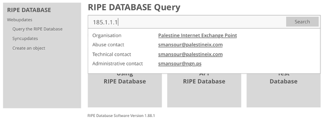
Performing a lookup for resources to find organisations details such as abuse contact, administrative contact and organisation name is one of the main actions of RIPE Database users. According to analytics, we found that 67% of our users perform a single search on RIPE Database, then leave the site.
Since we want to make sure information gets delivered as quickly as possible, the idea here is to make organisation details visible as soon as the user types the IP Address or AS number in the search field. The relevant details will appear in a dropdown so that users see the information right away.

Relevant Filtering
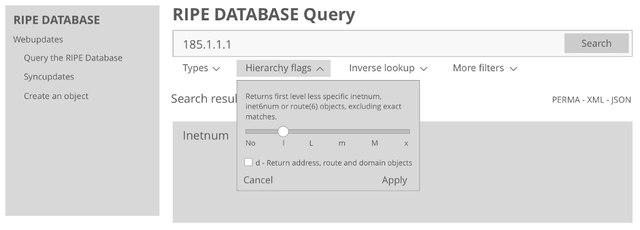
Again from usability testing and interviews, we learned that being presented with a whole list of parameters for filtering results – i.e. type, hierarchy flags, inverse lookup - can be confusing. Users don’t always know in advance which filters they can expect to yield results. One way to avoid confusion here would be to let users enter the resource they’re searching for, and then display only those parameters that will actually yield a result for the resource entered so they can refine the search results as needed.

Searching by Flag
Searching with flags is a powerful way to get optimal results. Often users don’t know all the flag types as the information is hidden in documentation. In the past we provided a small feature where a user can see what flags are attached with a query in a grey box. But now we would like to take one step further and detect which flags users are typing and provide meaningful information about each flag type and what users may expect from the query when they click on search.

Full Text Search
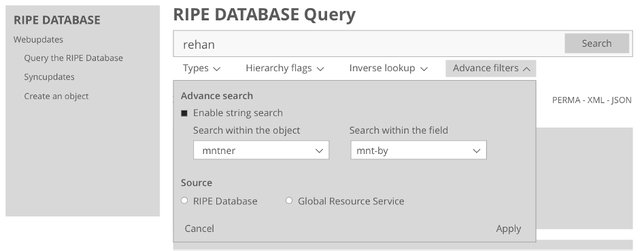
When searching for keywords across the entire RIPE Database or for selected object types, full text search is the most handy tool. We observed through analytics that only 16% of users move on to full text search when their desired result does not appear in the regular search. Full text search in its current state is a separate functionality and by observing data and user behaviour we think the best use of full text search is within RIPE Database search UI. This means users would be able to switch between the two without leaving the screen, hopefully encouraging more use of full text search.

We also plan to open the Full Text Search API to our end users, so searches can be automated and used by third party tools. Currently this feature is only accessible through the website.
Moving Forward
The ideas we’ve looked at here have all grown out of a design process where we’ve drawn on different sources of information – analytics, user interviews, usability testing and earlier feedback from the community – to help work out what would actually benefit users. Now we have concrete changes to propose, we’re keen to understand what users actually want before moving forward.
It’s also important to note that, were we to move ahead with any of the changes outlined, we’ll notify the community beforehand. We would also make the changes incrementally. This will help make sure users can get used to them one at a time, and it’ll allow us to better assess the extent to which each change actually improves the user experience. And finally, we will not break existing functionality. The aim is to improve the page without taking functionality away from the user.
With all that said, if you have feedback on the changes we’ve outlined here, please leave your thoughts in the comments section below. And if you’d be interested in getting more involved, you can always sign up to take part in our usability testing to help make sure future changes to our services lead to meaningful improvements for our users.
[1] The ripe.net website uses the open-source Matomo application for website analytics. The data is hosted in-house, we anonymise the client IP address so individuals are not identifiable, and we store history for 30 days.


Comments 0
The comments section is closed for articles published more than a year ago. If you'd like to inform us of any issues, please contact us.