Our work on improving the user interfaces for our services continues. And as always, we're keen to find out what you think. In this article, we look over the recent feedback users have shared with us and how we're working to transform their suggestions into tangible improvements.
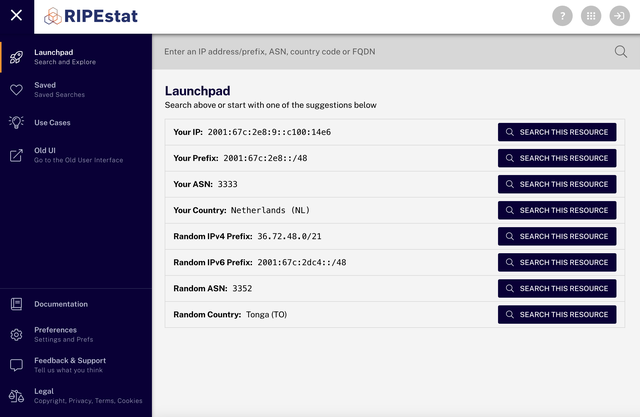
You may have noticed that many of our services - e.g. RIPE Database, LIR Portal, RIPE Atlas, and others - have a new interface design. The aim of this change is to unify our design language so it is easier for our users to navigate through the different applications and have a seamless experience throughout. You can read more in-depth about the changes and decisions we made from the article we published Rolling Out the RIPE Atlas Redesign.

We periodically carried out testing with users in order to measure how the design changes we were making were impacting their workflows. Collecting their feedback as we went along, we were able to work on continuous improvements. You can read more about our approach to usability testing in our previous article on Usability Testing at the RIPE NCC.
Testing the new UI
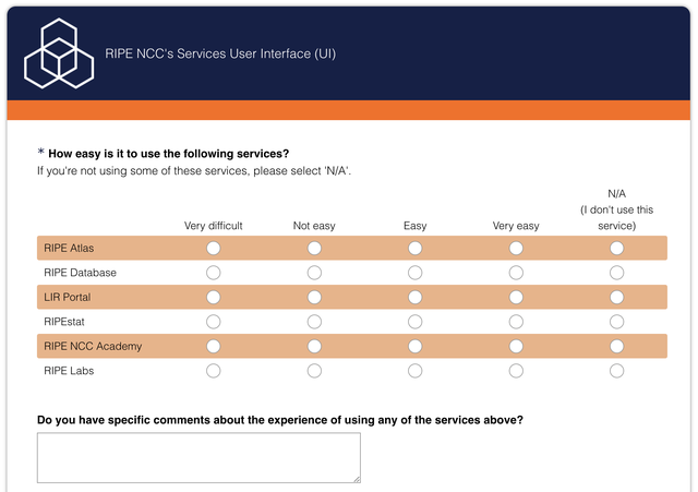
In the second half of 2021, we launched a survey aimed at getting users to share more feedback with us. As usual, all responses were anonymous. To get the word out and reach as widespread a range of respondents as possible, we advertised the survey on a number of different mailing lists and social media platforms.

Survey
In total, 287 people responded to the survey. 80 of those left clear feedback about what they would like to have improved with regards the usability and appearance of the user interface. While most of the feedback focused on RIPE Atlas and RIPEstat, a lot of the suggestions made have also been really useful when it comes to thinking about our other platforms.
Some of the suggestions from the survey were:
Keyboard navigation is not easy. The menu on the left does not seem to work with keyboard hints (f) when using a keyboard-driven web browser such as Qutebrowser (this is general web accessibility issue, so it is really about the template and not the services)
“RIPE Labs' redesign, in particular, is fantastic, but so is the new Atlas portal. Well done!” - RIPE Labs user
“Resources window always returns to the start of the list, so when editing multiple entries, you need to scroll a lot. Changing inetnum object size requires creating a new one, and removing the old one first if it overlaps. This situation happens when we expand allocation to a customer.” - LIR Portal user
After we collected the feedback, we did a lot of quick fixes and created categories for identifying which areas we should put most focus on moving forward.
As the survey returned a lot of qualitative, subjective feedback, we wanted to make sure that we also capture the feedback in a recorded interview session so we can be certain of the issues that our users are facing.
Usability testing interviews

Last October, we sent out invites to join our usability testing session via our usability testing list. From those who responded, we selected eight users who represented the real users of all our services and platform.
A qualitative study was conducted through user interviews on RIPEstat, RIPE Database, LIR Portal, RIPE NCC Academy, RIPE Atlas, and RIPE Labs. The questions we covered related to:
- Template design
- Accessibility
- New and old UI features
- General feedback on UX of the application
We received great feedback from our users. Here are a few of the points we noted down from the sessions, just to give you an idea of the kind of things people had to say:
- On the result page, the user would like to see all the hops and all the longest paths, and all the slowest paths rather than graphs as is not very clear to diagnose. - RIPE Atlas
- Hierarchy flags information can be changed, so the user does not need to slide to see the description of other flags. - RIPE Database
- It is sometimes not intuitive for users to determine if the course is finished or not when all chapters are completed. - RIPE NCC Academy
Improvements + implementation
We summarised all the feedback and assigned it to the appropriate teams here at the RIPE NCC. Some of them are quick fixes and some of them can take longer as they need a bit of brainstorming.
Here is the list of planned fixes that we have been busy working on:
Planned items
- It is sometimes not intuitive for users to determine if the course is finished or not when all chapters are completed. - RIPE NCC Academy
- Have the article page be more compact so that the users can see most of the content before scrolling down. As of right now the title, of the picture takes a lot of space on the page including navigation on the top with the header. - RIPE Labs
- In mobile layout, if there are 8 digit credits it cuts out in the layout. - RIPE Atlas
- In mobile layout, the menu should collapse when loading a new page like a probe page. - RIPE Atlas
- The Circle and Rectangle are cut off from the UI in Probe selection during measurement creation. Although the user uses a chrome browser. - RIPE Atlas
- Zoom in-out buttons do not load on the map when selecting probes. - RIPE Atlas
- Have a button for "Copy object" in object edit mode in lookup and my resources, so that the user can copy the object and do changes in sync update as compared to a single line as it takes time. Solution: Have a switcher to the text area and line by line update in my resources and copy button on the object lookup page. - RIPE Database
- Have an alert if the user decides to delete the Route object and there is a ROA associated with it, to also delete the ROA at the same time. Solution: Have an alert when deleting the Route object and list the associated ROAs. - RIPE Database
In progress
- Explore the options. Users will find it more intuitive if the search box on RIPE.net for RIPE Database and website search can be unified. - RIPE.net
- In the iPhone X dimension, the header cuts out the login icon. Maybe standardising three dot icons. - General layout
- BGPlay widget functionality in new UI. - RIPEstat
Completed
- In IPv6 fundamental analyst users would like to have more material, the user feels it does not cover everything which is being asked during the exam. - RIPE NCC Academy
- Login icon redesign - General layout
- Create awareness in different features of RIPEstat such as layout columns, grouping, and saved search. - RIPEstat
- Fully expanding looking glass section. - RIPEstat
- Change time to 24hrs in the absolute filter. - RIPEstat
- Show replies in the ticket from RIPE NCC agents. - LIR Portal
- Status update on the tickets (resolved, picked up, etc). - LIR Portal
- Show ticket history. - LIR Portal
- Give more priority to the introduction text to draw user attention. - RIPE Labs
- The user always gets a cookie banner even when the cache is not clear. - RIPE Atlas
- Hierarchy flags information can be changed, so the user does not need to slide to see the description of other flags. Live update the text when moving the slider. - RIPE Database
Future plans
In the future, we are considering dividing up usability testing for each individual service. This approach will give our participants more chances to raise their concerns and our users can participate in multiple feedback sessions. We will share more information on this once plans are settled.
For now, we'd like to thank our users who participated in the survey and usability testing to give us their valuable time and providing us with their feedback!
Open house
On Wednesday 6 April we'll be holding a virtual open house session to discuss all the recent changes to our user interface. We invite our users for a casual conversation about our services and how we can improve.
Get more information on the open house session, or go ahead and register to take part.
Join our usability mailing list to know more about the details and to participate in future usability testing events.


Comments 0
The comments section is closed for articles published more than a year ago. If you'd like to inform us of any issues, please contact us.