
The RIPE Atlas team is developing a new tool for traceroute visualisations that should make analysing large traceroute measurements much clearer and easier.
As part of our mission, the RIPE Atlas team is looking for ways to make our data more usable and accessible, providing tools that help users gain insights into the measurements they are running. Recently we have been working on one such tool (tentatively named Khipu for its visual resemblance to the record keeping devices of the Incas) that will help users visualise and make sense of measurements that contain many traceroutes. This tool is currently under heavy development, but we wanted to release it to the community in early form to gather feedback and make improvements before releasing it into production.

The challenge: visualising Internet routes
RIPE Atlas users are quite familiar with traceroute - a diagnostic tool that reveals the path packets take from source to destination. However, interpreting traceroute data presents significant challenges:
- Scale: A single RIPE Atlas measurement can generate a large number of traceroutes from probes worldwide
- Complexity: Each traceroute contains multiple hops through different routers and networks
- Failures: Not all traceroutes succeed - some fail at intermediate points, creating incomplete paths
- Aggregation: Understanding patterns requires grouping related paths while preserving important details
Using text-based traceroute output quickly becomes overwhelming when analysing multiple paths. RIPE Atlas has helpful measurement pages that give users a mapped overview and sortable results lists, and has an older tool called TraceMON that can visualise some routes. But it can still be challenging to make comparisons of the full collection of routes and get a clear visual overview. This new tool addresses these challenges by providing interactive, graphical representations of large amounts of measurement traceroute data together in one place.
Two complementary views: IP and ASN
The visualisations below consist of two main views using the new traceroutes tool; IP and ASN.
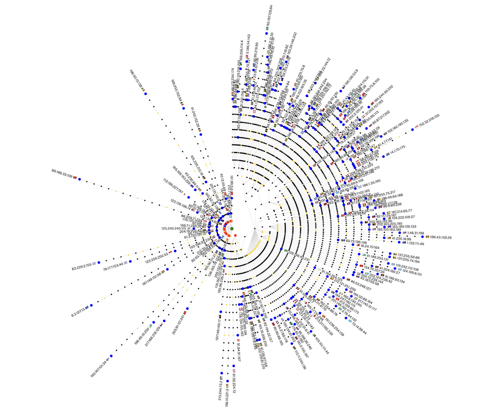
IP view: detailed hop-by-hop analysis
The IP view presents traceroutes at the most granular level, showing each individual IP address encountered along the path. This view can be essential for troubleshooting specific connectivity issues and examining performance metrics.
The visualisation creates a tree structure with the destination IP at the centre, branching out through intermediate nodes and ultimately blue source nodes (probes) at the outer edges. Grey lines show successful paths, yellow nodes indicate unknown IPs, and the red nodes indicate last hops in traceroutes that did not reach their destination.

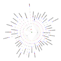
ASN view: network-level topology
The ASN (Autonomous System Number) view (below) aggregates paths by the networks they traverse, providing a higher-level perspective useful for understanding Internet topology, and analysing peering relationships. Each Autonomous System appears as a labeled node with paths merged for clarity.

Technology
In addition to this being integrated into the regular Vue based Atlas frontend tech stack, the complexity of this visualisation demanded a more performant approach. We have written this in WebGL, which provides excellent performance on modern hardware, even with many thousands of nodes being represented. All interactions including zooming, panning, hovering, and others are quick and fluid.
Key features and controls
Here are a few of the features and controls you can find in the new tool. Try them out and let us know what you think.
Interactive navigation
- Pan and zoom to explore the visualisation
- Fullscreen mode to maximise space
- Hover over nodes for quick information
- Click nodes to pin a popup and then drag anywhere
- Copy data directly from popups for analysis or reporting
Filtering options
- Country filter: focus on specific geographic regions
- RTT range filter: select low and high ms RTT
- Path filter: find all routes through a specific ASN or IP address
- Hide successful traces: isolate failed connections for troubleshooting
- Hide unknown ASNs: clean up incomplete data (ASN view)
Display options
- Hops vs RTT (IP view): position nodes by hop count or actual round-trip time to reveal true network distance
- Show ASN labels: toggle network identifiers for cleaner presentation
- Target: show target label in center of visualisation, can be dragged anywhere
Visual indicators
- Node colour: Green (target/destination), Blue (sources), Red (failure points), Yellow (no IP), Black (intermediate)
- Path highlighting: hovering or pinning source nodes will highlight path in orange
- Adaptive scaling: Elements automatically resize based on trace density
Sharing
- URL params: settings are automatically updated in the URL, meaning you can cut and paste it to share your same filtering or view options with anyone
Future development and testing
There are a slew of other features and enhancements the RIPE Atlas team are talking about, and we will add some of these in the coming days. But we very much want to hear from you, the community, at this point.
Try it out!
You can test out this new visualisation on our beta-ui site, from any traceroute measurement detail page, just look for the "KHIPU" link at the top of the page and click it.

Provide feedback
- The RIPE Atlas mailing list is the place to discuss RIPE Atlas with other users, and is also followed by RIPE Atlas developers who will answer questions and read your feedback
- You can also access the RIPE Atlas mailing list via a web-based interface using the RIPE NCC Forum
- Ask a question or report a bug or problem by emailing us
Comments 0