The user interface (UI) of RIPEstat has become a familiar view for our user base, but after nine years of service we are starting to explore new concepts to improve the user experience on our information service. In this article we share our motivation, the guiding principles for the new UI and the first results of our development efforts.
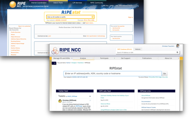
Older and current RIPEstat web interfaces
The UI has already gone through several iterations and changes, most of which only affected its outer appearance. In order for us to better serve the needs of today's users - particularly the need to support mobile devices - and to get us ready for the next steps in the development of RIPEstat, more fundamental changes were required. Since our main driver for RIPEstat development has always been our users, we want to share the first of those changes with our community.
Motivations
Having carried out an analysis of the current RIPEstat UI, we identified a number reasons to revisit its design. In particular, we saw there was a need for each of the following:
- Better support for mobile devices
- More consistency in the presentation of information and improved interaction options for users
- Leverage the benefits of state-of-the-art UI frameworks
- Improved performance
- Enhanced customisation
Led by this list of motivations, we began imagining and experimenting with a new UI that would respond to many of these concerns. In our efforts, we have kept to a set of guiding principles, according to which RIPEstat should be/have:
- Responsive and mobile friendly
- Self contained “App"
- User-driven presentation/configuration
- Universal search context (resource, range, etc applies to all displayed elements)
- Shareability (via some or all of the following: url, stored config, file/image, embedding)
Prototype
Today we are releasing a very early prototype to the community. Its purpose is to spark a discussion about the future of RIPEstat and the way we present information so that we can take into account the needs and desires of the community from the outset.

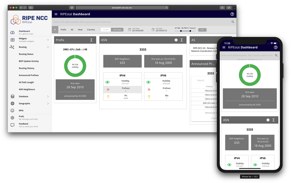
New UI in web and PWA (mobile) versions
Some of the key features to take note of in this early release are: the user configurable dashboard (via the prefs); the fact that (data calls aside) this is completely a client side application (and all prefs and app data are stored locally, not on our servers); the universal search context (via the search bar); the new navigational structure; the fact that this also functions as a PWA (and can be added to your device's homescreen); and of course, device adaptability.
As mentioned, this is a very early UI prototype, and as such it has limitations and bugs. The small collection of widgets is meant to show the various types of information that can be displayed when searching. It also helps in assessing context awareness (for example, if the search context is for an AS, widgets that are meant to show prefix information will not display content, etc) as well as interactions between the elements. Many of the elements in the navigational tree may not currently work, but are there to provide hints of our direction in this area, and to solicit feedback.
You can download or view the current app prototype.
We will be updating this quite often with new and expanded features on our list, so stay tuned. We are very excited to receive your ideas and feedback, and you can click on the feedback menu in the app to be taken to our feedback page.

Comments 0
The comments section is closed for articles published more than a year ago. If you'd like to inform us of any issues, please contact us.