It is often claimed that the ISP industry is concentrated and the bulk of the address space is in the hands of a small number of organisations. Is this really the case and what does that mean for the composition of the whole industry? Is it open for new businesses or controlled by a few?
Introduction
Back in August 2010 we looked at RIPE NCC membership growth trends and concluded that the total number, or population, of RIPE NCC members (i.e., Local Internet Registries, or LIRs) has continued to grow at a surprising pace in recent years despite the challenges and uncertainties of the ongoing global economic downturn (for more information see Internet Continues to Grow at Astonishing Pace (Perspectives from RIPE NCC Membership Stats) ). Today we turn to the somewhat related question of how these population dynamics have affected the distribution -- that is, the overall pattern of concentration and/or diffusion -- of address resources across member organisations and other RIPE NCC resource recipients. This work updates research that was first presented by Chief Scientist Daniel Karrenberg at RIPE 56 in Berlin [1] . Both exercises were inspired by some rather casual claims that have appeared in various technical and policy fora over the last few years, claims suggesting that the Internet industry is now highly concentrated, and becoming even more concentrated over time. Since these claims continue to draw some interest, and because the potential consequences of critical resource concentration can be serious (see for example Figure 1, below), we thought it might be worthwhile to look at this issue with the benefit of actual empirical data, specifically on IPv4 addresses.
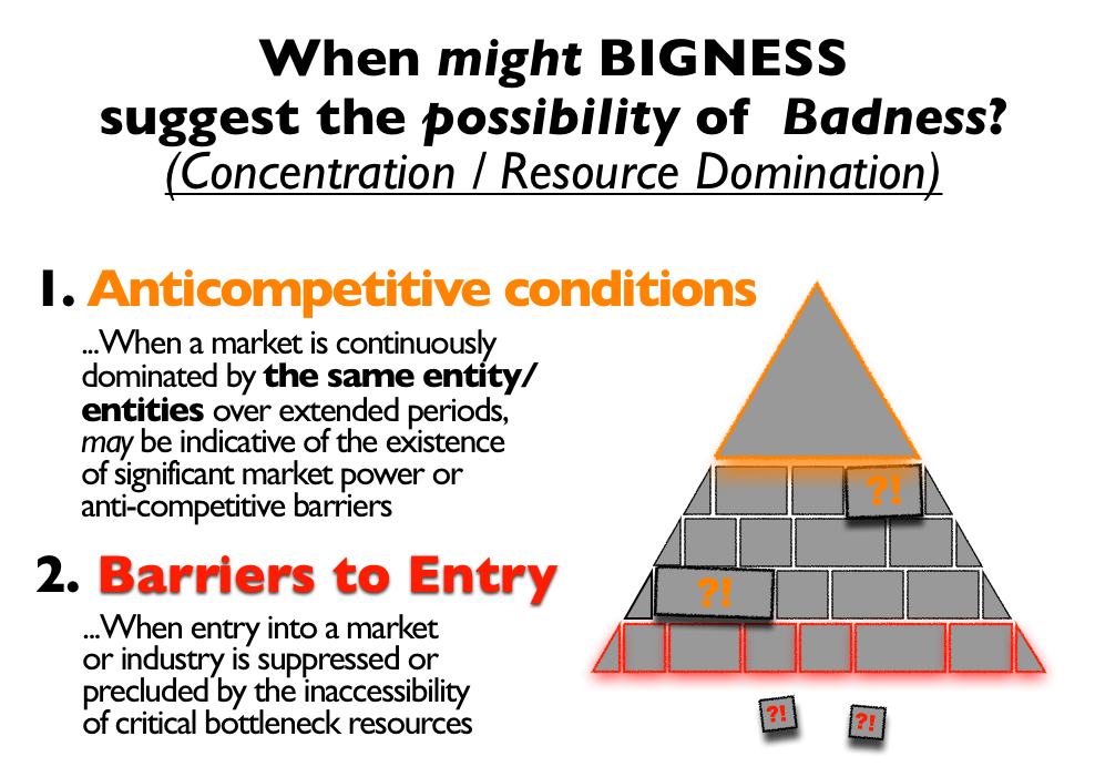 Figure 1: Criteria for Concentration
Methodology: Visualising concentration/diffusion patterns
The first challenge we encountered involved finding a means of presenting data of relevance to these claims in a way that would be intuitively appealing and informative but which would not reveal any sensitive or proprietary information about individual RIPE NCC resource holders. Given the sheer size of the RIPE NCC resource registrant population and the large number of resource distribution transactions that have been completed since the RIPE NCC started as a Regional Internet Registry (RIR), finding a scale-preserving method for condensing the relevant concentration/diffusion information would be essential. For this, we took some inspiration from the increasingly popular (and easy-to-publish) Hilbert Space representations [2], as well as from some of the hierarchical, multi-scale visualisation techniques that have come out of the now booming field of Analytical Visualisation [3]. Ultimately, we chose to represent the cumulative distribution of IPv4 address space handed out by the RIPE NCC as a segmented bar chart with five rows, each representing 20% of the total cumulative IPv4 address space allocated or assigned by the RIPE NCC at a particular point in time. In the series of graphs below, those dates correspond to the last day of six notional "IPv4 addressing eras" that were defined for this exercise. We then populated those five rows from left to right and top to bottom with bars of varying widths. These bars correspond to the total number of IPv4 addresses given out by the RIPE NCC to an organisation up to that point in time, in order from the "largest" to the "smallest" IPv4 recipient [4][5]. Note that this particular ordered arrangement of elements makes the resulting graph especially interesting for people who have seen (or made) claims along the lines of: "(very large x)% of total IPv4 is controlled by (very small y)% of the largest LIRs."
It is widely known that community address resource distribution policies and RIR distribution practices have gradually become more "conservative" over time, as improvements in routing technology have increased the efficiency and multiplexing potential of each unique IP address that is used in production. So, to further illuminate how this particular factor might affect the distribution of IPv4 addresses, each of the organisations depicted in the graphs is marked by a distinctive colour indicating the era in which it first obtained IPv4 addresses from the RIPE NCC:
- Organisations that received their first IPv4 address allocation before the end of 1997 -- i.e., before the first global Internet "boom" -- are depicted in red.
- Those that received their first IPv4 during the "boom years" (1998-2002) are coloured orange.
- First-time recipients from the years immediately following the dot-com crash (2003-2006) are yellow.
- Those IPv4 address recipients that obtained their first resources during the period when post-IPv4 addressing questions began to attract renewed industry attention (2007-2008) are coloured green.
- Organisations that received their first IPv4 resources during the period that broader public interest about the run-out of IPv4 address space was increasing (2009) are marked blue.
- Violet elements indicate first-time IPv4 recipients that have emerged since 1-Jan 2010.
The Results: Shifting concentration/diffusion patterns over time
Pioneer days (Figure 2): in 1997 there were 845 LIRs registered with the RIPE NCC. In total 5 /8s were allocated to these 845 organisations (each quintile represents 1 /8). 8 organisations held 20% of all address space allocated at the time. Another 20% was held by 15 organisations and so forth.
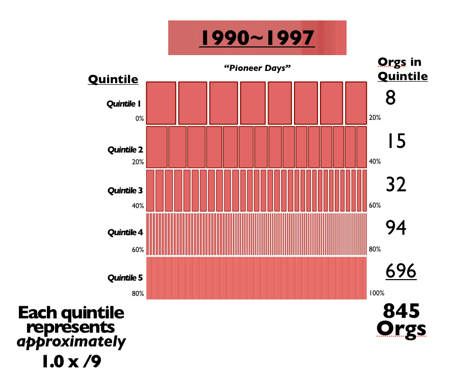 Figure 2: The Pioneer Days: 1990 - 1997
Boom Time (Figure 3): In addition to those organisations that received their first IPv4 allocations before 1998 (marked red), this image shows all organisations that started between 1998 and 2002. In that period the RIPE NCC acquired 2768 new members. These are marked orange. At this point, each quintile represents 1.7 /8 of IPv4 address space. That means by the end of December 2002, the RIPE NCC had allocated the equivalent of 8.5 /8's to all its members. As you can see a number of orange LIRs 'bubbled up' during these 4 years, so that at the end of 2002 20% of the address space was held by 10 organisations.
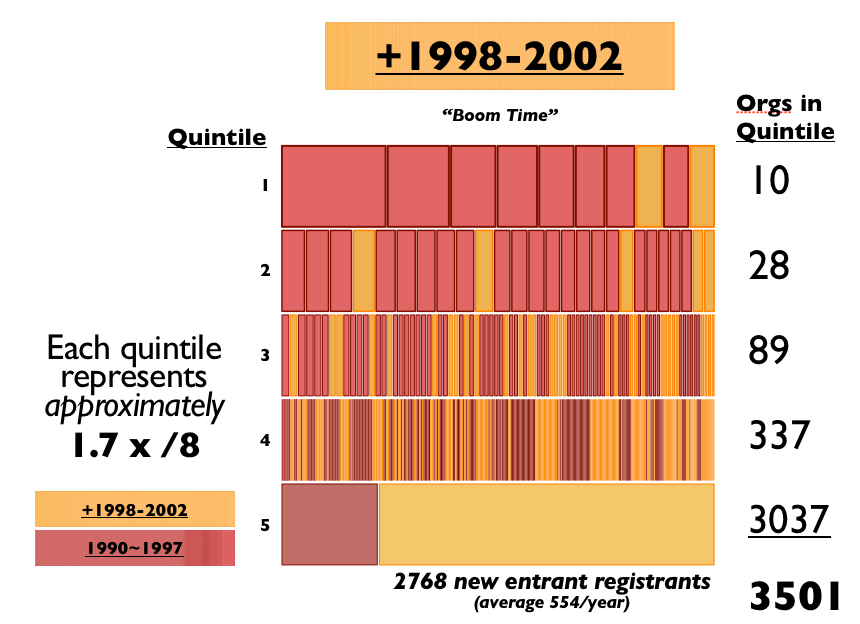 Figure 3: Boom Time: 1998 - 2002
Recovery & Adaptation Years (Figure 4): In this image you can see the red organisations (that received their initial allocation prior to 1998), the orange organisations (that received their initial allocation between 1998 and 2002) plus all those organisations that received their initial allocation between 2003 and 2006. During that period 2,227 LIRs were established. Again you can see that more orange organisations and some of the new yellow organisations moved up and accumulated more address space over time. You can also see that in that period, after the 'dotcom bubble burst', consolidation was indeed happening: only 5 organisations held 20% of all address space (which by that time had grown to the equivalent of 3.9 /8s). Also the other quintiles show lower numbers of LIRs. However, the overall number of RIPE NCC members was growing and new organisations entered the system. As a result of these opposing dynamics, the ratios of the population numbers associated with each quintile remained recognisably similar (i.e., roughly 1:3:3:4:10 for the boom years vs. 1:5:3:4:16 for the post-boom).
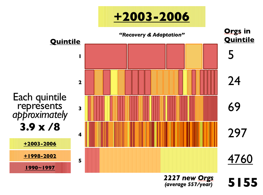 Figure 4: Recovery & Adaption: 2003 - 2006
Anticipating the Post-IPv4 Era (Figure 5): During 2007 and 2008 the RIPE NCC had 1,576 new members. Those are marked in green in the image below. By the end of this period, each 20% quintile represented 5.1 /8s. Again you can see organisations growing and accumulating more address space over time. There are still only 6 organisations holding 20% of the address space, and 22 another 20%, but some of these are different organisations than in the years before. Also, this was the period with the highest numbers of new RIPE NCC members per year (788).
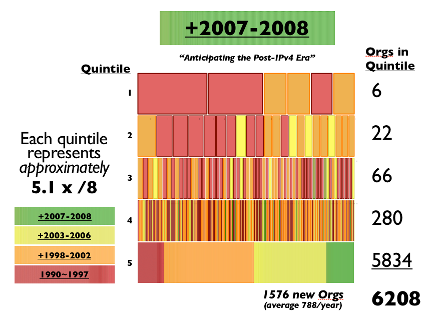 Figure 5: Anticipating the Post-IPv4 Era: 2007 - 2008
Preparing for the End (Figure 6): By the end of 2009, each quintile represented 5.6 /8s, and the RIPE NCC had attracted 781 new IPv4 address recipients, marked here in blue. Even within the short span of this this one year, some of the new organisations accumulated more address space than their older counterparts, and so moved ahead in the size rankings.
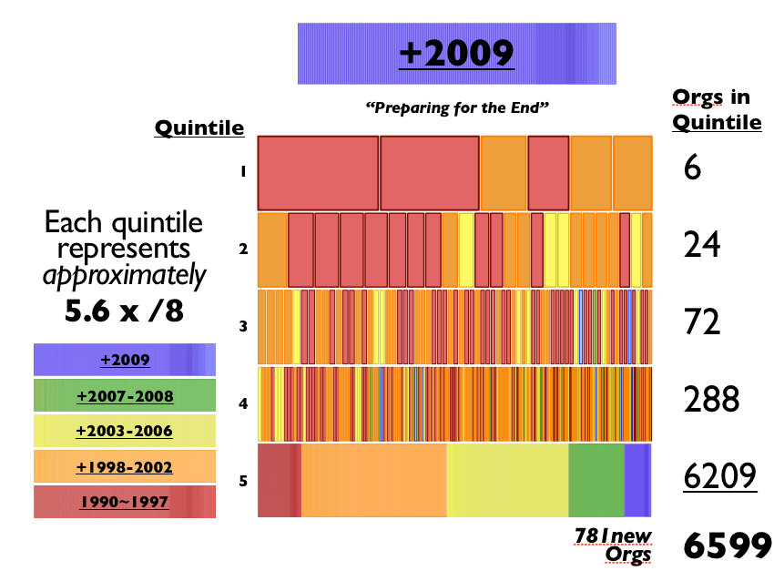 Figure 6: Preparing for the end: 2009
You are Here (Figure 7): In Q1 and Q2 2010, 402 new organisations received their initial IPv4 allocation or assignment from the RIPE NCC. We can see that there are currently 7 organisations occupying the topmost quintile of IPv4 holdings, which was equal to 5.8 /8s as of 01-July 2010.
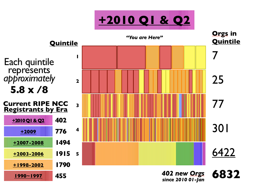 Figure 7: You are here: Q1 & Q2 2010
In the last image below (Figure 8) we show all 6 periods next to each other to illustrate the overall growth of the industry over the last 20 years:
- 1990 1 /8 was allocated to a total of 845 organisations.
- 1998 - 2002 a total of 3.33 /8s was allocated or assigned to 3,501 organisations.
- 2003 - 2006, 7.65 /8s were allocated or assigned to a total of 5,155 organisations.
- 2007 and 2008, 10.12 /8s were allocated or assigned to a total of 6,208 organisations. In 2009 11.11 /8s were allocated to 6,599 organisations.
- In the first half of 2010, 11.43 /8s were already allocated to a total of 6,832 organisations.
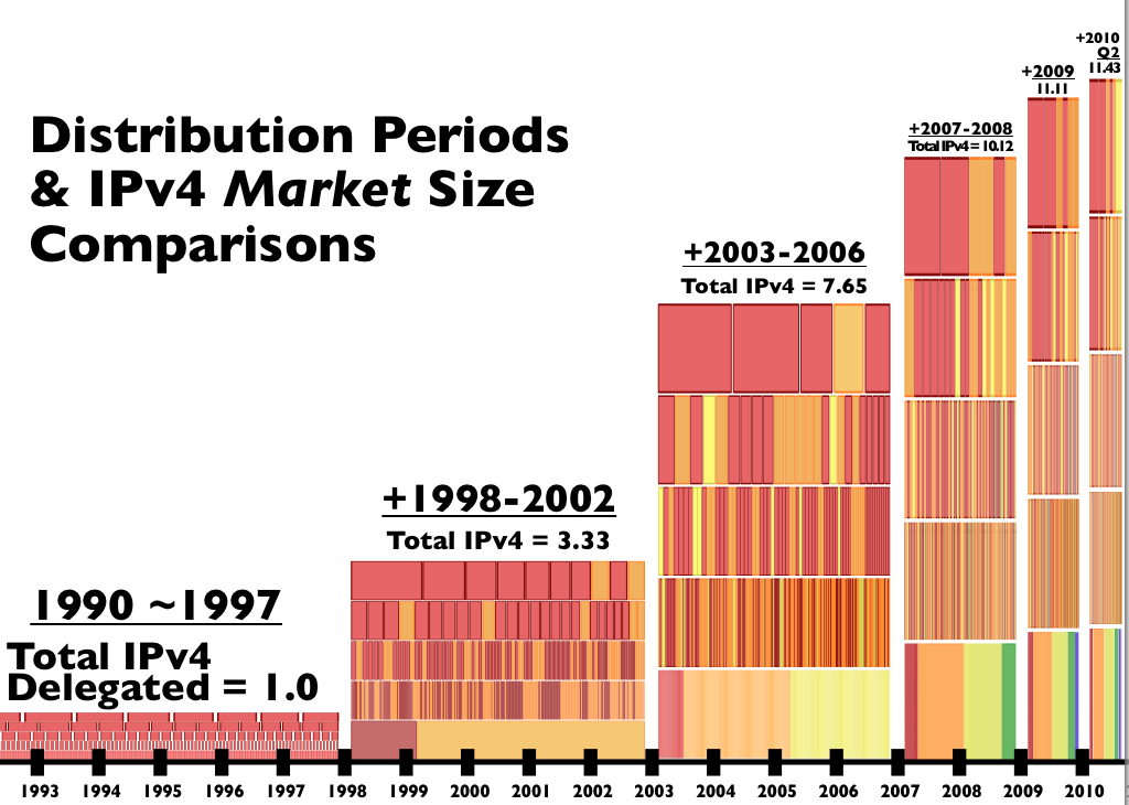 Figure 8: Distribution Periods 1990 - 2010
This image also shows nicely that a number of 'old' organisations are still in business and hold a big portion of the address space.
You can further see that in each period, organisations that started in the years before, expand their business and grow (in terms of number of IPv4 address space allocated to them).
Conclusion
Inevitably, judgments about whether a particular pattern is indicative of concentration or diffusion will involve a variety of subjective factors. That said, our own preliminary review of IPv4 cumulative distribution patterns does not reveal any clear indication of either of the two kinds of problems that are commonly associated with "excessive" resource concentration (recall Figure 1). Occasional turnover among the ranks of the largest IPv4 holders -- as some organisations fell behind and were surpassed by other, faster growing RIPE NCC resource holders -- suggest that to-date "incumbency" has provided no guarantee of continuing resource dominance. Moreover, consistently high establishment rates for new RIPE NCC resource holders is suggestive of an industry that is literally wide open to new entrants.
In future installments on this subject we will introduce some of the increasingly sophisticated analytical tools that have been developed to systematically explore "long-tailed" concentration|Diffusion patterns like the IPv4 distributions described herein. In the meantime, interpreting the patterns embodied in the foregoing chart series must be left as an exercise for individual readers. For now we can only point to features like the relatively stationary ratios between the numbers of RIPE NCC members in each of the top four quintiles (and after 2002, between all five quintiles) as an indicator that claims of increased concentration merit, at the least, very careful scrutiny.
NOTES
[1] "Concentration | Diffusion ...measured using IPv4 Address Space Distribution."
[2] One good example is here: http://maps.measurement-factory.com/ .
[3] See esp. the "Area-Preserving Bar-Chart Tree" and the "Multiscale HeatMap with Average Values" in Mansmann et al., "Exploring OLAP Aggregates with Hierarchical Visualization Techniques." http://www.inf.uni-konstanz.de/cgip/bib/files/MaScKe06.pdf
[4] Here, the term "organization" refers to Local Internet Registries, as well as to non-LIR institutions that have received IPv4 addreses from the RIPE NCC. Accordingly, the IPv4 distributions presented here encompass both IPv4 provider aggregatable (PA) allocations and provider independent (PI) IPv4 assignments. Since both kinds of organizations are identifiable by virtue of a persistent registration identifier, "organizations" are sometimes referred to as "resource holder."
[5] This particular version of the graph was created using OmniGraffle Professional 5.2.3. Precise scaling of each of the organization-level elements was greatly facilitated by the Bar Chart Script created by Peter McMaster: http://www.petermcm.dircon.co.uk/software/og_bar_chart/index.html . Note that in all but the bottom-most row in each graph, every RIPE NCC IPv4 resource recipient in every other quintile is individually represented by a unique graphic element.


Comments 1
The comments section is closed for articles published more than a year ago. If you'd like to inform us of any issues, please contact us.
Anonymous •
Nice work tom. Thanks for including tips on the s/w you used, nice to share the tools around.<br /><br />-G