
Both APNIC and Facebook publish statistics on IPv6 adoption per country. Next to the visualisations, these organisations also provide the numerical data. We take a look at these to see how the two methodologies compare.
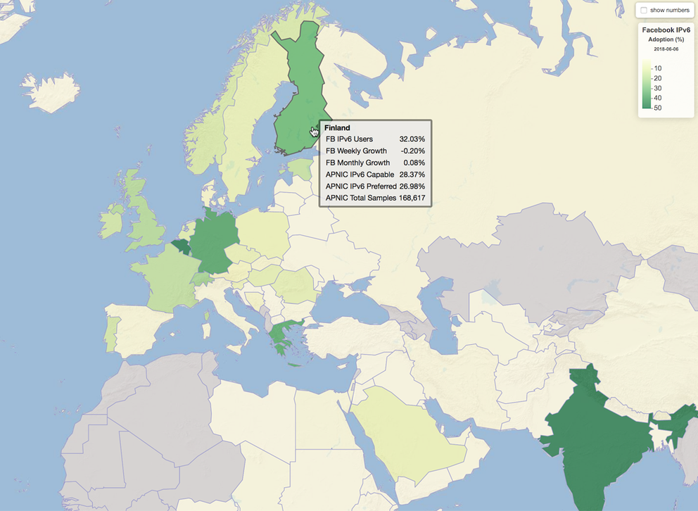
Google, Facebook, Cisco, and APNIC all publish statistics on IPv6 adoption levels per country, usually in the form of an interactive map where you can see the percentage of each country by hovering over the map. APNIC and Facebook also provide the raw data to the public from their respective websites. We created two maps which show the results in the same colour scheme to better compare these data sets. 
Figure 1: IPv6 adoption maps based on data from the APNIC (left) and Facebook (right)
The maps were created using data from 6 June 2018, the 6th anniversary of World IPv6 Launch. They are available from our website, here and here. By loading these in the web browser and going back and forth, it is easy to the spot countries where the two statistics differ by more than a fraction, the shade of green being darker on one map compared to the other. When you hover over the countries, the key statistics from both APNIC and Facebook are listed in the popup windows.
The maps are fully zoomable, which allows us to zoom in to the RIPE NCC service region, where several countries with a sizeable population cover only a relatively small area.

Figure 2: IPv6 adoption in the RIPE NCC service region
IPv6 adoption in Western Europe, Iceland, Spain, Italy and Denmark are falling behind, especially when compared to their direct neighbours. In Eastern Europe, adoption levels are generally lower, with only four countries passing the 10% mark in either Facebook's or APNIC's measurements. And in the Middle East, Saudi Arabia is the only country with notable deployment: 11% found to be IPv6 capable by APNIC, 9.4% seen using IPv6 when connecting to Facebook.
A more quantitative way to check the similarity between APNIC and Facebook data is to compute the difference between the two statistics for each country. The distribution of this is shown below in Figure 3. Since APNIC's method is based on sampling, only countries with at least 1,000 samples are included; that keeps purely statistical errors to acceptable levels.

Figure 3: Differences between the APNIC and Facebook statistics for each country
For most countries, the differences are very small with the two results being less than 0.5% apart. Countries in this group are typically countries with no visible signs of IPv6 deployment. With only one exception (South Korea), Facebook and APNIC are aligned when it concerns the countries where IPv6 has taken off with adoption reaching at least 5%. Differences for this last group of countries are, however, more spread out. They range from Facebook observing an 8.7% higher adoption, to APNIC measuring a 10.2% higher rate. Given the two very distinct metrics and their different methodologies, these differences are not unexpected. Neither the Facebook user community nor the users presented in APNIC's ads necessarily form a representative subset of a country's Internet users. The important thing to observe is that both methods find the same five countries with sizeable IPv6 adoption at the top, in the same order. That tells us the high levels of adoption in Belgium, India, USA, Germany and Greece are real, not a measurement glitch.
Comments 1
The comments section is closed for articles published more than a year ago. If you'd like to inform us of any issues, please contact us.
George MIchaelson •
Thanks for this. We have difficulties understanding why the skew in South Korea is so bad. We have known for some time the distribution of adverts to ISP in this economy probably doesn't reflect the true in country distribution (we have been told by research scientists from KISA our figures are off) and we also suspect some dynamics of the Korean peering behaviours distort the measurements. (We are told a lot of domestic IPv6 is not well peered or lacks transit.) SK Telecom are said to have significantly more market share than we impute. I would love to discuss this with Google advert placement specialists but it's a pretty opaque placement model inside the economy. Recent under-measurements in Thailand related to intermediate transit issues to our linode which have just been resolved. Black holes in IPv6 routing are often hidden by dualstack connection behaviours but in our case if an ipv4 served client attempts to fetch our configuration for adserve over IPv6 with an invalid route there is no fallback and we can lose samples. It is interesting to consider the akamai figures too. I tend to characterise sonic as an under-measurement and others as optimistic over measure!