
We created a data aggregate we call 'minRTT' that gives the minimum latency into each ASN (and IXP!) from RIPE Atlas for a given day. This allows us to visualise network deployments and can help with insights into structural latency problems for a network. We build a few visualisations on top of this data aggregate to show the potential.
As RIPE Atlas is deployed worldwide, one can easily look for probes that are hosted in a particular network to get an idea of where a network is deployed. But that doesn't give the full story. As probes perform a massive amount of traceroutes, we can also get an idea of how far from a particular network a probe is by looking at the IP address with the lowest latency for that particular network.
Minimum RTT
To do this we created a data aggregate, based on RIPE Atlas data in the Google Cloud Platform. We extract the minimum round trip time (RTT) that we see in traceroutes from each RIPE Atlas probe into each network that we have collected traceroute data for on a given day. The network data is aggregated by their well-known identifier, the Autonomous System Number (ASN), but we also aggregate data for IXP peering LANs in as far as they are recorded in PeeringDB.
So for a network or IXP, this dataset will contain a single minimum RTT value for all RIPE Atlas probes that see IP addresses for that particular network or IXP for a given day. And this requires no extra measurement as it builds on top of measurements that already exist in RIPE Atlas.
The resulting dataset is an interesting aggregate. Not only is it small (500MB uncompressed per day), but as we'll show below, it can provide insights for the following use-cases:
- What is the latency into a network as seen from over 10,000 vantage points all over the world?
- Which networks are close/far from a particular vantage point?
We've created prototype visualisations, using the ObservableHQ platform. This allows for rapid and agile prototyping of data ideas. If you have programming and/or visualisation skills, you can easily fork this code and create your own version of it and, if you want, contribute back your improvements. More on observableHQ in a separate RIPE Labs article.
Where in the World is This Network or IXP?
If you want to see where in the world a particular network is, there are a variety of sources that are typically taken to be a first port of call. You can look at geolocation databases, like MaxMind, for instance. Or you can check the kind of data provided by PeeringDB. That said, geographical data from the MaxMind doesn't tend to be accurate when it comes to locating network infrastructure, and PeeringDB isn't really designed to provide geographic data about networks, but rather where networks want to peer. So we wanted to augment the kind of geolocation data available from these sources with a pure measurement-based approach.
For this we created a RIPE Atlas latency world map in Observable!
The RIPE Atlas website already has a few maps that show latency worldwide to certain IP end points; e.g., for the DNS root server system. This map is different, though, in that it shows the lowest latency into particular networks or IXPs as seen from RIPE Atlas, so not only for a particular IP end point.
For this map we aggregate probes that are physically close into a single hexagon. The size of the hexagon represents the number of probes that are aggregated together and the colour represents the latency. This aggregation depends on the zoom-level, ie. if you zoom in this hexagon-aggregation is recalculated, so you will see more resolution as to where latencies are high or low. Hovering over a hexagon will show the number of probes and the latency.
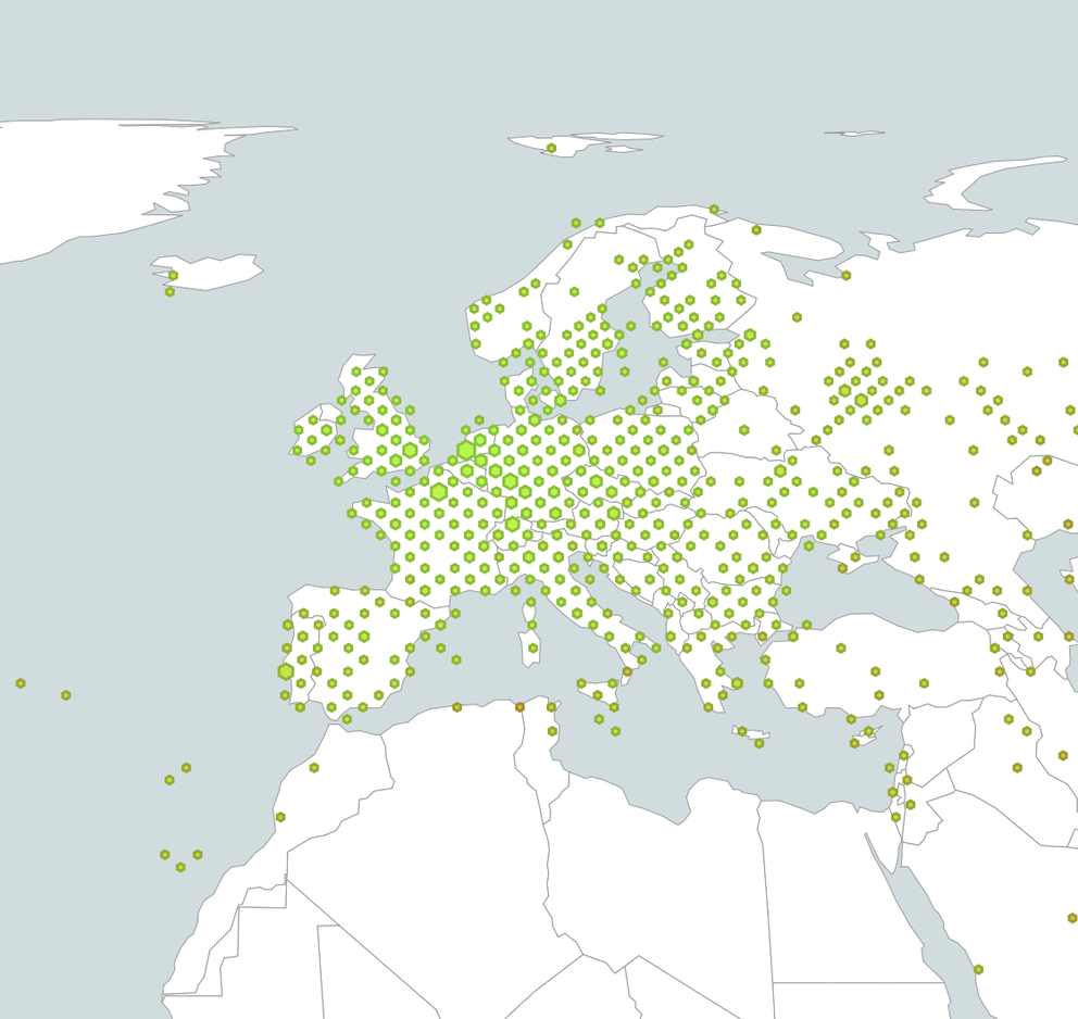
For instance if you take the RIPE NCC AS3333 (Figure 1), physically located in Amsterdam, you see, unsurprisingly, that vantage points in Amsterdam have low latency into this network, and that latency increases the further away you get from Amsterdam. As most of the Internet packets travel at the speed of light in fibre, as a ballpark you can take that 100km of physical distance increases latency by roughly 1ms of RTT. The visualisation is embedded here (best viewed in browser!). You can also interact with it in Observable:
Figure 1: Latencies into AS3333.
This visual interface also allows for querying for latencies into IXPs, because we have calculated minimum RTT into IXP peering LANs. We expose these IXP aggregates by their PeeringDB IXP ID. For instance for INEX LAN1, which has peeringDB IX ID 48, you can enter 'ix-48' into the origin field for this visualisation (Figure 2). Of course this can be made a bit more user-friendly, we just haven't gotten there (but if you are inclined to, you can fork a version of this to add support for that?).
Figure 2: Latencies into INEX LAN1 (ix-48)
As some IXPs have grown to have a wider geographical footprint, these IXPs will show up with low latency in multiple cities. An example that we found for this is ix-699 (NetIX), as shown in Figure 3.
Figure 3: Latencies into NETIX (ix-699)
Networks with a worldwide footprint are quite interesting, because these will show low latency from many vantage points in RIPE Atlas all over the globe. Let's look at some large content networks in the screenshots below (Figure 4 to 7)

Figure 4: Screenshot of latency map for AS15169 (Google)

Figure 5: Screenshot of latency map for AS16509 (Amazon)

Figure 6: Screenshot of latency map for AS13335 (Cloudflare)

Figure 7: Screenshot of latency map for AS20940 (Akamai)
While exploring these RTT maps, we found a number of probes that report provably incorrect RTTs to many destinations. For the maps we decided to use the median of all minimum RTTs as the basis to color the hexagons on. If we use the minimum of all minimum RTTs, which arguably is a better metric, these data inaccuracies stick out as a sore thumb. This minimum is still available as an option in the visualisation. The difference is that the median will tell us something about how a network is seen on average, while the minimum would allow us to see if any vantage point in a particular geographic area would see a network with low latency.
Some other interesting network latency patterns we found are in Figure 8, 9, 10 and 11, these are examples of regional deployments. We both show the minimum and median of the minRTT values, so one can see the difference and what it can tell us.

Figure 8: Screenshot of median latency map for AS37468 (Angola Cables). This shows low latencies on both sides of the Atlantic Ocean.

Figure 9: Screenshot of minimum latency map for AS37468 (Angola Cables). This shows low latencies on both sides of the Atlantic Ocean, and also in other places where this network peers in Europe and North America.

Figure 10: Screenshot of median latency map for AS30844 (Liquid Telecom). This shows low latencies in many African countries.

Figure 11: Screenshot of minimum latency map for AS30844 (Liquid Telecom). This shows low latencies in many African countries, and also in other places where this network peers in Europe. We suspect low latencies in North America to be a problem with the underlying measurements.
By default we will show the latest data, typically the data for yesterday.
Cells are embeddable, and the URLs for the observable notebook take parameters, so you can share these. We would love to see how you use these maps and what interesting things you find this way.
What Does My Network Neighbourhood Look Like?
Looking at things from another angle, this data also allows you get an idea of how things look from a particular vantage point on the Internet. If you host a RIPE Atlas probe, you might find it interesting to see what the neighbourhood of networks looks like around that in which you host your probe. Taking it that things with low latency are close by, we wanted to see what insights can be gained from being able to see what networks are close by to a particular RIPE Atlas probe.
To explore this, we created a RIPE Atlas probe neighbourhood visualisation!
Of course the network that a probe is connected to will have the lowest latency, but how far from the probe is the nearest hand-off to another network? If a probe is close to a place where there's a lot of interconnection between networks, we expect the latency between probe and these interconnections to be roughly the same. So if we order the latencies from probe to all networks that are seen, one would expect to see groups of similar latencies. In this visualisation, these locations of interconnect will show up as "plateaus".
As an example, take the network neighbourhood of this probe on Iceland. The networks are ordered by the minimum latency we see from the probe towards IP addresses in the network. As you can see there are around 10 networks that this probe sees at a very low latency of 1-2 ms. This means that this probe is close to where the network that this probe is in interconnects with other networks. This plateau represents interconnection on Iceland. We do see the Reykjavik Internet Exchange (RIX) at this plateau, its' peeringDB IXP ID is 228, so it appears as ix-228. Because we do have IXP peering LAN latencies in this data set, one can pretty easily identify the latencies for particular cities from these types of graphs. Cities were interconnect happens will typically show up as plateaus, with one or more IXP at that particular plateau. The more interconnection happens at the city, the larger the plateau.
Figure 12: Network neighbourhood of RIPE Atlas probe located in on Iceland
For those hosting RIPE Atlas probes, we hope that this provides you with some interesting insights into what your network neighbourhood looks like. Any surprises?
Limitations and Possible Solutions
Of course these visualisations are only as good as the data that backs them. A few things limit us here:
- RIPE Atlas deployment: If RIPE Atlas is not deployed in a place that interests you it won't be able to get data from there. One can fix this by deploying RIPE Atlas nodes in that location, for instance software probes.
- RIPE Atlas measurement bias: If RIPE Atlas doesn't measure into the network that you are interested in, the data we collect won't reflect the network very well. RIPE Atlas does a limited amount of so called 'topology measurements' where RIPE Atlas probes target the .1 or ::1 address of each prefix we see in BGP, which will likely give some visibility to the majority of networks. This can be fixed by scheduling additional measurements that would capture routes of low latency into particular networks.
- ICMP blocking: If a network blocks the various packet types needed for data collection, this network won't show up.
- Data errors. If a probe has wrong geolocation information, or if the network setup around a probe causes data problems, this will cause our data aggregates to capture inaccurate information. For instance: We see some probes near routers that return ICMP messages with fake source addresses (for instance, the destination address of a traceroute).
Where to go from here?
We hope these visualisations show the potential of the minimum RTT data that we are collecting. One can think of many future uses of this. With the flexibility of these one can easily add other data into the same visualisation. As an example one can add peeringDB locations for facilities as an overlay for the network map.
We hope you like these data aggregates and visualisations. We also hope what we've done here attracts the tinkerers out there - people who'd be interested in playing around with Observable and the data we have to offer in order to create visualisations of their own that they can bring back to our community. The power of Observable is that its visualisations are open-source, so we can merge changes made by others if we/others like them.
Remember, for now these are prototypes, but based on your reaction we'd be keen to develop this further. Let us know what you think!
Comments 0
The comments section is closed for articles published more than a year ago. If you'd like to inform us of any issues, please contact us.