
The new RIPEstat UI brings big changes to the look and feel of RIPEstat. It presents an updated, clean, responsive design built on a modern framework and comes equipped with a whole host of new features. In this article, we explore all these features and improvements.
Update on New Features - August 2021
The RIPEstat UI is not standing still. We're constantly refining, fixing, and adding new features requested by the community. Here are some of the bigger changes we've made.
- Save and share expanded state
Previously when you saved or shared a collection of infocards, the expanded state of the card wouldn't be accounted for, so cards would always display in collapsed/simple state. Now, the expanded state of each card will be stored (and restored) when saving or sharing a collection.
- Remember enabled/disabled cards on the launchpad
When performing a new search on the launchpad in the past, all available cards would be shown for that resource type. Now, if you've enabled or disabled/closed a card, it will be remembered for each type of resource and across searches. When resetting the search completely (by hitting the "x" button in the search bar) these preferences will be set back to default/show all cards for all resource types.
- Saved searches restored across resets and updates
Now when there's a new RIPEstat UI update, your previously saved searches will be restored. And when resetting the app to default state in the prefs, you'll likewise have an option to restore your saved searches.
- Bug fixes and refinements
In addition to the new features above, we've fixed many outstanding bugs and tightened the codebase for an overall better functioning app.
As part of a wider project aimed at improving the usability of our services - which has now covered RIPE Atlas, RIPE Labs, the RIPE Database and LIR Portal - we on the RIPEstat team have been hard at work for quite some time, reimagining everything about the RIPEstat experience. After much work, we are ready to present the new and improved RIPEstat UI.
Key Concepts
Throughout the course of redesigning the RIPEstat UI, we held to a collection of foundational principles that have guided our work. These are:
RIPEstat is a self-contained "App"
The previous RIPEstat website (and in truth other sections of the ripe.net website) contained a lot of separate information that made it difficult to focus on the core functionality that RIPEstat provides. In the redesign, we wanted RIPEstat to behave more like an app, and be conceived of as such. This guided many decisions we took about how it should work.
Responsive and mobile friendly
We also wanted to improve the experience in a variety of screen sizes and devices. The new RIPEstat adapts well to this diversity and is much more usable on mobile, tablets, and desktop than ever before. It is even installable on mobile devices as a PWA (Progressive Web Application).
User customisation
We have also included many ways for users to customise the way they are interacting with RIPEstat. This includes being able to save collections of information, setting the order of information, drilling into the details, and even setting language and theme preferences.
Universal search context (resource, range, etc. applies to all displayed elements)
In the previous RIPEstat UI, each widget was a self-contained item with its own search box input, a variety of controls and different ways of retrieving information. We have vastly simplified how information is searched for in the majority of cases with a unified search bar whose contexts (of resource inputs and date ranges) are applied universally to all information queries at the same time.
Simple to more complex insights
One of the more important goals for the team was to help users receive and be able to understand the results of a query as quickly as possible. To that end, we have designed infocards that start out with a simple, top-line status information that is easily digested. From there, users can expand each of these infocards for increasing levels of detail about their query. In addition, infocards are colour-coded by status so you can see when everything is great, what's neutral/informational, or when you might want to investigate something further.


Shareability of insights
In the new RIPEstat UI, it's easy to share the collection of information you have configured, whether it be a snapshot in time or just the latest information. The system provides you an easily accessible share link so that others can see what you are seeing.
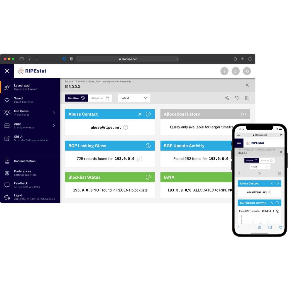
Launchpad
The Launchpad is the place to start for exploring data in RIPEstat. It displays the entire collection of information available to you for a given search, and allows you to organise that information, save it, or share it.
Search Bar
The search bar is where you can enter your resource (IP, prefix, ASN, country or hostname) along with date range (in relative or absolute values) and run a query based on those inputs. The lower part of the search bar also contains tools that allow you to share, save, and organise your results.

Search Input
In this field you can enter your resource (an IP, prefix, ASN, country, or hostname). The box will provide a dropdown with search suggestions based on your input, as well as suggestions based on your local information, such as your IP.
Date Range Input
The Date Range selector lets you choose from latest or relative timeframes (such as "last 4 weeks") or absolute timeframes by selecting a start date and end date, then being able to refine further the time within that envelope using the time slider.

Sharing
The Open Share Panel button opens a panel that gives you a link to share that will allow the receiver to perform the same search that you are currently viewing.
Save Search
The Save Search button brings up a dialog box allowing you to name, describe, and save your particular search (which you can then retrieve from the Saved menu on the left).
Manage Infocards
The Manage Infocards button reveals a dropdown panel that allows you to filter and order the infocards for your search type. You can show/hide all of them, check or uncheck the boxes to show/hide individual items, or drag them to reorder.
Infocards
Infocards are discrete pieces of information about a resource. When grouped together in certain ways, they constitute a particular use case. We have assembled some common use cases for you under the Use Cases menu, but you can also create your own groupings with saved searches.

Sidebar Menu Items
In addition to the all-important Launchpad mentioned above, the sidebar menu contains a variety of other useful sections.
Saved
This menu item is the place that holds your saved searches, and allows you to edit their names and descriptions as well as run them by clicking in the each sub menu item created by a save.
Use Cases
This menu will change depending on the type of search you have made in the search bar. For example, if you have searched for an ASN resource, this menu will be populated with ASN Use Cases like Geo Check and Registration Check (among others). You can click on any of these to filter the info cards for your search to the collection representing the particular use case.
Apps
The standalone apps menu contains items that do not exactly fit the search bar paradigm of input + time window. This is because they represent information that is either too complex or takes too many inputs. Most of these exist in the previous UI, and clicking on one of these links will send the user to the older UI. The RIPEstat team will be evaluating and reworking these in the coming months to improve ways to integrate this type of information going forward. As with the Use Cases menu above, the Apps menu will also populate with apps that are appropriate to the search type entered.
Old UI
Quite simply, this menu will take users directly to the previous interface in case there is something there that has not yet made it to the new UI, or because they are more comfortable searching for things in the older interface.
Documentation
This menu will eventually direct users to complete documentation about the new UI and data related to it. In the short term, it will launch the welcome slideshow that gives a quick overview of the UI.
Preferences
This menu will take you to the Preferences page, which allows users to set their preferred language, infocard layout width, infocard theme choice, and more.

Feedback
This menu will launch a Usersnap feedback form that allows users to report any issues or feedback about the new UI, including screenshots and annotations that will allow us to improve the UI for you.
Legal
And finally, the legal menu contains all-important legal information related to RIPEstat.
Have Fun!
We are very excited to finally be releasing the new RIPEstat UI to the world. We hope you enjoy it and welcome your feedback. Thanks!
Comments 0
The comments section is closed for articles published more than a year ago. If you'd like to inform us of any issues, please contact us.