
We've rewritten LatencyMON from the ground up, retiring its legacy libraries for a modern, more secure codebase, with a refreshed interface and new ways to group and explore your RIPE Atlas latency data.
The original LatencyMON was created by Massimo Candela in 2015, and it's been a useful part of the RIPE Atlas toolset ever since. The core idea hasn't changed: instead of plotting and eyeballing dozens of individual charts, you let LatencyMON group probes for you and compare their latency over time on a shared, auto-tuned axis.
What has changed is almost everything underneath, plus a good number of features on top. This article walks through what's new and where you can find it.

A quick refresher: what LatencyMON does
If you're new to the tool, the basics are worth a minute.
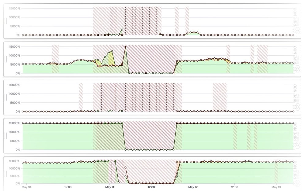
You point LatencyMON at one or more RIPE Atlas measurements - ping, traceroute, DNS, TLS or HTTP - and it draws the latency seen by the probes over time. Rather than one line per probe (which gets unreadable fast), probes are collected into groups, and each group is drawn as a band showing the minimum, middle (median, or the mean for ping) and maximum round-trip time across that group. Spikes, packet loss and slow drifts jump straight out at you.
You can read the charts in two modes: Natural, which shows absolute round-trip times in milliseconds, and Relative, which normalises everything against the lowest latency observed - ideal for spotting when something changed even when baselines differ wildly between probes.
Rebuilt from the ground up
The headline change is one you won't see directly, but rather you'll feel it: LatencyMON has been fully migrated to Vue 3 and Quasar, the same stack as the rest of the modern RIPE Atlas UI. This makes the codebase much more secure as well. The old jQuery, RequireJS and Backbone foundations are gone.
That matters for a few reasons. It makes the tool far easier to maintain and extend alongside everything else in RIPE Atlas; it lets LatencyMON share components and behaviour with the rest of the interface; and it's simply more responsive, holding up much better on smaller screens than the original did. Along the way we gave the whole interface a visual refresh and a good de-clutter.
See more of your data
Several of the new features are about getting more of your measurement data on screen, and getting to it faster.
- Min / middle / max, or just the minimum. Groups are drawn as a full min–median–max band by default, but a single toolbar toggle collapses them to the minimum line only - often the cleanest signal when you just want to see the noise floor move.
- No more blank areas on load. LatencyMON now zooms straight to the full extent of the available aggregated data the moment it opens, so you land on your data instead of an empty time window you have to go hunting through.
- Go beyond the aggregation window. The aggregated view is fast because it's pre-computed, but it only covers a certain range. LatencyMON can now also pull the raw, non-aggregated per-sample results for periods outside that range - capped at 10,000 samples for now to keep things smooth - so you're no longer boxed in by the aggregation limits.
- Packet loss you can actually see. Areas affected by packet loss are now opacity-scaled, so heavier loss stands out more strongly, with a prompt to zoom in when you want the full, un-aggregated detail.

New ways to group probes
Grouping is the heart of LatencyMON, so we added another way to do it.
By default, LatencyMON builds groups from the countries with the greatest number of probes, which is a sensible starting point for most measurements. New in this version, a toolbar control lets you instead group by distance from the target, which is handy when you care more about where probes sit relative to your destination than about raw probe counts - for example, separating nearby vantage points from far-flung ones.
You can also now split any group into individual per-probe charts with a single click. Groups are great for spotting that something is wrong; splitting them out shows you exactly which probe is responsible.
And if you pass two measurement IDs, LatencyMON will line them up as an IPv4 vs IPv6 comparison automatically, giving you a quick way to check whether both address families are behaving the same.
Arranging, sharing and embedding
Once you've got the charts you want, they're yours to rearrange. You can drag to resize individual charts and reorder them so the comparison you care about sits where you want it.
For sharing, there's a proper fullscreen mode with easy zoom, a clean embed option that drops a live LatencyMON view into any page (capturing the full state of what you're looking at), and a direct link out to the underlying measurement ID whenever you want to jump from the visualisation to the measurement detail behind it.

Now linked across RIPE Atlas
Finally, LatencyMON is much better connected to the rest of RIPE Atlas. Previously you'd mostly reach it from ping and traceroute results. Now it's linked from DNS, TLS and HTTP results as well, with proper support for those measurement types - so wherever you're looking at a measurement that has latency worth comparing, LatencyMON is one click away.
Try it out
LatencyMON works straight from a URL. All you need to do is append one or more measurement IDs:
- For a single measurement:
https://atlas.ripe.net/latencymon/109943096 - An IPv4 / IPv6 comparison (two IDs joined by a hyphen):
https://atlas.ripe.net/latencymon/29095963-29095966
The full reference lives in the LatencyMON documentation.
We'd love your feedback
LatencyMON has been a favourite for years, and the goal of this rebuild was to keep everything that made the original useful while giving it a modern foundation and room to grow. If you put it through its paces - especially across the newly supported DNS, TLS and HTTP measurements - we'd genuinely like to hear how it works for you, what's missing, and what you'd like to see next.
Please send any feedback you might have to the RIPE Atlas team. Happy monitoring!
Comments 0