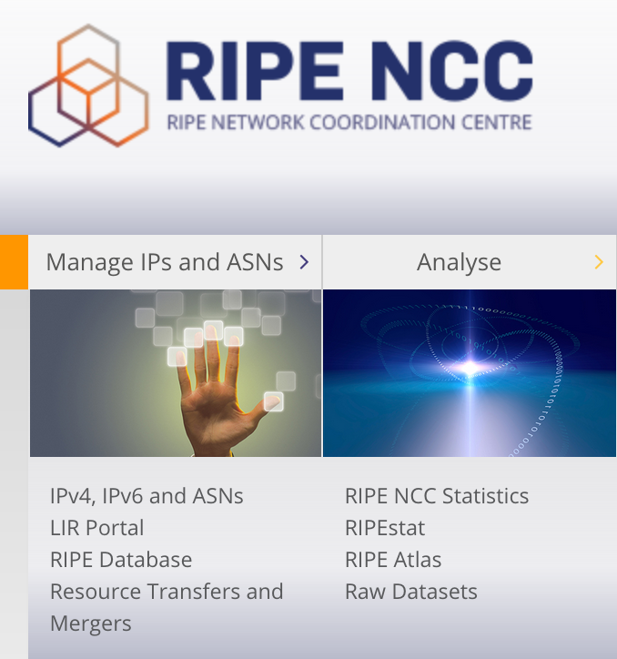
We've been reviewing user actions on www.ripe.net and acting on your feedback. As we go into a new year, ripe.net is getting a fresh look with a cleaner homepage, a customisable dashboard and content that is more user-centric!
Over the years, ripe.net has grown to have a staggering 13,000 pages of content. While these pages include RIPE Documents and policy proposals, we also have about 3,000 pages of content. Most of our content answers common queries like 'What is an IP address' and 'How to become a member'. Yet there is often a lot of duplication across the paes since most of these pages have been added organically over the years.
We don’t want a labyrinth. Though we have a good content management system (CMS), it has become tricky to arrange pages so that the user finds the information they need. Some pages are very long, making it even harder to find information. Further, a large part of our readers are non-English speakers.
User Testing
Over the past twelve months we’ve been reviewing how our users have been using the website. We held user testing sessions at member lunches and RIPE meetings and further examined our web analytics.
From this we identified two areas to improve in:
- User Driven Content
- Cleaner homepage and a user dashboard
User Driven Content
Templates, Templates, Templates
We’ve come up with standard templates for certain webpages. Our templates will help make sure users get the content they need. This will streamline the website and improve findability. Further, we’re cutting pages to a limit of about 300 words from our current average of over 600 words. This will make content easier to update depending on user needs.
Creating actionable content
During our research, we noticed that a lot of users found our content frustrating, they found it too long and their goal was to complete a task, rather than read about the reasoning behind the task. We will flip the content structure to make sure that the action or goal is easy to get to, and there is a still a flow to show why things are a particular way.

Many pages will include a button taking you straight to the action like a tool or a request form.
Are there improvements you'd like to see?
You will be noticing the changes coming to the website over the next few months. The content will be more user driven.

Our goal is to make your access to our content and services easier and your feedback is very important in this process. We appreciate your taking the effort to share it with us. Please do let us know if there are any issues on a page by clicking the “Is there anything wrong with this page ” link found at the foot of each page.


Comments 0
The comments section is closed for articles published more than a year ago. If you'd like to inform us of any issues, please contact us.