You may have noticed that, as of this past week, RIPE Atlas is looking different. To explain what's changed and why, here's a quick update on our latest efforts in rolling out the new design we've been working on for our services.
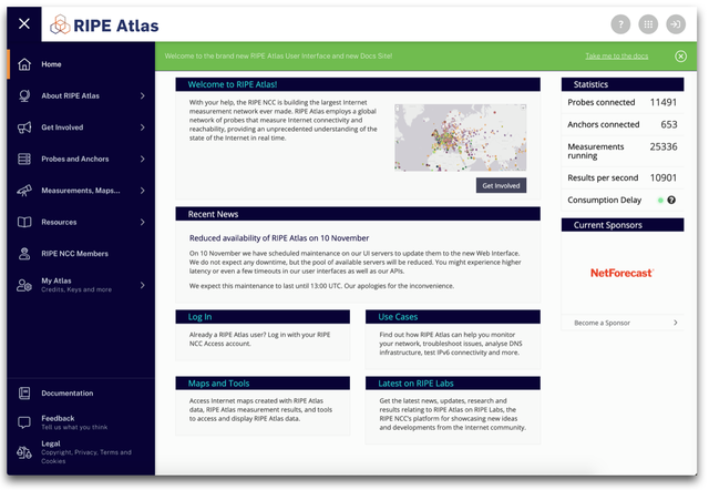
Over the past year, we’ve been looking at ways to improve the user interfaces for our services. On the one hand, we want to make sure that the front end for each service is up to date, easy to navigate and all the other good things you’d want from a UI. On the other, we want better alignment in the look and feel of our services, so you can move between them easily and get the most of all the things we have to offer. As of this week, RIPE Atlas has become the latest service to start seeing the benefits of the new redesign.
Unified Design
Coming up with an improved design for our services has involved a coordinated effort between several teams here at the RIPE NCC. 
An important aim was to resolve issues that had been flagged in earlier usability testing. Users had made it loud and clear that the layout for several of our user interfaces could be better. There was a need for smarter use of the real estate available in browsers, so that people could see more and do more when interacting with services. There was a call for improved responsiveness, especially for mobile devices. And there were other things to be fixed, like the fact that users visiting services they were familiar with were having a pretty hard time discovering others they’d not yet encountered.
The solution we came up with was to put together a new design system for those common elements – i.e. headers, navigation sidebars, footers, etc. – that users rely on to orient themselves as they interact with each service.
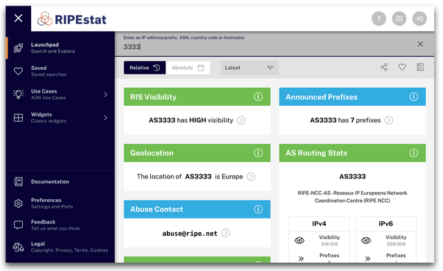
After a careful development process, aided by usability testing, we now have a design in place complete with a repository of web components that can be shared to create improved layouts for each service. Implementation of this has been visible to anyone visiting the new RIPEstat for some time now, and as of this week, we’re pleased to announce that the first iteration of the new design has been deployed for RIPE Atlas.
A Quick Tour
While the best way to get a feel for the new design is to go check out RIPE Atlas or RIPEstat right now, here’s a quick look at some of the key components.
Header and Icons

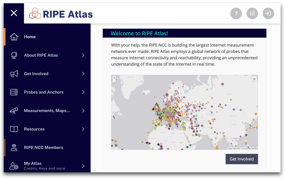
The new header is lightweight and minimal to prevent it taking up valuable space. On the right, you’ll see three icons. The first provides basic details on the service you’re viewing and a link to further information, while the last lets you quickly sign in and out of your RIPE NCC Access account.
In the middle of these, we have the app-switcher, which you can use to move quickly between services. While this will become more useful as we implement the new design system for other services, users will already find it easier to hop between RIPE Atlas, RIPEstat, LIR Portal and ripe.net, or jump to other services, like RIPE Labs and the RIPE Academy.

Navigation Sidebar
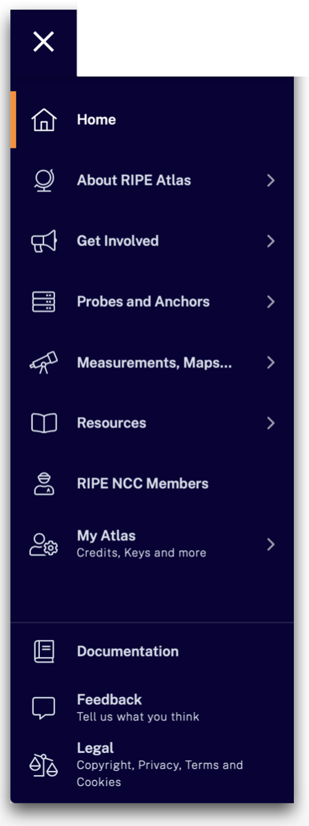
As for navigation, while in this first iteration we haven’t wanted to make any drastic changes to how people get around in RIPE Atlas, we think the new layout presents the information you need much more clearly than before. It also helps bring certain common navigation items – e.g. documentation, feedback, legal – into alignment for different services. Note that, by hitting the cross at the top left, you can collapse the sidebar entirely, again helping make sure you have all space you can get while interacting with each service.
Coming soon, you'll see some of the items currently listed in navigation for RIPE Atlas transferred to a dedicated space for promotional content, the aim being to make a clean split between content aimed at explaining what RIPE Atlas is all about and content essential to the actual use of RIPE Atlas. Look out for this in future updates!
Other Changes
As well as all the above, you may have noticed we’ve done away with the footer altogether, again to free up more space. All the information that used to be available there can now be accessed from the sidebar. One other thing to note, in keeping with an important goal behind the new design, is that we’ve also strived to make the RIPE Atlas pages much more mobile-friendly.
Documentation
We've taken this opportunity to make sure that all the documentation for RIPE Atlas is available in one place and presented in a more clear and logical way. The RIPE Atlas Docs Centre brings together all the information you'll ever need in order to get to work with RIPE Atlas - from guides on
Next Steps
In terms of RIPE Atlas, what with this being the first iteration, there will no doubt be a few wrinkles to iron out in the coming days and weeks. As we work on this, we'll be listening carefully for any feedback and carrying out further testing to make sure we keep going in the right direction.
More generally, the team is already turning its attention to other services. Elements of the redesign have already led to changes on our main website, and as was reported in another article recently, RIPE Labs will soon be following suit. After that, other key services we plan to focus on include the RIPE Academy (already partially in line), the LIR Portal and the RIPE Database.
In sum, we very much hope that our users will appreciate the changes we've made as well as the further changes to come. If you have any thoughts about the redesign, please feel free to leave a comment below. Or if you have feedback specific to the the changes to RIPE Atlas, contact us at atlas@ripe.net.


Comments 2
The comments section is closed for articles published more than a year ago. If you'd like to inform us of any issues, please contact us.
Niall O'Reilly •
UX troubles I've encountered using Firefox on MacOS Catalina 10.15.7: - Without setting my browser to use the full screen, I can't set up a new measurement, as the OK button for confirming probe selection is outside the viewport, and horizontal scrolling seems not to be available. - In the "Mine" tab on the "Measurements" screen, two measurements are listed, as expected, but also the confusing message, "You do not have any measurements listed here. If you've never created a measurement of your own, create one now".
Robert Kisteleki •
Thank you for reporting these, we'll investigate / fix!